Skip to content
  • Recent
  • Tags
  • Popular
  • Users
  • Search
Skins
  • Light
  • Cerulean
  • Cosmo
  • Flatly
  • Journal
  • Litera
  • Lumen
  • Lux
  • Materia
  • Minty
  • Morph
  • Pulse
  • Sandstone
  • Simplex
  • Sketchy
  • Spacelab
  • United
  • Yeti
  • Zephyr
  • Dark
  • Cyborg
  • Darkly
  • Quartz
  • Slate
  • Solar
  • Superhero
  • Vapor

  • Default (No Skin)
  • No Skin
Collapse

Lay Theme Forum

  1. Home
  2. General Discussion
  3. add social media buttons to mobile menu

add social media buttons to mobile menu

Scheduled Pinned Locked Moved General Discussion
2 Posts 2 Posters 115 Views
  • Oldest to Newest
  • Newest to Oldest
  • Most Votes
Reply
  • Reply as topic
Log in to reply
This topic has been deleted. Only users with topic management privileges can see it.
  • F Offline
    F Offline
    florine
    wrote on last edited by florine
    #1

    hi dear Lay Theme team

    For the phone layout of the website https://www.johannapaerli.ch/journal
    I would like to add the social media buttons (for now placed with css as a fixed element on every page) to the mobile menu, so they only show up when you open the menu-layer.

    ist there a possibility to do this?
    writing a css code that hides them on all pages also makes them disappear on the mobile menu, so I guess I would need some extra code to make them remaining visible in the menu.

    Thanks for your help!
    Best,
    Florine

    1 Reply Last reply
    0
    • RichardR Offline
      RichardR Offline
      Richard
      Global Moderator
      wrote on last edited by
      #2

      Dear Florine

      @florine

      This may not be the most graceful way to do it, but maybe it works for you šŸŒ

      The following code clones your social-media group and adds it after the last menu element "uber mich"

      jQuery('#handyrow').clone().insertAfter('#menu-item-388');
      

      Result:

      Screen Shot 2022-03-20 at 5.03.12 PM.png

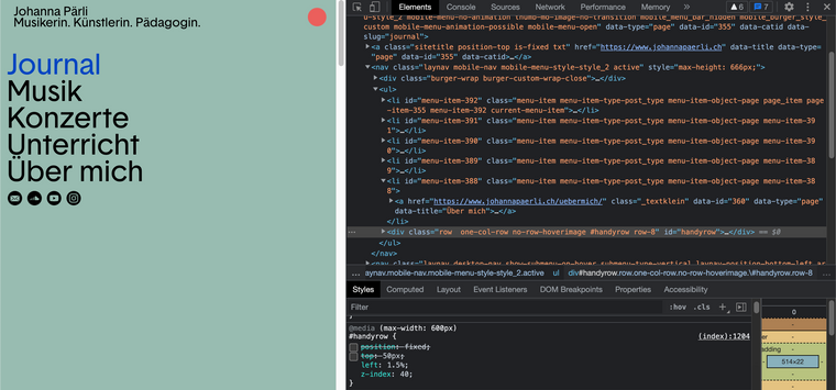
      There would need to be some changes to the handyrow css:

      .mobile-nav #handyrow {
              position: initial;
              top: 0;
              left: 1.5%;
              z-index: 40;
      }
      

      You can specify it only to apply to the handy-row within the menu by adding .mobile-nav beforehand.

      Hopefully if this isn't exactly whats needed it still helps you in the right direction Florine ā­ļø


      best wishes
      Richard
      1 Reply Last reply
      0
      Reply
      • Reply as topic
      Log in to reply
      • Oldest to Newest
      • Newest to Oldest
      • Most Votes


      I also code custom websites or custom Lay features.
      šŸ’æ Email me here: šŸ’æ
      info@laytheme.com

      Before you post:
      1. When using a WordPress Cache plugin, disable it or clear your cache.
      2. Update Lay Theme and all Lay Theme Addons
      3. Disable all Plugins
      4. Go to Lay Options → Custom CSS & HTML, click "Turn Off All Custom Code", click "Save Changes"

      This often solves issues you might run into

      When you post:
      1. Post a link to where the problem is
      2. Does the problem happen on Chrome, Firefox, Safari or iPhone or Android?
      3. If the problem is difficult to explain, post screenshots / link to a video to explain it
      Online Users
      dafvD
      dafv
      Forgot your key, lost your files, need a previous Lay Theme or Addon version? Go to www.laykeymanager.com
      laytheme.com
      • Login

      • Don't have an account? Register

      • Login or register to search.
      • First post
        Last post
      0
      • Recent
      • Tags
      • Popular
      • Users
      • Search