Responsive Footer
-
Hello there!
Due to the needs of my website I had to built my menu using the footer.
Now, what I am trying to do is make it responsive, so that when you change the viewport (screen size) the footer is always visible from top to bottom.you can see the website here: https://groups.uni-paderborn.de/digitale-ausstellung-bildhauerei/
the thing is that the footer is not acting as a responsive section, it is fixed on top but not on the bottom.
So when the screen size is "higher" (longer in hight) it stays the same size and hangs from the top, leaving a blank space:

but when the screen gets shorter, it appears as cut:
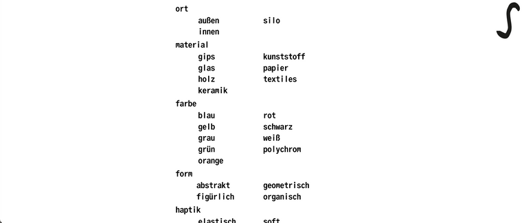
what I want to do is that the footer is always visible, so that it adjusts type size to fit in whatever the screen size is. now that's what I did:
#footer-region{
z-index: 15;
bottom: 2px !important;
top: 2px !important;
left: 0;
min-height: 100% !important;
position: fixed !important;
display: absolute !important;
mix-blend-mode: difference;
justify-content: center;
flex-direction: column;
flex: 1;
}i've tried endless CSS' snippets but it's just not happening, and I'm loosing my mind here... helppp!!!
thanks :)
-
Dear @giselach
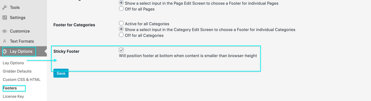
Is the behaviour related to a "sticky footer"
http://laythemeforum.com:4567/topic/3750/link-with-fullscreen-background-image-on-hover/11
Best ✨
Richard
-
Dear @giselach
Is the behaviour related to a "sticky footer"
http://laythemeforum.com:4567/topic/3750/link-with-fullscreen-background-image-on-hover/11
Best ✨
Richard
-
Dear @giselach
I dont think this is Bug, but just that you have a certain amount of content and this content is large enough to push over a normal screen amount. Like with a book that has too many sentences to fit on a single page. In the other threads i felt this was because your content (text) was set in pixels which is a fixed unit. The solution will be to use text formats and apply a responsive or relative unit like % , vh, or vw.
If the behaviour of your Footer is not normal you may have some custom CSS or JS that is affecting it, i am unsure of you setup.
If customizing the Footer is your wish, i am happy to help send you in the right direction but the result will be ultimately up to you 🌝
As this is posted in the "need developer help section" i hope others will speak up @giselach and help you if possible 👍
Sincerely
Richard
-
@giselach all usability-questions put aside, I think the problem is the margin between the rows. while the letters get smaller with smaller window height, the rows stay the same size (it seems to me).
I also code custom websites or custom Lay features.
💿 Email me here: 💿
info@laytheme.com
Before you post:
- When using a WordPress Cache plugin, disable it or clear your cache.
- Update Lay Theme and all Lay Theme Addons
- Disable all Plugins
- Go to Lay Options → Custom CSS & HTML, click "Turn Off All Custom Code", click "Save Changes"
This often solves issues you might run into
When you post:
- Post a link to where the problem is
- Does the problem happen on Chrome, Firefox, Safari or iPhone or Android?
- If the problem is difficult to explain, post screenshots / link to a video to explain it