Hidden Mobile Menu > white Bar on Bottom by 100vh
-
Hej @Richard,
Thanks for the info, I'll take a closer look at the tool.
Unfortunately, the bar is definitely visible on my phone (iPhone X) and my colleague's phone (iPhone 13 mini) :/
There is also a white strip at the top edge where the notch is.
What else can I do? Unfortunately, I'm slowly getting desperate ...
Best regards,
FabiHello again,
I have just spoken to my developer friend again and he also says that this is a problem caused by Laytheme. It also varies in severity depending on the iPhone version and browser used.
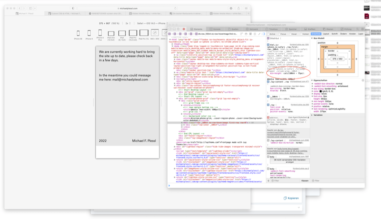
It looks like you are setting different values for each device, which means I would have to adjust the values for each device and overwrite yours?
Please tell me there is a simpler solution?
Best regards and many thanks,
Fabian -
Hello again,
I have just spoken to my developer friend again and he also says that this is a problem caused by Laytheme. It also varies in severity depending on the iPhone version and browser used.

It looks like you are setting different values for each device, which means I would have to adjust the values for each device and overwrite yours?
Please tell me there is a simpler solution?
Best regards and many thanks,
FabianDid you have another chance to look at the whole thing? Is there anything that can be done?
Unfortunately, I'm running out of time with this project and would otherwise have to find a completely different solution.
Many thanks in advance,
Fabi -
Dear Fabi
@fabiandraxl
I am using Browserstack which are real devices and not simulations to be clear. 🌝
I have tested on an old Iphone of mine & a new android. (in my hands)
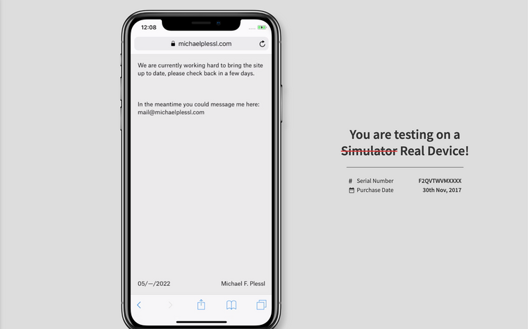
I have tested on Iphone 13, 11 & 8Here is testing on an IPhone X:
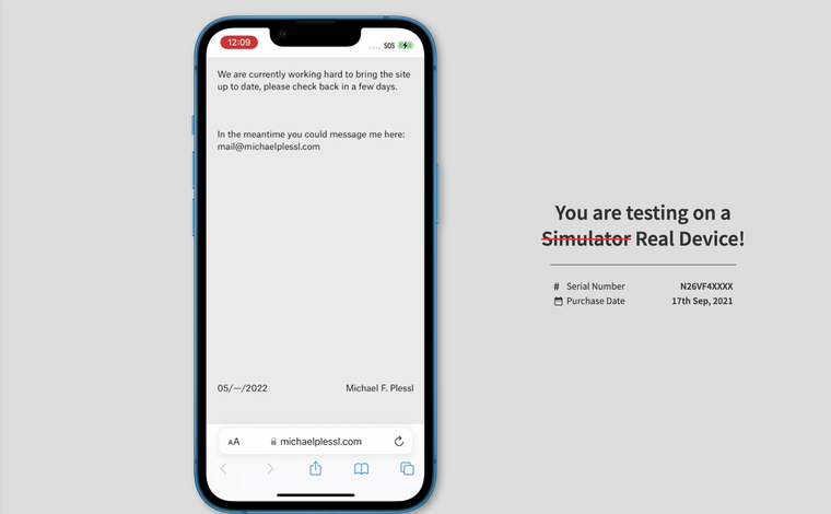
Here testing on Iphone 13 Mini:
Once again: Safari Responsive Mode is not a true mobile
The white bar may be there but not on true devices.
I am really unable to recreate the white bar on all these different devices. I really wish to help but cant see it at the moment.You are sure that you experience the white bar on real mobiles? 🌝
I will forward this to Armin for this thoughts ✅
Best
Richard
-
Dear Fabi
@fabiandraxl
I am using Browserstack which are real devices and not simulations to be clear. 🌝
I have tested on an old Iphone of mine & a new android. (in my hands)
I have tested on Iphone 13, 11 & 8Here is testing on an IPhone X:

Here testing on Iphone 13 Mini:

Once again: Safari Responsive Mode is not a true mobile
The white bar may be there but not on true devices.
I am really unable to recreate the white bar on all these different devices. I really wish to help but cant see it at the moment.You are sure that you experience the white bar on real mobiles? 🌝
I will forward this to Armin for this thoughts ✅
Best
Richard
Hej @Richard,
I don't know about you, but I have this problem on every iPhone I use. Attached is a photo of my colleague's screen as proof.
This page is built with the fullpageslider at 100vh:
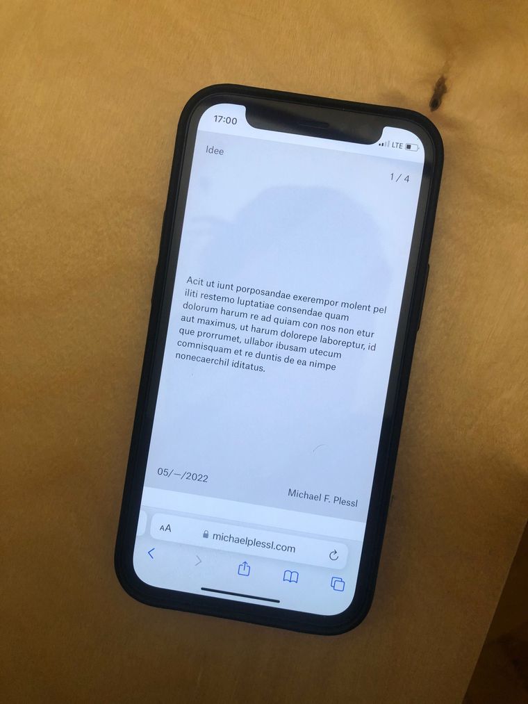
And this page is a "normal" Laytheme page with rows (the first row should be 100vh).
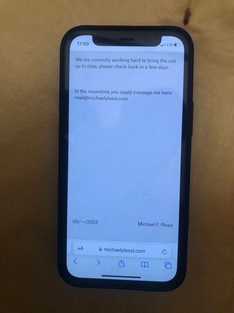
In the second screenshot, the bar at the bottom is no longer white because I changed the background color from white to grey, but the bar remains.
If you want I cloud setup up an account for you, to get deeper into this?
Best regards and thanks in advance, Fabi
-
Dear Fabi
@fabiandraxl
Thank you for the confirmation, it is strange that we experience different outcomes 🌝
Please send your website address, /wp-admin/ username and password and a link to this topic to info@laytheme.com?
Armin can then have a better look 🔍✅
Bet wishes
Richard
-
Dear Fabi
@fabiandraxl
Thank you for the confirmation, it is strange that we experience different outcomes 🌝
Please send your website address, /wp-admin/ username and password and a link to this topic to info@laytheme.com?
Armin can then have a better look 🔍✅
Bet wishes
Richard
Hej @Richard,
I have sent you the login data, thank you very much.
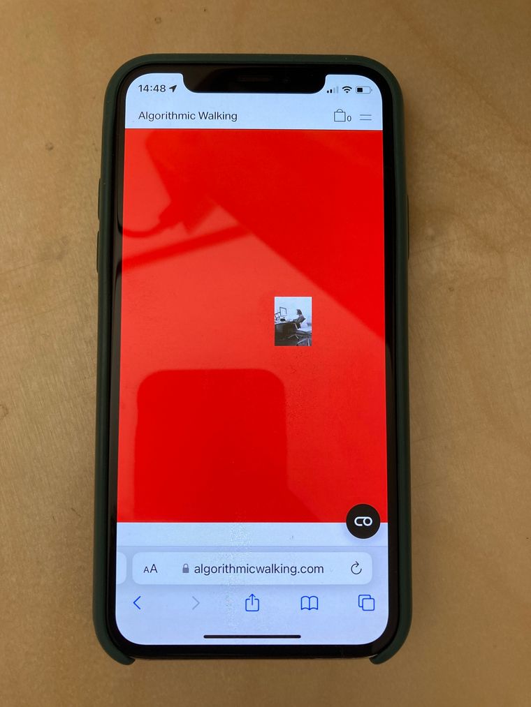
I am also working on another page. I have set up the same scenario here for test purposes, and the problem is exactly the same.
On this page you can also see a bar at the bottom of the page, if you open the page with Safari on iPhone.
https://algorithmicwalking.com/test
-
-
Mhm, is there already an update in this case, my client is still waiting very hard for the site. And would like to finally be able to get started ... did you get my mail with the login data?
Thanks,
Fabi 😇 -
:O
hey! sry this seems to have not been resolved for a very long time, im taking a look at it now
-
you need to remove your custom CSS:
        .lay-content {
            min-height: calc(100vh - 40px);
        }
it messes up the height! xD
it is here:
 @media (max-width: 600px) {
        body.woocommerce-page .lay-content {
            min-height: auto;
        }/* account for possible mobile menu menubar height,
        					not if this is a woocommerce page */

        .lay-content {
            min-height: calc(100vh - 40px);
        }
    }
please carefully read the instructions, before posting a bug please always remove all of your custom css and disable all plugins to see if the bug still persists.
lmk if that fixed the issue for you. if not i will take another look!
-
Hej @arminunruh ,
Thank you for your quick answer.
I think you mixed up my two requests, the email from today was for another post.
I only reconstructed the same problem from this thread on this site too (algorithmicwalking.com).michaelplessl.com/frontpage is not a whoocommerce page and there is no custom code like the one you mentioned above on both of the sites. :P
Video proof here: https://www.dropbox.com/s/lf358ay9tiq7nli/No Custom Code.mov?dl=0
I also sent you the login data to info@laytheme.com for michaelplessl.com 2 weeks ago.
Can you please have a look at it again.
Thanks and best regards,
Fabi -
hey!
oh
i took another look and yea, my fault.
i just changed something in lay theme's code and released an update, can you update your site and check again? -
hey!
oh
i took another look and yea, my fault.
i just changed something in lay theme's code and released an update, can you update your site and check again?Hej @arminunruh,
Thanks again for taking care of this. 🥰
I have installed the update, but unfortunately I couldn't see any difference. I also checked again in the Customizer whether the menu and all other menu parts are hidden. Still the same problem, that 100vh does not correspond to 100vh on Safari mobile.
Any other ideas to solve this problem?
P.S.: Don't know if you've seen it yet, but unfortunately the update caused the other site (algorithmicwalking.com) to crash.
Best regards and thanks in advance, Fabi
-
can you update again and then the website should work again
-
let me know when u have updated your site and i will take another look.
or post a different url here where u have a 100vh row that doesnt work correctly -
let me know when u have updated your site and i will take another look.
or post a different url here where u have a 100vh row that doesnt work correctlyHej @arminunruh,
I installed your latest update but it seems that the problem with the bar still persists and there is a new one as described in the other thread.
Here are some examples, where it still does not work:
https://michaelplessl.com/frontpage/
https://michaelplessl.com/index/
https://michaelplessl.com/konzept-design/
https://michaelplessl.com/
https://algorithmicwalking.com/testpage/However, I have noticed that it now works in Safari Responsive Test mode where the bar is no longer displayed. But on my iPhone I still have the problem, even after resetting the website data and cache.
You should still have access data, right?
Thanks, Fabi
-
Hej @arminunruh,
I installed your latest update but it seems that the problem with the bar still persists and there is a new one as described in the other thread.
Here are some examples, where it still does not work:
https://michaelplessl.com/frontpage/
https://michaelplessl.com/index/
https://michaelplessl.com/konzept-design/
https://michaelplessl.com/
https://algorithmicwalking.com/testpage/However, I have noticed that it now works in Safari Responsive Test mode where the bar is no longer displayed. But on my iPhone I still have the problem, even after resetting the website data and cache.
You should still have access data, right?
Thanks, Fabi
hej @arminunruh,
Thanks for fixing the other page now.
What about this problem, is there a solution soon?Thank you very much in advance,
Fabian -
ok lets take this page for example:
https://michaelplessl.com/index/
it has a custom phone layout with 2 rows
the first row is 100vh
and then theres another one underneath with some text in itthe first row fills out my safari browser on my iphone pro 12
so ure saying there is a bar at the end of the page on https://michaelplessl.com/index/ on your iphone?
-
ok lets take this page for example:
https://michaelplessl.com/index/
it has a custom phone layout with 2 rows
the first row is 100vh
and then theres another one underneath with some text in itthe first row fills out my safari browser on my iphone pro 12
so ure saying there is a bar at the end of the page on https://michaelplessl.com/index/ on your iphone?
Hej @arminunruh,
Hmm, I probably made a mistake with the example, sorry, for some reason the text was in the second row. I have fixed that now and you don't see a bar on my iPhone X anymore and the page is also displayed in 100vh. But the bar is still there on an iPhone 8 for example.
Other example: On the frontpage there are also 2 rows, there is now no more bar displayed but the second row protrudes into the area that should be 100vh, here is a screenshot from my iPhone X:

And the worst example can be found here (fullscreen slider on 100vh) where a white bar is displayed at the top and bottom:
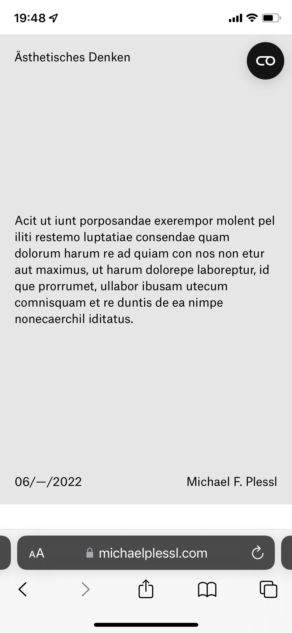
Thank you, Fabi
-
Hej @arminunruh,
Hmm, I probably made a mistake with the example, sorry, for some reason the text was in the second row. I have fixed that now and you don't see a bar on my iPhone X anymore and the page is also displayed in 100vh. But the bar is still there on an iPhone 8 for example.
Other example: On the frontpage there are also 2 rows, there is now no more bar displayed but the second row protrudes into the area that should be 100vh, here is a screenshot from my iPhone X:

And the worst example can be found here (fullscreen slider on 100vh) where a white bar is displayed at the top and bottom:

Thank you, Fabi
Hej @arminunruh
Any Update on this?
Need a Solution soon, my client getting pretty impatient. 🦹🏼♂️
If it is not solvable, I would have to build a new layout ...
Please keep me updated and thank you very much,
Fabi
I also code custom websites or custom Lay features.
💿 Email me here: 💿
info@laytheme.com
Before you post:
- When using a WordPress Cache plugin, disable it or clear your cache.
- Update Lay Theme and all Lay Theme Addons
- Disable all Plugins
- Go to Lay Options → Custom CSS & HTML, click "Turn Off All Custom Code", click "Save Changes"
This often solves issues you might run into
When you post:
- Post a link to where the problem is
- Does the problem happen on Chrome, Firefox, Safari or iPhone or Android?
- If the problem is difficult to explain, post screenshots / link to a video to explain it