Mobile styling for carousel captions
-
Hello, I have searched the forum and found a few false starts with this. I'm not a developer, and I feel this problem is most likely a really simple mistake rather than a bug. But I can't figure out what I've done/not done so I'm here potentially looking silly.
———
The captions I have work fine on desktop and tablet, with the spacing and padding I've set. However, on mobile for some reason, I just can't set the left or bottom spacing to match the other two devices.
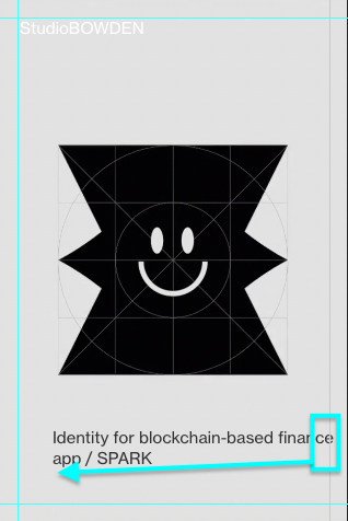
I have added guides to the image below to show you where I'd like the caption to sit on mobile (bottom left) and below that, is a shot of the tablet with the correct position.


As I said I'm sure this is a user error, but any pointers would be greatly appreciated.
Thanks
DB -
Dear DB
Are able to send a link of your webpage with Carousel in question? 🔍
If you do not wish to post it on the thread you can always send a personal message via 'Chats'.Also to clarify:
On this mobile width, the Caption 'bumps' to the next line because of lack of space.
This could be because of the Text being set in pixelspx.
You could change this in Text formats to percentage%.You would like it spaced into one line like this?:
Talk soon 🌝
Richard
-
Hi Richard, thanks for replying. I have sent you a DM.
The issue is that I'd like the caption to sit in line with the site title (left aligned) and the bottom of the screen on mobile. These elements align on all but Mobile. For some reason, I have no control over the mobile spacing of the captions.
-
Dear @dbdb
Thanks for the message,|
I'd like the spacing on the left of the mobile screen to line up with the site title. Not have such large padding on the left.
If you cannot set the caption dimensions for Mobile because they are already set up for Desktop in a certain way, then the following code you can use to define the caption left padding:
.lay-carousel-sink-parent .single-caption {
    padding-left: 25px !important;
}
Also... the arrow position - I'd like that to have the same left and bottom margin as the site title on mobile, as it does on desktop.
You can define the left margin to be the same as your site title in > customize > Project arrows >
If the arrows are set to 'center' normally and need them set to 'bottom' on mobile this would need to be custom coded, something like:
.project-arrow.center {
    top: 90vh;
    -webkit-transform: translateY(-50%);
    -ms-transform: translateY(-50%);
    transform: translateY(-50%);
}
You can see here the class
.centerthis is applied if set to 'center' within the project arrow settings.
Best
Richard
I also code custom websites or custom Lay features.
💿 Email me here: 💿
info@laytheme.com
Before you post:
- When using a WordPress Cache plugin, disable it or clear your cache.
- Update Lay Theme and all Lay Theme Addons
- Disable all Plugins
- Go to Lay Options → Custom CSS & HTML, click "Turn Off All Custom Code", click "Save Changes"
This often solves issues you might run into
When you post:
- Post a link to where the problem is
- Does the problem happen on Chrome, Firefox, Safari or iPhone or Android?
- If the problem is difficult to explain, post screenshots / link to a video to explain it