Split screen website Thumbnail grid hides active project
-
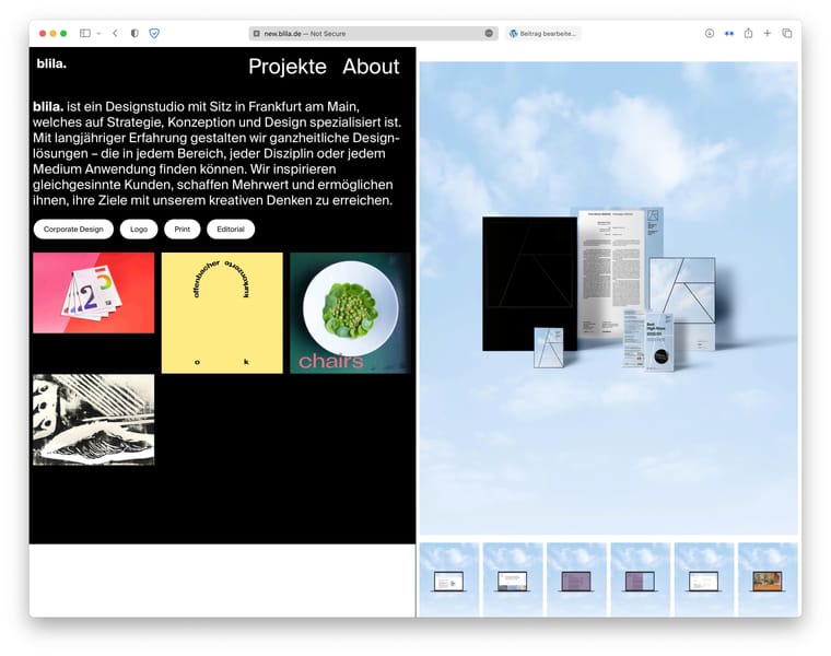
Hey guys, i am currently working on a new Website using the Laytheme splitscreen method following the Tutorial.
But instead of using a Project Index we want to use a Thumbnail Grid. However, when inside of an active Project, the Thumbnail for this project disappears from the grid. Is there a way to change this behaviour so that all projects will stay inside the grid? Perhaps i am just missing a checkmark in some place?Site: new.blila.de
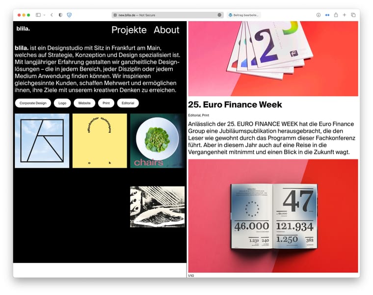
I have also found, that the last content-row of the project (right half) will be cut off.
[Another, unrelated, question: is there a way to further style the tags inside the grid (under each project); like for example changing the separator like in the project index?]
Thank you so much in advance!
All the best,
Jacob -
I have also found, that the last content-row of the project (right half) will be cut off.
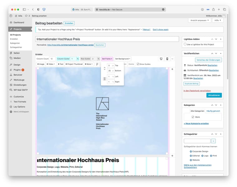
can you set your frame-bottom to use px in lay options → gridder defaults
not sure if this is related, please send a screenshot and url of where this happens
But instead of using a Project Index we want to use a Thumbnail Grid. However, when inside of an active Project, the Thumbnail for this project disappears from the grid. Is there a way to change this behaviour so that all projects will stay inside the grid? Perhaps i am just missing a checkmark in some place?
I can code a setting for this, i dont know when i will have time for this, i wrote it down
[Another, unrelated, question: is there a way to further style the tags inside the grid (under each project); like for example changing the separator like in the project index?]
no
i will need to code settings for this
-
I have also found, that the last content-row of the project (right half) will be cut off.
can you set your frame-bottom to use px in lay options → gridder defaults
not sure if this is related, please send a screenshot and url of where this happens
But instead of using a Project Index we want to use a Thumbnail Grid. However, when inside of an active Project, the Thumbnail for this project disappears from the grid. Is there a way to change this behaviour so that all projects will stay inside the grid? Perhaps i am just missing a checkmark in some place?
I can code a setting for this, i dont know when i will have time for this, i wrote it down
[Another, unrelated, question: is there a way to further style the tags inside the grid (under each project); like for example changing the separator like in the project index?]
no
i will need to code settings for this
can you set your frame-bottom to use px in lay options → gridder defaults
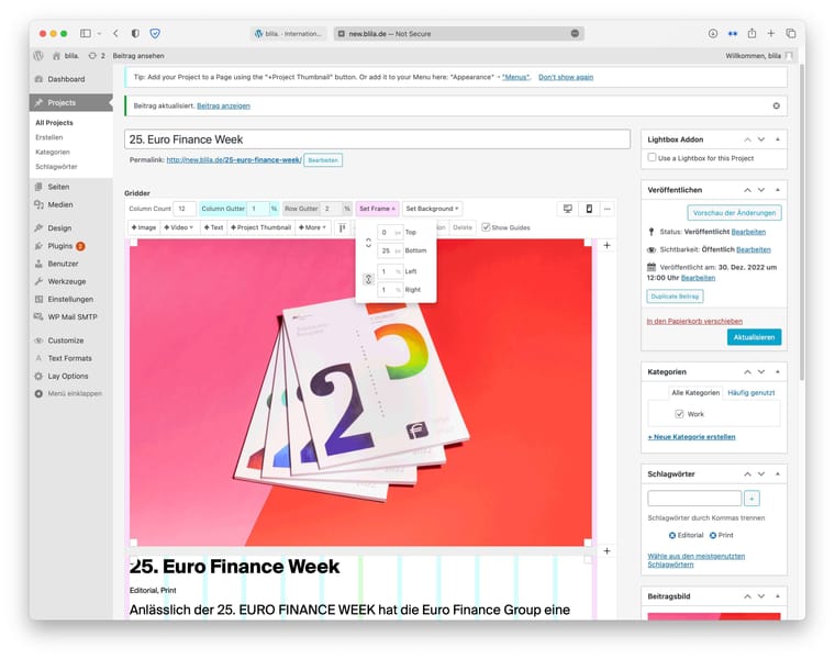
not sure if this is related, please send a screenshot and url of where this happensI did that, unfortunately this doesn’t solve it (yeah, it’s a good workaround, but it’s not like there’s a universal amount of px cut off, it seems to depend on the row height. For example in this project http://new.blila.de/25-euro-finance-week/ i set the frame-bottom to 25px but it sits right at the bottom of the page. And on http://new.blila.de/25-euro-finance-week/ i also set frame-bottom to 25px and here the images are even cut off (if only by a bit but still).


And you can also see that the background of the left half doesn’t extend do the bottom of the page, probably because the page is shorter than the left half. But i could possibly find a workaround with custom CSS.
I can code a setting for this, i dont know when i will have time for this, i wrote it down
Thank you!
no
i will need to code settings for thisThank you anyways!
-
the background of the footer will expand if you use this css:
#footer{
    box-sizing: border-box;
    min-height: 100%;
}
ok for the other issue:
#grid{
box-sizing: border-box;
}
i think that should fix both issues
updating the tutorial -
ok can u update lay theme now
go to lay options, scroll down, and uncheck
"Hide current Project from Thumbnailgrid" -
thank you so much for adding the options to the settings as well as for the custom code; that fixed all the issues!
-
aha amazing :)
I also code custom websites or custom Lay features.
💿 Email me here: 💿
info@laytheme.com
Before you post:
- When using a WordPress Cache plugin, disable it or clear your cache.
- Update Lay Theme and all Lay Theme Addons
- Disable all Plugins
- Go to Lay Options → Custom CSS & HTML, click "Turn Off All Custom Code", click "Save Changes"
This often solves issues you might run into
When you post:
- Post a link to where the problem is
- Does the problem happen on Chrome, Firefox, Safari or iPhone or Android?
- If the problem is difficult to explain, post screenshots / link to a video to explain it