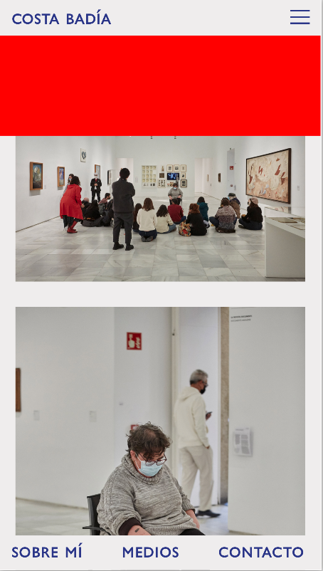
mobile menu background height
-
Hello :)
I'm currently working on this website, which includes a hamburger mobile menu.
When the mobile menu is open, I want a flat color background covering the space under the menu items, so i've added the following custom css:
.mobile-nav {
background-color: red;
height: 100vh; /need to add height or the background isn't displayed/
}This works when the menu is fold out, but the 100vh red background is also partially displayed under the navbar (at least when the vh is higher than 600px), like here:

Is there a way to call the .mobile-nav only when the menu is open... or can you think of any other solution?
Thank you very much for all the work on this helpful forum.
Diego
-
how about you go to customize → mobile → mobile menu
and choose menu style: "menu style 3"
and scroll down and choose red as the background color
-
how about you go to customize → mobile → mobile menu
and choose menu style: "menu style 3"
and scroll down and choose red as the background color
@arminunruh that's right, thank you!
I also code custom websites or custom Lay features.
💿 Email me here: 💿
info@laytheme.com
Before you post:
- When using a WordPress Cache plugin, disable it or clear your cache.
- Update Lay Theme and all Lay Theme Addons
- Disable all Plugins
- Go to Lay Options → Custom CSS & HTML, click "Turn Off All Custom Code", click "Save Changes"
This often solves issues you might run into
When you post:
- Post a link to where the problem is
- Does the problem happen on Chrome, Firefox, Safari or iPhone or Android?
- If the problem is difficult to explain, post screenshots / link to a video to explain it