different secondary menus
-
Dear @Richard
How are you?
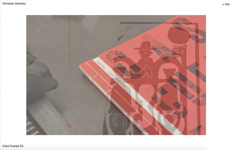
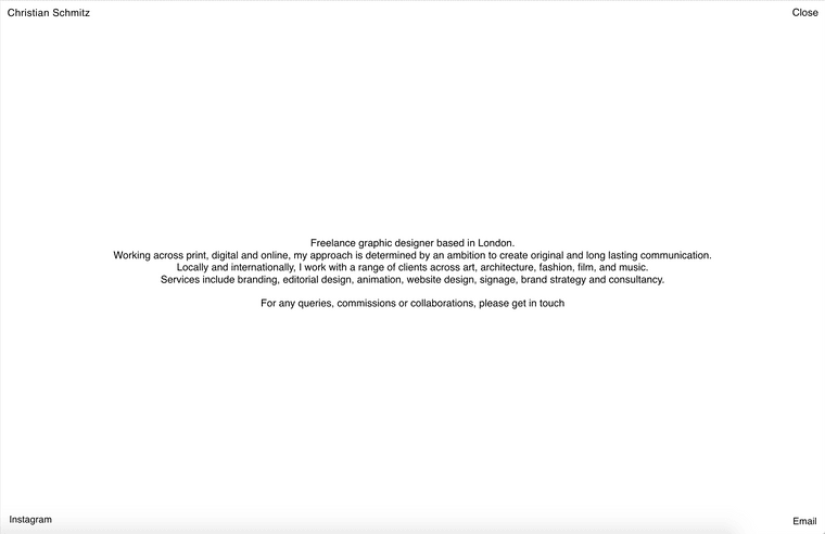
I am trying to set up a simple differentiation in menus/links between Homepage and About page like the attached screenshots. In total, there should be 4 (+Info) in the Homepage only and (Email, Instagram and Close) in the About page only. I have looked at other threads and tried to hide the menus in the homepage through this css:
nav.second_menu{
visibility: hidden !important;
}body[data-id="74"][data-type="category"]
nav.second_menu{
visibility: visible !important;
}nav.third_menu{
visibility: hidden !important;
}body[data-id="74"][data-type="category"]
nav.third_menu{
visibility: visible !important;
}But it seems to hide it in the about page as well.
http://s955093523.mialojamiento.es/Do you have any idea what I am doing wrong/if there is a better responsive way of doing this? I would like this system to be reflected in the mobile version too.
Any help would be super appreciated!
Thanks very much in advance,Christian
-
Dear @Richard
How are you?
I am trying to set up a simple differentiation in menus/links between Homepage and About page like the attached screenshots. In total, there should be 4 (+Info) in the Homepage only and (Email, Instagram and Close) in the About page only. I have looked at other threads and tried to hide the menus in the homepage through this css:
nav.second_menu{
visibility: hidden !important;
}body[data-id="74"][data-type="category"]
nav.second_menu{
visibility: visible !important;
}nav.third_menu{
visibility: hidden !important;
}body[data-id="74"][data-type="category"]
nav.third_menu{
visibility: visible !important;
}But it seems to hide it in the about page as well.
http://s955093523.mialojamiento.es/Do you have any idea what I am doing wrong/if there is a better responsive way of doing this? I would like this system to be reflected in the mobile version too.
Any help would be super appreciated!
Thanks very much in advance,Christian
hey!
richard moved to new zealand so he doesnt work here anymore. :D
i think hes doing well!!ok not sure maybe this:
by default, on all pages hide third menu:
.third_menu{
display: none;
}
on info page, hide second menu and show third menu:
body.slug-info nav.second_menu{
display: none;
}

body.slug-info nav. third_menu{
display: block;
}
just use .slug-xx or .type-xxx or .id-xxx its a little easier
-
Dear @Richard
How are you?
I am trying to set up a simple differentiation in menus/links between Homepage and About page like the attached screenshots. In total, there should be 4 (+Info) in the Homepage only and (Email, Instagram and Close) in the About page only. I have looked at other threads and tried to hide the menus in the homepage through this css:
nav.second_menu{
visibility: hidden !important;
}body[data-id="74"][data-type="category"]
nav.second_menu{
visibility: visible !important;
}nav.third_menu{
visibility: hidden !important;
}body[data-id="74"][data-type="category"]
nav.third_menu{
visibility: visible !important;
}But it seems to hide it in the about page as well.
http://s955093523.mialojamiento.es/Do you have any idea what I am doing wrong/if there is a better responsive way of doing this? I would like this system to be reflected in the mobile version too.
Any help would be super appreciated!
Thanks very much in advance,Christian
hey @arminunruh !
Thanks so much for getting back to me, very glad to hear all is going well for him in new zealand :)
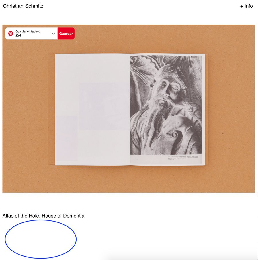
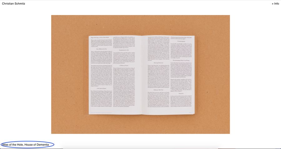
Your suggestion helped for desktop with id's which is great, but not sure if this applies to mobile also? Menus seem to be behaving a bit weirdly, i.e social media ones disappearing in the about page and unwanted ones hidden in the homepage (Close appearing in grey when hovering on the top corner) like the screenshots attached? Feel like I am missing a very small detail to crack this!!
http://s955093523.mialojamiento.es/homepage-copy/
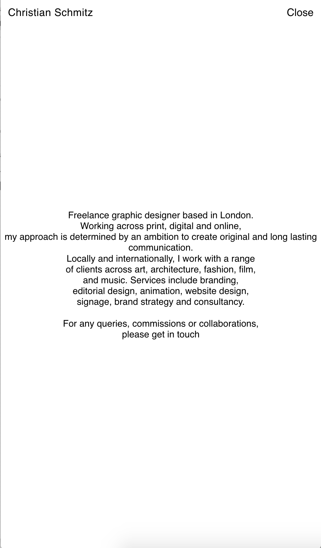
Any idea what this could be? Thanks so much!
-
hey @arminunruh !
Thanks so much for getting back to me, very glad to hear all is going well for him in new zealand :)
Your suggestion helped for desktop with id's which is great, but not sure if this applies to mobile also? Menus seem to be behaving a bit weirdly, i.e social media ones disappearing in the about page and unwanted ones hidden in the homepage (Close appearing in grey when hovering on the top corner) like the screenshots attached? Feel like I am missing a very small detail to crack this!!
http://s955093523.mialojamiento.es/homepage-copy/
Any idea what this could be? Thanks so much!
@cschm-tz Hi Christian, sorry to interrupt your thread but how did you get your captions to sit perfectly and responsive at the bottom? It'd be great to know, thanks!
-
hey i think for mobile the css is different
-
go to lay options → carousel addon → enable "Align Captions and Numbers to width of slides"
-
go to lay options → carousel addon → enable "Align Captions and Numbers to width of slides"
@arminunruh thanks man! but how do I get it the captions and numbers to sit at the bottom of the page, best to make the row a full browser window?
-
hey i think for mobile the css is different
@arminunruh Hey Armin hope you are well!
Thanks very much for getting back to me, is there any chance you could indicate me what the difference would be in mobile css?
I would really appreciate any guidance.
Thanks a lot and have a great weekend! -
@arminunruh thanks man! but how do I get it the captions and numbers to sit at the bottom of the page, best to make the row a full browser window?
Hey hope you are well! I applied some css to the captions, see if this helps you? :)
.lay-carousel-sink {
position: fixed !important;
bottom: -24px !important;
left: 12px !important;
z-index: 999 !important; } -
Hey hope you are well! I applied some css to the captions, see if this helps you? :)
.lay-carousel-sink {
position: fixed !important;
bottom: -24px !important;
left: 12px !important;
z-index: 999 !important; }@cschm-tz awesome, thanks man!
-
@cschm-tz
is everything resolved?
-
@cschm-tz
is everything resolved?
Hi Armin,
Thanks for getting back to me.
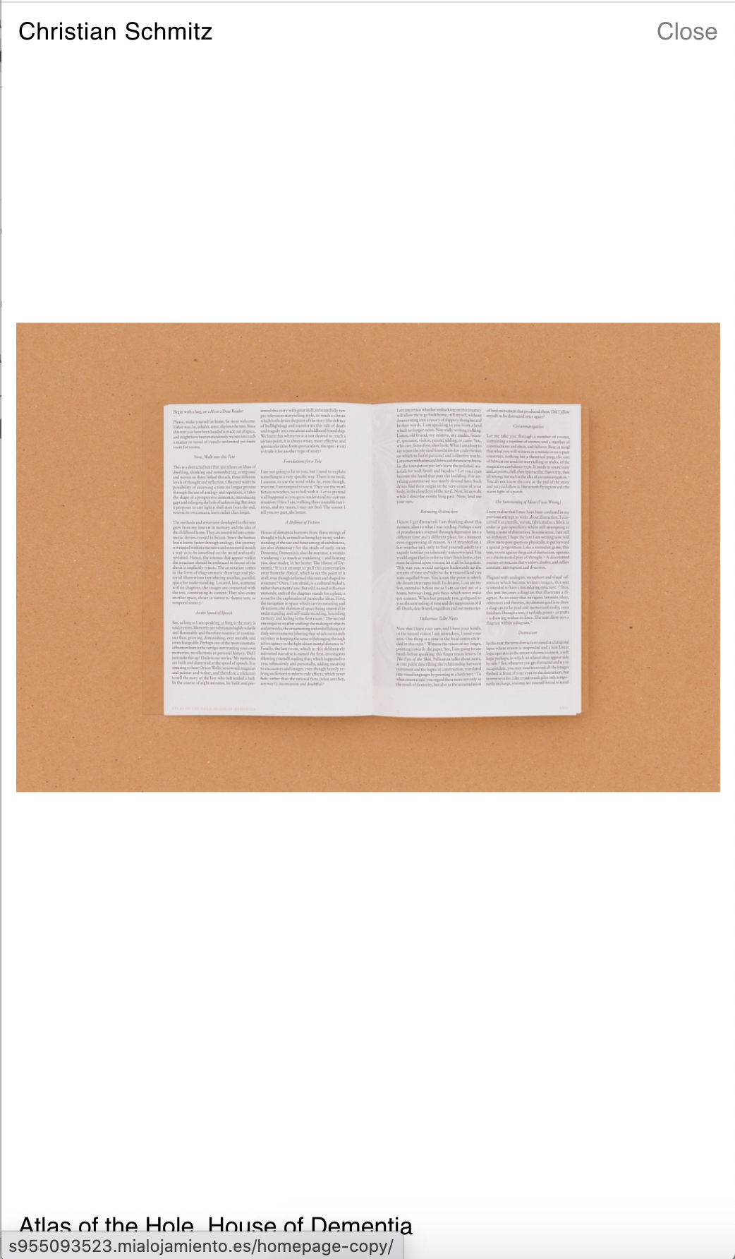
Not yet unfortunately. Captions seem to work individually in desktop version and mobile version, they are ultimately in the right position. However, when shrinking the page on desktop, the caption on bottom left jumps up leaving a gap underneath.
http://s955093523.mialojamiento.es/info-copy/
I would really like to avoid this if possible. Would you be able to help me assuring this? I have reached out for help but they weren't able to crack this..
Thanks a lot and hope all is well!
-
do u have a video or screenshot of this, i cant reproduce this
-
do u have a video or screenshot of this, i cant reproduce this
@arminunruh sure thing please find attached!
-
oh i see! its only on the phone version!
u are using this css for the desktop version:
.lay-carousel-sink {
position: fixed !important;
bottom: -24px !important;
left: 12px !important;
z-index: 999 !important;
}you have to use that css for the phone version too!
in lay options → custom css & html → css for phone
@arminunruh thanks so much! feel like i had been here before and had issues but it's working now which is what counts! have a lovely week :)
-
@arminunruh thanks so much! feel like i had been here before and had issues but it's working now which is what counts! have a lovely week :)
@cschm-tz
hi @arminunruh after cleaning my cache on mobile I have now found what the issue was, the last time I copied the css from the desktop version into the mobile version.
What you suggested does fix things when shrinking the browser on desktop. However, on mobile it moves the caption to a different position (bigger bottom and left margins). Please see attached — seems like going in a vicious cycle! :(
What do you think this could be?
Thanks again!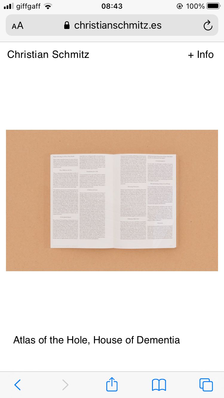
-
this happens because some of your captions span multiple lines because they are longer.
use this css instead:
.lay-carousel-sink .single-caption{
vertical-align: bottom!important;
}
and
.lay-carousel-sink {
    position: fixed !important;
    bottom: 12px!important;
    left: 12px !important;
    z-index: 999 !important;
}
the difference is we align the texts to the bottom and we change "bottom: -24px;" to "bottom: 12px;" for the wrap
@arminunruh said in different secondary menus:
.lay-carousel-sink {
position: fixed !important;
bottom: 12px!important;
left: 12px !important;
z-index: 999 !important;
}Hi @arminunruh
Sorry but that only seems to be working for chrome but not for safari or mobile, screenshots attached...I worry that we're going in circles, is there any chance you understand what is happening, I am asked to share final site before the weekend?
Thank you!
-
@arminunruh said in different secondary menus:
.lay-carousel-sink .single-caption{
vertical-align: bottom!important;
}this is the important part of the css
I also code custom websites or custom Lay features.
💿 Email me here: 💿
info@laytheme.com
Before you post:
- When using a WordPress Cache plugin, disable it or clear your cache.
- Update Lay Theme and all Lay Theme Addons
- Disable all Plugins
- Go to Lay Options → Custom CSS & HTML, click "Turn Off All Custom Code", click "Save Changes"
This often solves issues you might run into
When you post:
- Post a link to where the problem is
- Does the problem happen on Chrome, Firefox, Safari or iPhone or Android?
- If the problem is difficult to explain, post screenshots / link to a video to explain it