full width space in navbar / menu and evenly distribute menu items to fill out whole navbar
-
Hello,
I would like to ask if there is a way to space the elements inside the navbar equally, so that the menu items take up the full width of the page.
Currently, we only have pixels to space the elements, so I have been trying to use custom CSS, but have not been successful.
If anyone knows how to achieve this, it would be fantastic!
Thank you.
-
sure!
nav.primary{
/* 60px here is space left * 2 so the nav doesn't go to the full width of the page */
width: calc(100% - 60px);
display: flex;
}

nav.primary ul{
display: flex;
justify-content: space-between;
}
in "desktop css"
-
sure!
nav.primary{
/* 60px here is space left * 2 so the nav doesn't go to the full width of the page */
width: calc(100% - 60px);
display: flex;
}

nav.primary ul{
display: flex;
justify-content: space-between;
}
in "desktop css"
Hi @arminunruh
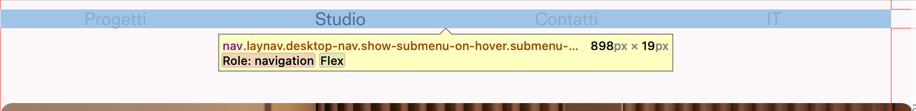
thank you for that, I tried it and it does not seem to work, I show what I got:

-
@arminunruh not sure if this is correct, but doing the code in this way it does the job:
nav.primary{
width: 100%;
display: flex;
}

nav.primary li{
width: 32vw;
display: flex;
justify-content: space-between;
}
What do you think?
-
oh yea you can do it like that too
mh
-
oh yea you can do it like that too
mh
@arminunruh Fantastic, thank you so much for your help
-
oh yea you can do it like that too
mh
@arminunruh sorry Armin, quick question
I edited the code in this way in the end:
nav.primary{
    width: 95%;
    display: -webkit-flex;
    display: flex;
    -webkit-justify-content: space-between;
    justify-content: space-between;
}


nav.primary li{
    display: block;
    padding-right: 9vw;
    padding-left: 9vw;
}
But there is still something strange in that, basically, I would like to have the first text aligned to the margin left and the last voice in the menu should be aligned at the margin right.
If you look the navbar at this moment, they are all evenly spaced but they are all centered.

There is a way to update it?
Thanks!
-
Fixed!
In case someone needs it:
nav.primary{ width: 97.5vw; display: -webkit-flex; display: flex; -webkit-justify-content: space-between; justify-content: space-between; flex-wrap: wrap } nav.primary ul{ display: flex; justify-content: space-between; flex: 1; } -
nice! very good
-
@arminunruh sorry Armin, quick question
I edited the code in this way in the end:
nav.primary{
    width: 95%;
    display: -webkit-flex;
    display: flex;
    -webkit-justify-content: space-between;
    justify-content: space-between;
}


nav.primary li{
    display: block;
    padding-right: 9vw;
    padding-left: 9vw;
}
But there is still something strange in that, basically, I would like to have the first text aligned to the margin left and the last voice in the menu should be aligned at the margin right.
If you look the navbar at this moment, they are all evenly spaced but they are all centered.
There is a way to update it?
Thanks!
@frittata_studio @arminunruh Hey, is it possible to add a certain spacing from the edges of the screen, left and right, in % or px? So they stick whithin website's frame spacing when you resize the browser 🤔


-
@frittata_studio said in full width space in navbar / menu and evenly distribute menu items to fill out whole navbar:
nav.primary{
width: 97.5vw;the width: 97.5vw determines the width of the nav
just do
nav.primary{
    width: 100%;
    display: -webkit-flex;
    display: flex;
    -webkit-justify-content: space-between;
    justify-content: space-between;
    flex-wrap: wrap
    padding-left: 0.5%;
    padding-right: 0.5%;
    box-sizing: border-box;
}

nav.primary ul{
    display: flex;
    justify-content: space-between;
    flex: 1;
}
here im using 0.5% for padding-left and -right, because that is your frame-left and frame-right value

I also code custom websites or custom Lay features.
💿 Email me here: 💿
info@laytheme.com
Before you post:
- When using a WordPress Cache plugin, disable it or clear your cache.
- Update Lay Theme and all Lay Theme Addons
- Disable all Plugins
- Go to Lay Options → Custom CSS & HTML, click "Turn Off All Custom Code", click "Save Changes"
This often solves issues you might run into
When you post:
- Post a link to where the problem is
- Does the problem happen on Chrome, Firefox, Safari or iPhone or Android?
- If the problem is difficult to explain, post screenshots / link to a video to explain it