Add an option to turn the carousel into a one column stack on mobile
-
Would be so so helpful, cause carousels often pass well on phones, and making a separate gallery for phone layout is a pain (:
Thanks!@spontans this would be so great! good suggestion!
-
hey!
great idea, writing it down
-
I would really appreciate more flexibel carousel settings for desktop and mobile. For example on desktop I set my carousel to 70vh, on mobile though, I would like to have it 40vh. Currently I have to separate carousel for both layouts, which is a pain.
The element grid already has an option to display content differently on different screens, would be amazing to also have for carousel!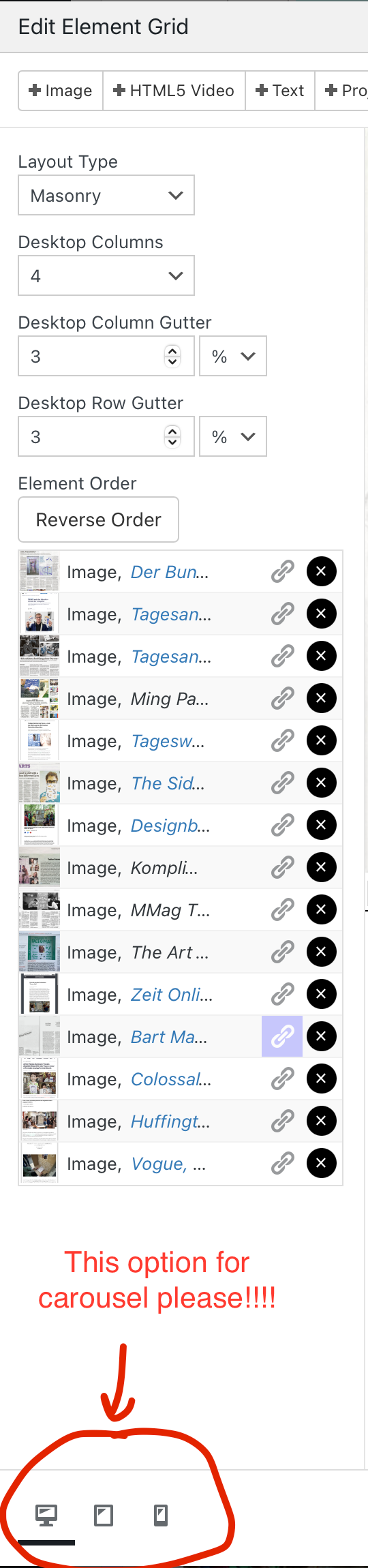
-
oh very good idea! writing it down
I also code custom websites or custom Lay features.
💿 Email me here: 💿
info@laytheme.com
Before you post:
- When using a WordPress Cache plugin, disable it or clear your cache.
- Update Lay Theme and all Lay Theme Addons
- Disable all Plugins
- Go to Lay Options → Custom CSS & HTML, click "Turn Off All Custom Code", click "Save Changes"
This often solves issues you might run into
When you post:
- Post a link to where the problem is
- Does the problem happen on Chrome, Firefox, Safari or iPhone or Android?
- If the problem is difficult to explain, post screenshots / link to a video to explain it