Burger menu in desktop website
-
Any CSS experts here?
I'm guessing it must be possible to enable the code of the mobile menu in the desktop version? -
At the moment no :/
@arminunruh I would also love to use this. Is it possible (2 years later)?
-
Is there an update on this?
Would appreciate - even a workaround for - this
-
its still on my list
theres no workaround
-
It's possible but messy. You can hide the desktop menu in the Customizer and copy the CSS code pertaining to the mobile menu from the laytheme files into the custom CSS desktop code in the laytheme options to render the mobile menu visible on desktop. I've done this here: https://annafrei.net/
Generally it works well but the critical problem is that laytheme upgrades often render the custom code obsolete, which then needs to be painstakingly updated.
A less messy way is to use custom CSS and JS to adjust the appearance and
behaviour of the desktop menu itself. I've done this here: http://clients.ateliervarga.ch/nz/ -
It's possible but messy. You can hide the desktop menu in the Customizer and copy the CSS code pertaining to the mobile menu from the laytheme files into the custom CSS desktop code in the laytheme options to render the mobile menu visible on desktop. I've done this here: https://annafrei.net/
Generally it works well but the critical problem is that laytheme upgrades often render the custom code obsolete, which then needs to be painstakingly updated.
Dear @brogr, thank you for this invaluable tip!
The burger menu on your website annafrei.net is exactly what I'm looking for.I'm trying to copy my mobile menu into the custom CSS desktop code in my lay theme options, but am unsure which parts exactly I ought to copy and paste, worried I might mess up something as I'm a total newbie with CSS.
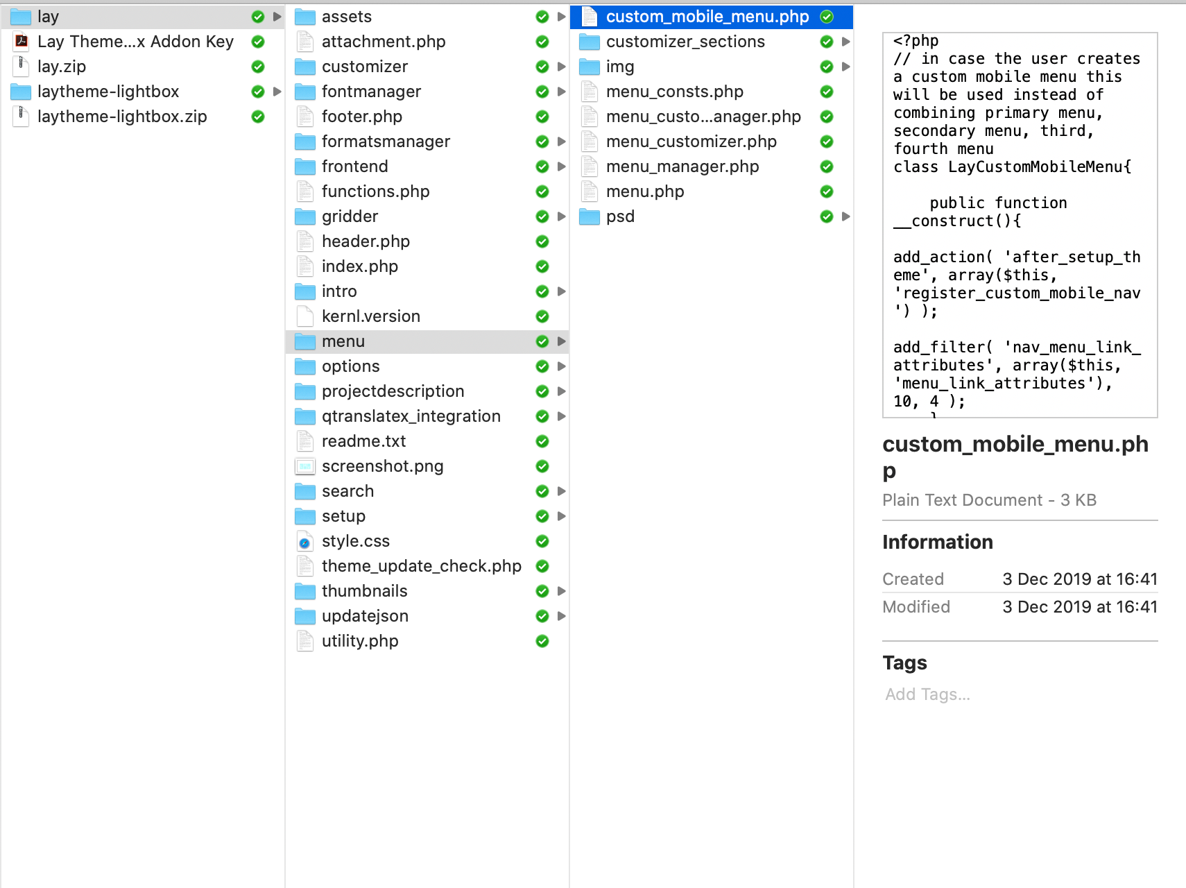
Is this what you were referring to as the mobile menu from the laytheme files?

Thank you so much for any and all help!
-
Dear @heleneleuzinger
We would not recommend to change the code inside the theme folder. It will get overwritten with the next update. Try to use the CUSTOM CSS and JQUERY section.
Best!
Marius -
Hi @heleneleuzinger
You'd find most of the relevant CSS code in frontend/style_phone.php: look for .mobile-nav and the relevant mobile-menu-style. As I said, this solution isn't ideal, as lay upgrades might make your custom CSS code faulty.
The more stable approach I'd recommend is to use custom CSS and JS to adjust the appearance and behaviour of the desktop menu itself...
Best -
Dear @heleneleuzinger
We would not recommend to change the code inside the theme folder. It will get overwritten with the next update. Try to use the CUSTOM CSS and JQUERY section.
Best!
Marius -
Dear @heleneleuzinger
We would not recommend to change the code inside the theme folder. It will get overwritten with the next update. Try to use the CUSTOM CSS and JQUERY section.
Best!
Marius@mariusjopen That's the idea...
-
Thank you very much! I'll try my hand at that :-)
-
Dear @heleneleuzinger
Perfect! Glad to hear!
Many wishes!
Marius -
Is there any way of doing this now? Or any kind soul would share their work around?
Thanks :))
-
Use the following custom CSS and JS to adjust the appearance and behaviour of the desktop menu. You can see it in action on https://quantaviva.ch
Custom CSS for Desktop Version:
nav.laynav.primary:before {
    display: block;
    content: "–––\A–––\A–––";
    white-space: pre-wrap;
    line-height: 0.6em;
    font-weight: 900;
    cursor: pointer;
}
    nav.laynav.primary.toggled:before {
        content: "✕";
        font-size: 1.5em;
        line-height: 1.15em;
    }
nav.laynav ul {
    display: none;
    width: 96vw;
    background: #fff;
}
Custom <head> content:
<script> jQuery( document ).ready(function( $ ) { $(".laynav.primary").on("click", function(e){ $(this).toggleClass("toggled").children("ul").toggle(); }); }); </script> -
oh cool - thanks @brogr :))
I also code custom websites or custom Lay features.
💿 Email me here: 💿
info@laytheme.com
Before you post:
- When using a WordPress Cache plugin, disable it or clear your cache.
- Update Lay Theme and all Lay Theme Addons
- Disable all Plugins
- Go to Lay Options → Custom CSS & HTML, click "Turn Off All Custom Code", click "Save Changes"
This often solves issues you might run into
When you post:
- Post a link to where the problem is
- Does the problem happen on Chrome, Firefox, Safari or iPhone or Android?
- If the problem is difficult to explain, post screenshots / link to a video to explain it
