cart layout / big vertical menu conflict
-
Hello
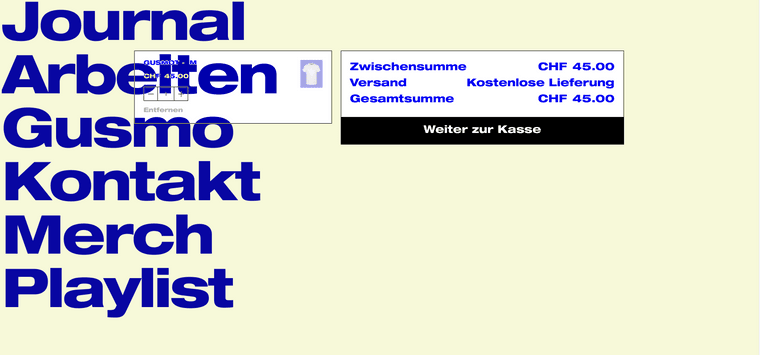
I’m building a new website with the lay theme and so far i really like how this is working out but there’s one situation that’s a bit of a struggle: it’s the cart. Unfortunately, with the big menu i’m working with, the cart is of no use at the moment. Is it possible to change the cart layout so that the two boxes are not next to each other but vertically arranged?
Here’s the shop/page – to see the problem, please add the tshirt to the cart and the go to the cart: lay.gusmology.com
And here’s a screenshot of how the cart looks right now (the important stuff is unklickable behind the menu):

looking forward hearing back soon
fabi -
hey sorry i overlooked your post
how about you use the sidecart plugin:
https://laytheme.com/documentation/shop-setup.html#sidecart-plugin
I also code custom websites or custom Lay features.
💿 Email me here: 💿
info@laytheme.com
Before you post:
- When using a WordPress Cache plugin, disable it or clear your cache.
- Update Lay Theme and all Lay Theme Addons
- Disable all Plugins
- Go to Lay Options → Custom CSS & HTML, click "Turn Off All Custom Code", click "Save Changes"
This often solves issues you might run into
When you post:
- Post a link to where the problem is
- Does the problem happen on Chrome, Firefox, Safari or iPhone or Android?
- If the problem is difficult to explain, post screenshots / link to a video to explain it