image size, mobile
-
-
do you have a link?
-
do you have a link?
Hi Armin! I made screenshots, hoping that is helpful.
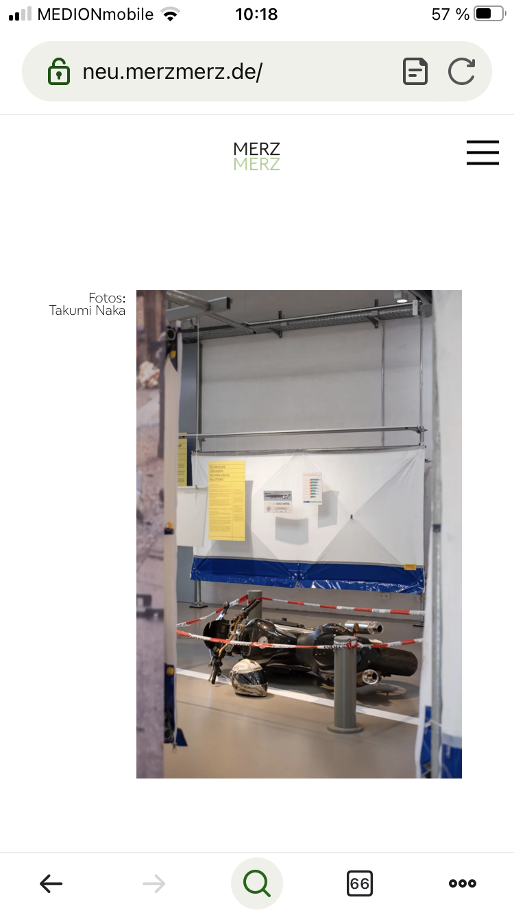
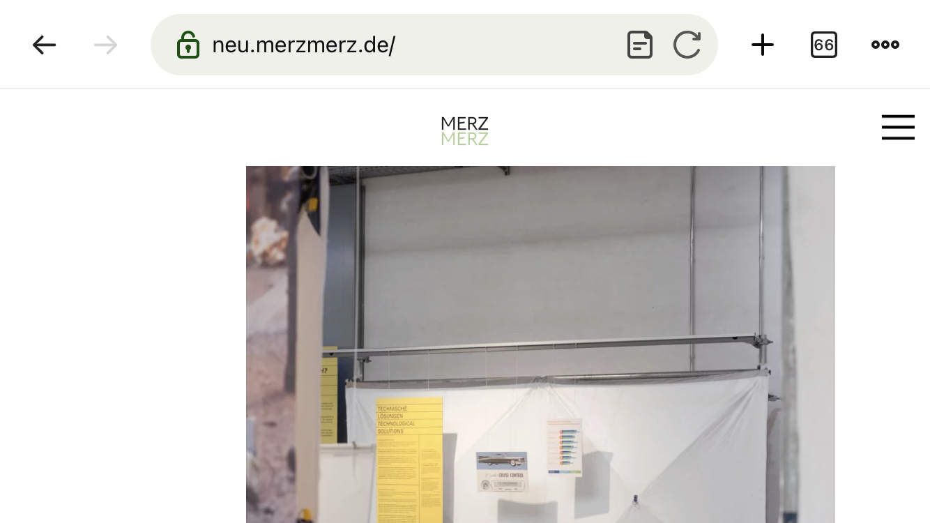
The first image shows the website on mobile in portrait mode. The second image shows it on mobile in landscape mode. The picture on the website does not respond to the format. If I set "Use Browser Height for Row Height", everything is awkward, because I also use the Fullscreen Slider. -
ah i see
the sizes of elements depend on their width.
they don't depend on the height of your browser.
so in that case the image will be cut offso when you look at the website on your phone in landscape, the image is cut off.
if you use fullscreen slider
you can use lay options -> fullscreen slider -> scroll down, activate "Give elements a max-width and max-height and center them"this only works if the image is the only image in the row
im planning to somehow make it possible to restrict image sizes based on the height of the browser
when you create a carousel you can for example check "fixed height" and enter a value like 100vh which will make the element as tall as the browser height
I also code custom websites or custom Lay features.
💿 Email me here: 💿
info@laytheme.com
Before you post:
- When using a WordPress Cache plugin, disable it or clear your cache.
- Update Lay Theme and all Lay Theme Addons
- Disable all Plugins
- Go to Lay Options → Custom CSS & HTML, click "Turn Off All Custom Code", click "Save Changes"
This often solves issues you might run into
When you post:
- Post a link to where the problem is
- Does the problem happen on Chrome, Firefox, Safari or iPhone or Android?
- If the problem is difficult to explain, post screenshots / link to a video to explain it