Responsive menu
-
Hey ED!
So you could use a menu with "Menu Points Arrangement": "vertical"
Doesn't work yet:
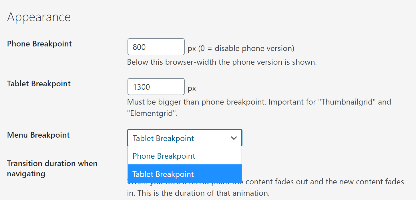
"Lay Options" -> "Add "Tablet" settings to Textformats"
Textformats can also have extra settings just for a tablet browser size. Currently that doesn't affect Menu and Site Title :/. I will improve that in an update. This way your menu would become shorter with a smaller browser width, because your textformat could have a smaller fontsize for tablet. -
Hey ED!
Please update your theme to the latest version 2.0.8.
In "Lay Options" scroll to "Textformat Settings" and check "Add "Tablet" settings to Textformats" and save.
Now go to textformats and create a textformat that you will use for your menu. Add a nice size for the tablet fontsize.
Now go to "Customize" -> "Menu Style" -> "Menu" and choose your menu textformat in the dropdown "Text Format".
Now your menu will use the tablet font size of your textformat when your browser is smaller.
Please note that if you change font specific settings in "Customize" -> "Menu Style" -> "Menu" then the textformat for menu will automatically be deselected, thus the tablet fontsize wouldn't be applied any longer.
-
Same problem, I have a pretty large menu.
Idealy I would be able to either set a custom break-point for the menu OR state that I want the burger style menu to start from tablet breakpoint instead of mobile.
This way I could have an adaptive layout for content : desktop > tablet > mobile.
But a menu that goes directly to desktop > burger style, starting from tablet breakpoint.UPDATE : I have been able to do exactly that by changing just four lines of code in the theme
Desktop layout Tablet layout Phone Layout Classic Menu Burger Menu Burger Menu This is a bit "rough" but adding a checkbox would be a piece of cake.
This is the git diff for current changes
I will also try to make a snippet that you can add to custom plugin that i'll use in case you don't intend to implement it.
warning: LF will be replaced by CRLF in themes/lay/customizer/css_output.php. The file will have its original line endings in your working directory. warning: LF will be replaced by CRLF in themes/lay/frontend/frontend.php. The file will have its original line endings in your working directory. diff --git a/themes/lay/customizer/css_output.php b/themes/lay/customizer/css_output.php index b793d93..570ab02 100644 --- a/themes/lay/customizer/css_output.php +++ b/themes/lay/customizer/css_output.php @@ -564,7 +564,7 @@ class CSS_Output{ // mobile menu fontsizes $mobileStyles .= CSS_Output::generate_css('nav.mobile-nav li a', 'font-size', 'mobile_menu_fontsize', Customizer::$defaults['mobile_menu_fontsize'], '', 'px'); - $breakpoint = get_option('lay_breakpoint', 600); + $breakpoint = get_option('lay_tablet_breakpoint', 600); $breakpoint = (int)$breakpoint; $tablet_breakpoint = get_option( 'misc_options_textformats_tablet_breakpoint', 1024 ); @@ -1159,4 +1159,4 @@ class CSS_Output{ } } -new CSS_Output(); \ No newline at end of file +new CSS_Output(); diff --git a/themes/lay/frontend/frontend.php b/themes/lay/frontend/frontend.php index b3a177d..c984660 100644 --- a/themes/lay/frontend/frontend.php +++ b/themes/lay/frontend/frontend.php @@ -414,10 +414,10 @@ class Frontend{ echo '<!-- lay media query styles --> <style> - @media (min-width: '.(MiscOptions::$phone_breakpoint+1).'px){ + @media (min-width: '.(MiscOptions::$tablet_breakpoint+1).'px){ '.MediaQueryCSS::$desktop.' } - @media (max-width: '.(MiscOptions::$phone_breakpoint).'px){ + @media (max-width: '.(MiscOptions::$tablet_breakpoint).'px){ '.MediaQueryCSS::$phone.' } </style>'; @@ -712,7 +712,7 @@ class Frontend{ 'misc_options_thumbnail_video' => $misc_options_thumbnail_video, 'misc_options_thumbnail_mouseover_image' => $misc_options_thumbnail_mouseover_image, 'breakpoint' => MiscOptions::$phone_breakpoint, - 'tabletbreakpoint' => get_option('lay_tablet_breakpoint', 1024), + 'tabletbreakpoint' => MiscOptions::$tablet_breakpoint, 'shortcodes' => LayShortcodes::$shortcodes_array, 'bg_color' => $bg_color, 'bg_image' => $bg_image, (END) -
After looking into it. There doesn't appear to be an easy way to enable this via third-party plugin without basicaly copying entire files, disabling natives classes and use the extended ones. Which wouldn't be update friendly anyway.
Would really appreciate if this could come in a future update.
It's should be a 10 lines update max (adding checkbox and everything) and this could be the result.
 .
.Would just need to add this option in layoptions.
Then in the git diff shown above, instead of directly changing phone to tablet, use get_option('menu_breakpoint', 'default') option to use appropriate breakpoint.
This would be pretty neat I think.
From what I've seen it doesn't break page layout if you keep those options in
wp_localize_script( 'frontend-app', 'frontendPassedData', <options>)(just as in the git diff)'breakpoint' => MiscOptions::$phone_breakpoint, 'tabletbreakpoint' => MiscOptions::$tablet_breakpoint,
I also code custom websites or custom Lay features.
💿 Email me here: 💿
info@laytheme.com
Before you post:
- When using a WordPress Cache plugin, disable it or clear your cache.
- Update Lay Theme and all Lay Theme Addons
- Disable all Plugins
- Go to Lay Options → Custom CSS & HTML, click "Turn Off All Custom Code", click "Save Changes"
This often solves issues you might run into
When you post:
- Post a link to where the problem is
- Does the problem happen on Chrome, Firefox, Safari or iPhone or Android?
- If the problem is difficult to explain, post screenshots / link to a video to explain it