Mobile - space around images
-
Hello everyone,
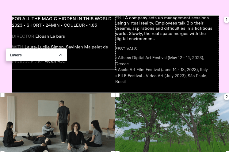
I'm setting up the theme for a website and I want the pictures to be full-width on desktop version, like this (out of the grid) :


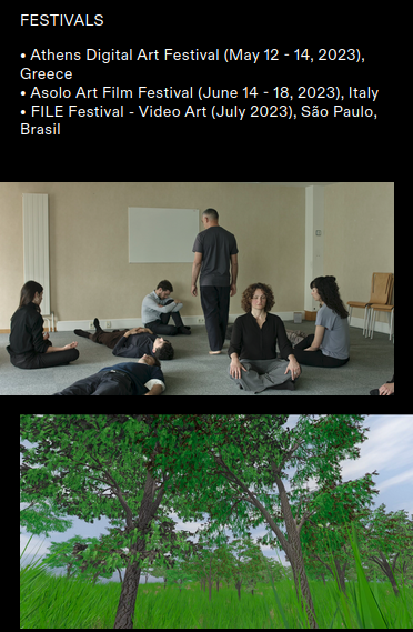
When switching to mobile version, we still have a space around the images (on the left or right), and I would like to have the default space for this version :

Is there a way to automatically keep the default spacing for the mobile images while having them exceeding grid on dekstop, without redesigning every project for mobile manually?
Thanks a lot and have a nice day,
Elouan -
yea!
in lay options, scroll all the way down and disable this

-
Great, thanks a lot!
I also code custom websites or custom Lay features.
💿 Email me here: 💿
info@laytheme.com
Before you post:
- When using a WordPress Cache plugin, disable it or clear your cache.
- Update Lay Theme and all Lay Theme Addons
- Disable all Plugins
- Go to Lay Options → Custom CSS & HTML, click "Turn Off All Custom Code", click "Save Changes"
This often solves issues you might run into
When you post:
- Post a link to where the problem is
- Does the problem happen on Chrome, Firefox, Safari or iPhone or Android?
- If the problem is difficult to explain, post screenshots / link to a video to explain it
Online Users
Forgot your key, lost your files, need a previous Lay Theme or Addon version?
Go to www.laykeymanager.com