Why is my checkout so ugly?
-
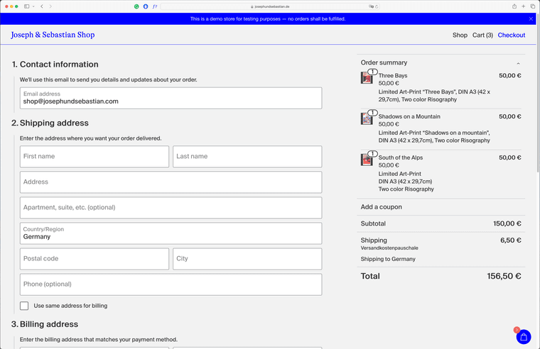
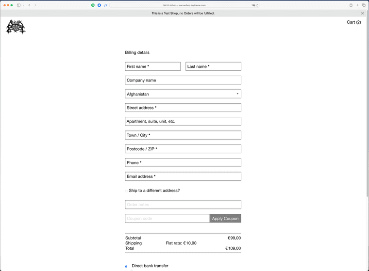
that's probably a pretty ridiculous question. I'm currently thinking about setting up a Woo Commerce shop with laytheme for us and am trying out a few things. It's working so far, but unfortunately, I'm not getting the laytheme styled version of the checkout, just a messed up version of the standard WooCommerce checkout. see images below.
here is a link to our test site -> https://josephundsebastian.de/checkout/
Is there an easy way to change this? I would be grateful for any advice.
All the best,
Joseph

-
mmmh it seems like the latest wordpress version inserts a different kind of checkout.
reading this: https://woo.com/document/woocommerce-shortcodes/
it seems like "woocommerce blocks" might be in use now, instead of the checkout shortcodein /wp-admin/ can you go to the "checkout" page,
in the texteditor, delete everything and add the shortcode:[woocommerce_checkout]
does it work?
-
Hi Armin,
Many thanks, this helped! It still showed the woocommerce checkout under the laytheme checkout, but I simply set the .wc-block-components-sidebar-layout{ to display: none !important; } via css. and this seems to do the job.
Many thanks for the quick reply and have a great day!
Joseph -
Just added this section to the shop setup:
https://laytheme.com/documentation/shop-setup.html#preparationThis will make sure future shop setups will have the checkout and cart look correct
I also code custom websites or custom Lay features.
💿 Email me here: 💿
info@laytheme.com
Before you post:
- When using a WordPress Cache plugin, disable it or clear your cache.
- Update Lay Theme and all Lay Theme Addons
- Disable all Plugins
- Go to Lay Options → Custom CSS & HTML, click "Turn Off All Custom Code", click "Save Changes"
This often solves issues you might run into
When you post:
- Post a link to where the problem is
- Does the problem happen on Chrome, Firefox, Safari or iPhone or Android?
- If the problem is difficult to explain, post screenshots / link to a video to explain it