Headers & footers
-
Hi Armin,
Hope you are well!
I am trying to design a very simple site that has the same menu/footer in desktop as the mobile version. For this, we need a burger on the top left as per the screenshot attached which I thought should be very simple.
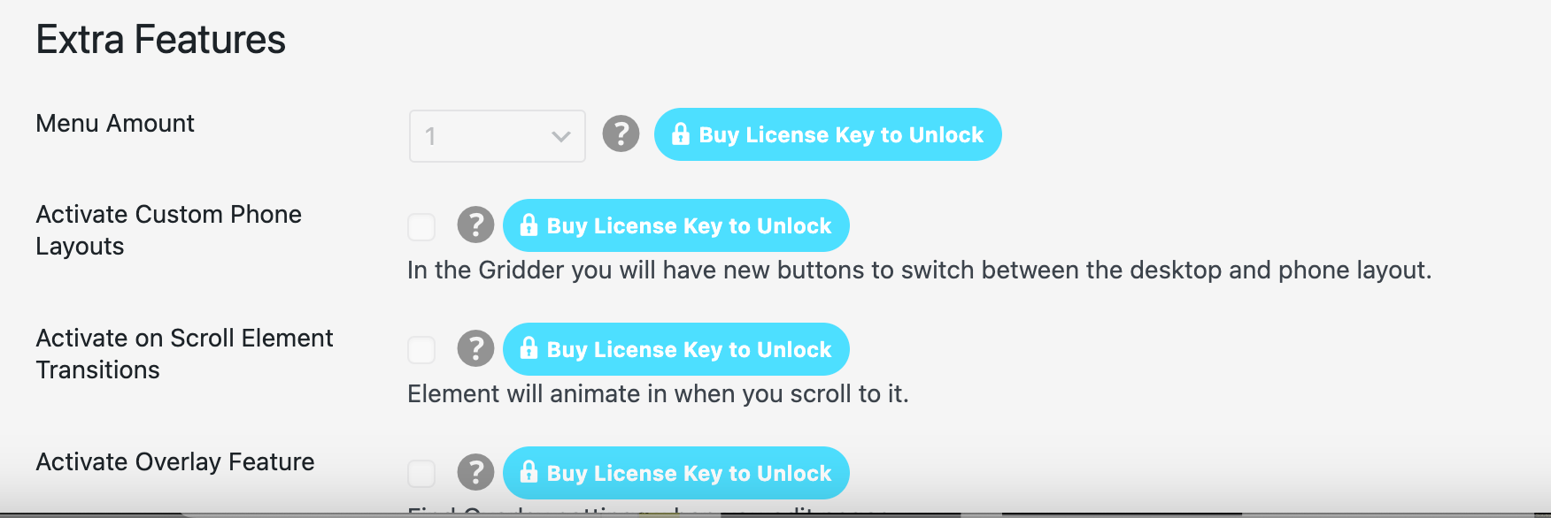
Is there any chance you could give me any guidance on this? I saw something related to overlays but even though I have bought the license it asks me to re-buy (see attached also).
On the other hand, the footer should ideally have a solid background as per the above screenshot instead of being transparent as it currently is here: http://das-fleet.com/home-1/ Where does one determine this?
Thanks so much for your help!
Christian -
hey!
yea you can enter your license key to unlock all features like the overlay feature
add a z-index to your footer:
#footer-region {
    position: fixed;
    bottom: 0;
    left: 0;
    width: 100%;
    background-color: black !important;
    z-index: 1;
}
if you want the exact same layout for phone i think you can go to lay options and set
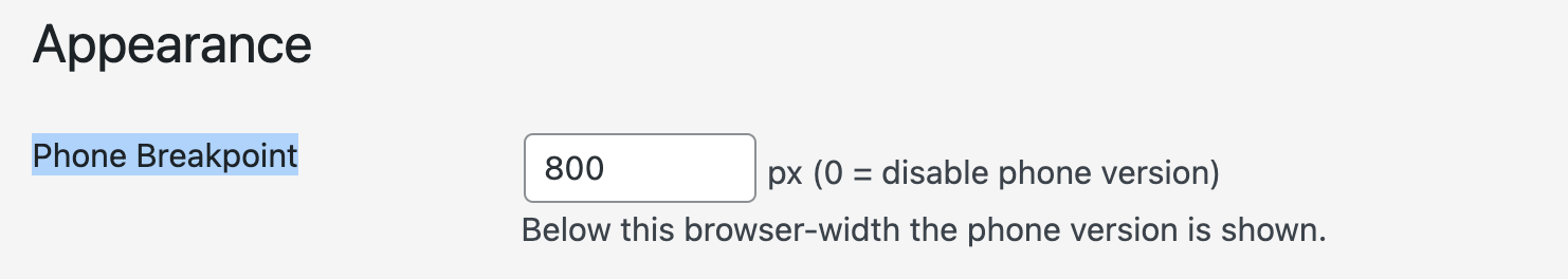
phone breakpoint to 0
-
Hi Armin,
Thanks so much, the z index solved the first bit and I was able to solve the custom burger with overlays!
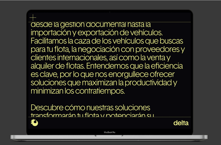
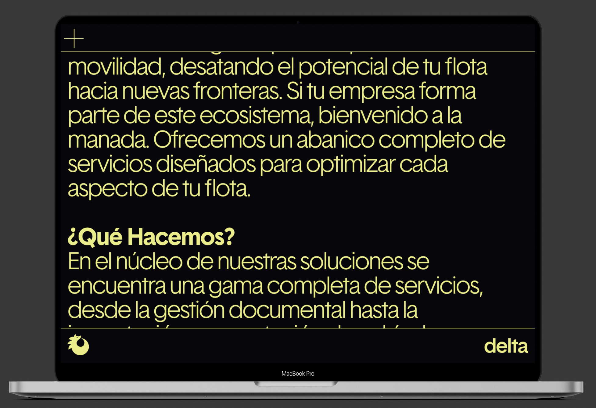
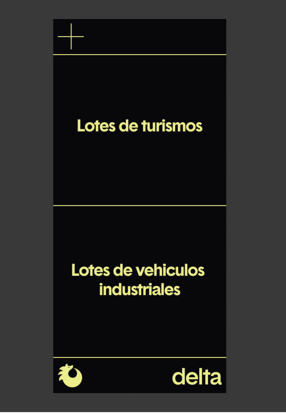
In terms of same layout, this applies to the header (custom burger icon and top key line) and footer (logos and bottom keyline) only like in the below screenshots. The text layouts etc differentiated between desktop and mobile would still be needed though — is this possible?

Thanks again!!!!
-
The text layouts etc differentiated between desktop and mobile would still be needed though — is this possible?
U just want smaller text for your mobile version that's all right?
don't use a custom phone layout,
that wont work if you disable the phone version by setting the breakpoint to 0
use textformats please instead of formatting the text using the texteditordisable the phone version by setting the breakpoint to 0 as i said
then use custom css to decrease the font-size of your text
in custom css write:@media (max-width: 800px) { /* your css to decrease font-size */ }if this won't work for you because you need to use a custom phone layout,
i would set the phone breakpoint back to 800 again,
then i would
code both of these parts:

using html. with the exception of the overlay burger button
i would first remove these parts with the exception of the overlay button,
then i would create html and css in lay options → custom css & html
to replicate these parts on the websitethis way, these two parts are completely controlled by custom code and they don't change if you're on the mobile version or not
-
Hi Armin,
Thanks for your feedback! So if the first option could work it would be amazing as html is perhaps beyond my expertise unless I know what to input..
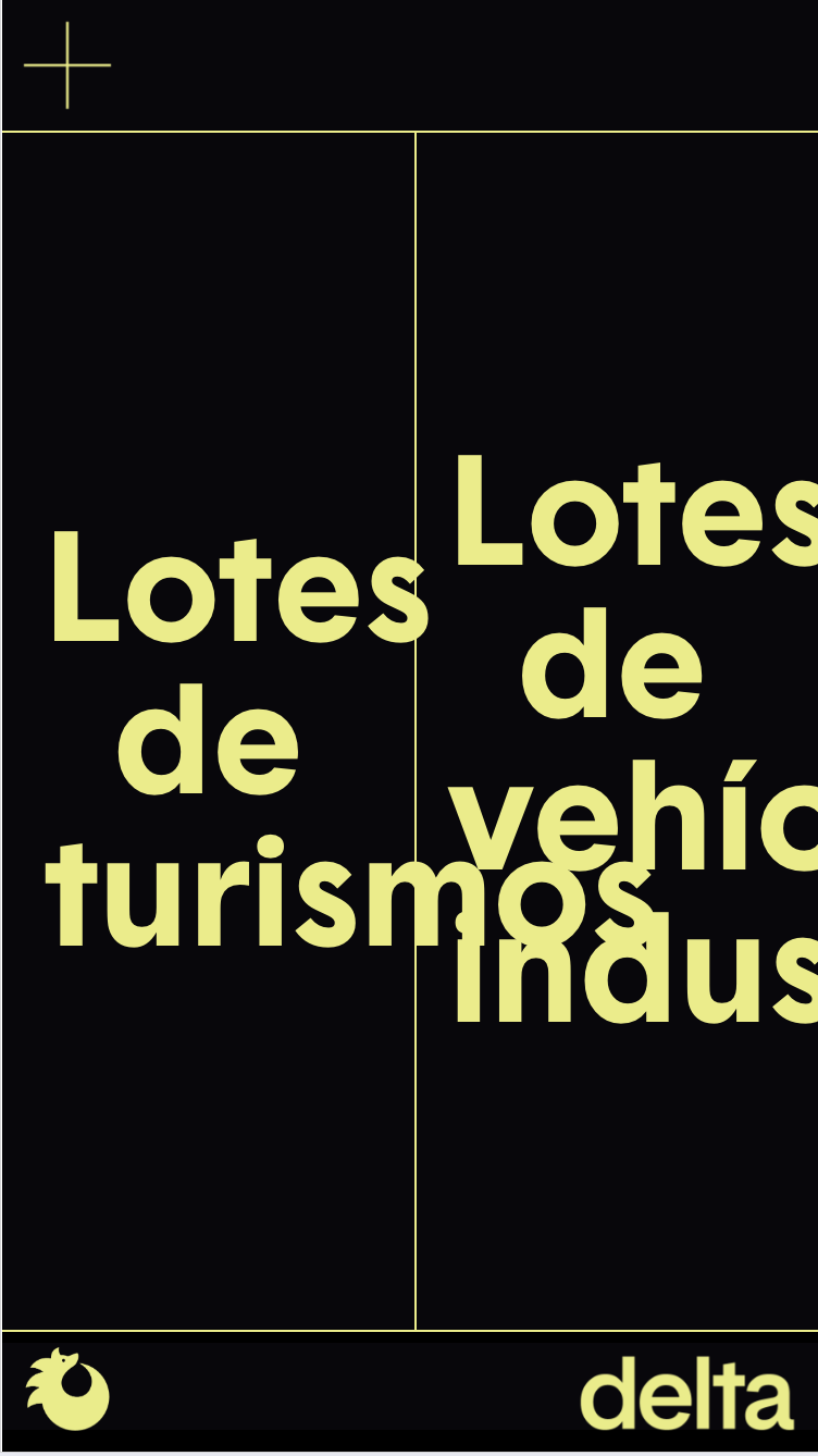
However when trying the first option (deleting phone layouts and using textformats) the footer still seems to shrink as per the above attachment, rather than stay within the desired scale — desktop and mobile the same, just the width of the page shrinks as per the below attachment

Any thoughts? Thank you!!!
-
i see!
the images in grids are always just %-based widths.
i need to somehow make lay theme better so people are not too restricted by the grid :|both of these images, the "dragon" and "delta" become smaller because they have a % based width.
can you right-click the "delta" image in the gridder, choose "give html class and id"
and then for html class enter: myrightdo the same for the "dragon" icon/image and enter: myleft
then:
.myright{
    right: 10px!important;
    left: auto!important;
    width: 100px!important;
    bottom: -1px!important;
}
.myleft{
    left: 10px!important;
    right: auto!important;
    width: 40px!important;
    bottom: -1px!important;
}
in lay options → custom css & html → custom css
you can play around with these values
-
Hi Armin,
Thanks very much this is great.
Hopefully last few questions on this:
- if i were to tweak the sizes of icon/delta what kind of css can i include in the classes?
- this whole process has implied disabling the custom phone layout and the split screen you previously explained has now been deconstructed attached below design vs result
Same thing applies to overlay

How can I make sure I obtain the results you suggested without preventing the rest from working? Thanks again!
-
if i were to tweak the sizes of icon/delta what kind of css can i include in the classes?
you can change the width!
like
width: 500px!important;this whole process has implied disabling the custom phone layout and the split screen you previously explained has now been deconstructed attached below design vs result
you're not talking about this:
https://laytheme.com/tutorials/create-a-desktop-burger-menu-or-info-overlay.html
(its just a note to myself cause this can get confusing)well,
in that case:we need to use the custom phone layout and use the solution i recommended earlier:
i would first remove these parts with the exception of the overlay button,
then i would create html and css in lay options → custom css & html
to replicate these parts on the websitethis way, these two parts are completely controlled by custom code and they don't change if you're on the mobile version or not
so i will do this for you
can you send your website address, /wp-admin/ username and password and a link to this topic to info@laytheme.com?
I also code custom websites or custom Lay features.
💿 Email me here: 💿
info@laytheme.com
Before you post:
- When using a WordPress Cache plugin, disable it or clear your cache.
- Update Lay Theme and all Lay Theme Addons
- Disable all Plugins
- Go to Lay Options → Custom CSS & HTML, click "Turn Off All Custom Code", click "Save Changes"
This often solves issues you might run into
When you post:
- Post a link to where the problem is
- Does the problem happen on Chrome, Firefox, Safari or iPhone or Android?
- If the problem is difficult to explain, post screenshots / link to a video to explain it