Skip to content
  • Recent
  • Tags
  • Popular
  • Users
  • Search
Skins
  • Light
  • Cerulean
  • Cosmo
  • Flatly
  • Journal
  • Litera
  • Lumen
  • Lux
  • Materia
  • Minty
  • Morph
  • Pulse
  • Sandstone
  • Simplex
  • Sketchy
  • Spacelab
  • United
  • Yeti
  • Zephyr
  • Dark
  • Cyborg
  • Darkly
  • Quartz
  • Slate
  • Solar
  • Superhero
  • Vapor

  • Default (No Skin)
  • No Skin
Collapse

Lay Theme Forum

  1. Home
  2. Feedback
  3. Tablet design

Tablet design

Scheduled Pinned Locked Moved Feedback
9 Posts 6 Posters 2.0k Views
  • Oldest to Newest
  • Newest to Oldest
  • Most Votes
Reply
  • Reply as topic
Log in to reply
This topic has been deleted. Only users with topic management privileges can see it.
  • T Offline
    T Offline
    teiner.dk
    wrote on last edited by
    #1

    Hi!
    Is there any way to design the tablet design individually, the same way as with the phone design?

    Kasper
    teiner.dk

    1 Reply Last reply
    1
    • arminunruhA Offline
      arminunruhA Offline
      arminunruh
      Global Moderator
      wrote on last edited by
      #2

      Hey kasper, no, there is no such option. There are tablet settings for textformats if you activate that in "lay options" and there is a tablet setting for the "thumbnailgrid" element.

      If the phone version of your website shows up on your tablet but you want the desktop version to show on your tablet, then set the option "Phone Breakpoint" in "Lay Options" maybe to 600 or 500.

      1 Reply Last reply
      0
      • Y Offline
        Y Offline
        YYY
        wrote on last edited by
        #3

        hi @arminunruh

        hope to have individually tablet design soon.
        it's still strange to see my website on tablet with either Desktop or Mobile version.
        If we can design the tablet version it will more cool.
        thank you.

        1 Reply Last reply
        1
        • arminunruhA Offline
          arminunruhA Offline
          arminunruh
          Global Moderator
          wrote on last edited by
          #4

          hey yyy, the only tablet layout options that you got right now is in the gridder with "+more" -> "Thumbnail Grid".

          What exactly would you like to change about your layout for your tablet?

          As I said in the previous post:

          If the phone version of your website shows up on your tablet but you want the desktop version to show on your tablet, then set the option "Phone Breakpoint" in "Lay Options" maybe to 600 or 500.

          1 Reply Last reply
          1
          • edgrbnzE Offline
            edgrbnzE Offline
            edgrbnz
            wrote on last edited by edgrbnz
            #5

            I’ve been searching for a related solution lately. A custom tablet layout would be an option. The main part is how things align on the tight space of 768px.

            In my case it’s a two column layout that looks alright until around 1024px-ish.
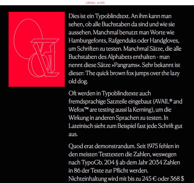
            0_1535617825517_Window_and_Moritz_Welker_—_Info_Demo.jpg

            The 768px view is all of it crammed side by side.
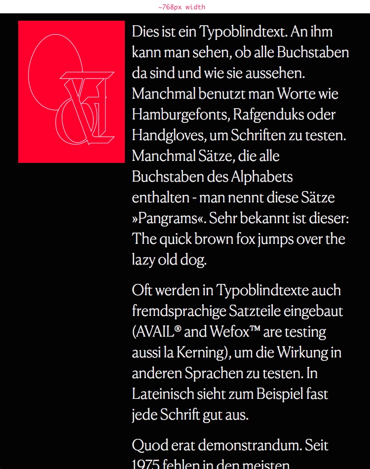
            0_1535617898850_Window_and_Moritz_Welker_—_Info_Demo.jpg

            All I’d like to do is to stack the elements on top of e.o. for resolutions below 1024 (aka small desktop). This doesn’t apply to all my pages, most of them look fine on 768px. But as soon as bigger text and images appear side by side it would be great to have a way of defining what happens below 1024 and before mobile ~600.

            ✦ ✦ ✦

            1 Reply Last reply
            0
            • mariusjopenM Offline
              mariusjopenM Offline
              mariusjopen
              Global Moderator
              wrote on last edited by
              #6

              Dear @edgrbnz

              a tablet option would be interesting. Until then you can use the CUSTOM CSS (media queries) to change font-sizes etc.

              Hope that helps!

              Best!

              Marius

              www.mariusjopen.world

              1 Reply Last reply
              1
              • edgrbnzE Offline
                edgrbnzE Offline
                edgrbnz
                wrote on last edited by
                #7

                Hi @mariusjopen

                Yes fontsize is an option,… but in my case it’s more about the layout of things. Is this also possible to do via media queries?

                Only thing I’d like to do with the page above is to align the elements as they would in the phone layout, but keep the font in desktop size. Any hint on how to do that via media query?

                Best!

                ✦ ✦ ✦

                1 Reply Last reply
                0
                • mariusjopenM Offline
                  mariusjopenM Offline
                  mariusjopen
                  Global Moderator
                  wrote on last edited by mariusjopen
                  #8

                  Dear @edgrbnz
                  It is possible to use media queries. We added a new CUSTOM CSS field which is open to use for that.

                  Are you talking about the Element grid? There you can select the tablet size.
                  In a project that is not really possible.

                  Best!

                  Marius

                  www.mariusjopen.world

                  1 Reply Last reply
                  0
                  • H Offline
                    H Offline
                    hans
                    wrote on last edited by
                    #9

                    @edgrbnz I have used setting the breaking point of the phone layout to a small desktop size (or to tablet size) to get a layout change, and to have elements stacked on top of each other (I’m using a similar layout with image and text side by side). One might apply tablet text sizes via lay options.

                    1 Reply Last reply
                    1
                    Reply
                    • Reply as topic
                    Log in to reply
                    • Oldest to Newest
                    • Newest to Oldest
                    • Most Votes


                    I also code custom websites or custom Lay features.
                    💿 Email me here: 💿
                    info@laytheme.com

                    Before you post:
                    1. When using a WordPress Cache plugin, disable it or clear your cache.
                    2. Update Lay Theme and all Lay Theme Addons
                    3. Disable all Plugins
                    4. Go to Lay Options → Custom CSS & HTML, click "Turn Off All Custom Code", click "Save Changes"

                    This often solves issues you might run into

                    When you post:
                    1. Post a link to where the problem is
                    2. Does the problem happen on Chrome, Firefox, Safari or iPhone or Android?
                    3. If the problem is difficult to explain, post screenshots / link to a video to explain it
                    Online Users
                    K
                    Kai Schecker
                    Forgot your key, lost your files, need a previous Lay Theme or Addon version? Go to www.laykeymanager.com
                    laytheme.com
                    • Login

                    • Don't have an account? Register

                    • Login or register to search.
                    • First post
                      Last post
                    0
                    • Recent
                    • Tags
                    • Popular
                    • Users
                    • Search