Custom row height + row image background
-
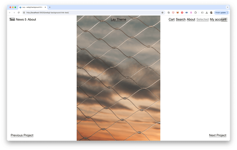
how can i change this properties, what should i add, to always fit my image height into the row, without cropping the height or streching the image. (width can be cropped).
thank you in andvance!
@oxfir +1
Would like to know the same exact thing! -
@arminunruh please, just let us place the image in the row that is taking full browser height (without cropping the height) and stays proportional to the width.
-
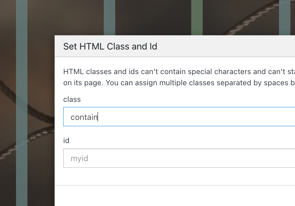
in gridder: right click on row - enter html class/id → as class enter: "contain"

Enter the custom css in "lay options" -> "custom css & html"
.contain img{
object-fit: contain!important;
}
this will result in the background image not getting cut off, but the image will be shown like this:

-
but after i think about it more, thats probably not what you want. :O
enter the class "full-height" in gridder: right click on row - enter html class/id
(without " ")then css:
.full-height img{ width: auto!important; height: 100%!important; object-fit: none!important; left: 50%!important; transform: translateX(-50%)!important; } -
this will not fill out the whole row in some cases
-
 A arminunruh referenced this topic on
-
but after i think about it more, thats probably not what you want. :O
enter the class "full-height" in gridder: right click on row - enter html class/id
(without " ")then css:
.full-height img{ width: auto!important; height: 100%!important; object-fit: none!important; left: 50%!important; transform: translateX(-50%)!important; }@arminunruh thank you!!! what makes you think that "contain" option is not what we want? I think it works perfectly and looks exactly how we wanted.
-
oh ok!
with contain, there can also be gaps at the top and bottom.
i thought you only wanted gaps at the left and right -
oh ok!
with contain, there can also be gaps at the top and bottom.
i thought you only wanted gaps at the left and right@arminunruh thank you, any idea how to contain two or three images in one "browser height" row as well?
When they're like this: ■ ■ ■
-
+more → +html
in the gridder.
then insert:<div style="display: flex; gap: 10px; position: absolute; width: 100%; height: 100svh; justify-content: center;"> <img style="height: 100svh;" src="https://upload.wikimedia.org/wikipedia/commons/9/90/Sanborn_Fire_Insurance_Map_from_Salem%2C_Essex_County%2C_Massachusetts%2C_1957%2C_Plate_0060.jpg" lazy/> <img style="height: 100svh;" src="https://upload.wikimedia.org/wikipedia/commons/9/90/Sanborn_Fire_Insurance_Map_from_Salem%2C_Essex_County%2C_Massachusetts%2C_1957%2C_Plate_0060.jpg" lazy/> <img style="height: 100svh;" src="https://upload.wikimedia.org/wikipedia/commons/9/90/Sanborn_Fire_Insurance_Map_from_Salem%2C_Essex_County%2C_Massachusetts%2C_1957%2C_Plate_0060.jpg" lazy/> </div>make sure you size that html element to span the whole width like here:

and make sure you use "right click -> browser height" on that row
-
this will probably cut off the left and right image a lot!
this is what it looks like for me with 3 portrait images:

I also code custom websites or custom Lay features.
💿 Email me here: 💿
info@laytheme.com
Before you post:
- When using a WordPress Cache plugin, disable it or clear your cache.
- Update Lay Theme and all Lay Theme Addons
- Disable all Plugins
- Go to Lay Options → Custom CSS & HTML, click "Turn Off All Custom Code", click "Save Changes"
This often solves issues you might run into
When you post:
- Post a link to where the problem is
- Does the problem happen on Chrome, Firefox, Safari or iPhone or Android?
- If the problem is difficult to explain, post screenshots / link to a video to explain it