Fullscreen slider: slide only to the right + click on image doesn't work
-
hei there;
I really like the fullscreen slider addon. Three questions I have:
- when clicking on an image or a video the navigation (so to slide to the next row) doesn't work. how can this be fixed? It seems only to work with text?
- is it possible to only move to the right in general?
- instead of an arrow I would like the slideshow to work like this: you click anywhere on the screen and get to the next slide. Is that possible?
- the content (a longer text) overflows the browser height. I tried the he "Give elements a max-width and max-height and center them" option, didn't change anything.
Here is the page I'm working on:
https://tiranwillemse.com/fullscreen1/
Thanks and best wishes
Daniel -
the content (a longer text) overflows the browser height. I tried the he "Give elements a max-width and max-height and center them" option, didn't change anything.
this setting doesnt work for text
only for images and such
when clicking on an image or a video the navigation (so to slide to the next row) doesn't work. how can this be fixed? It seems only to work with text?
i think it only doesnt work with videos, with images it works for me, can u confirm?
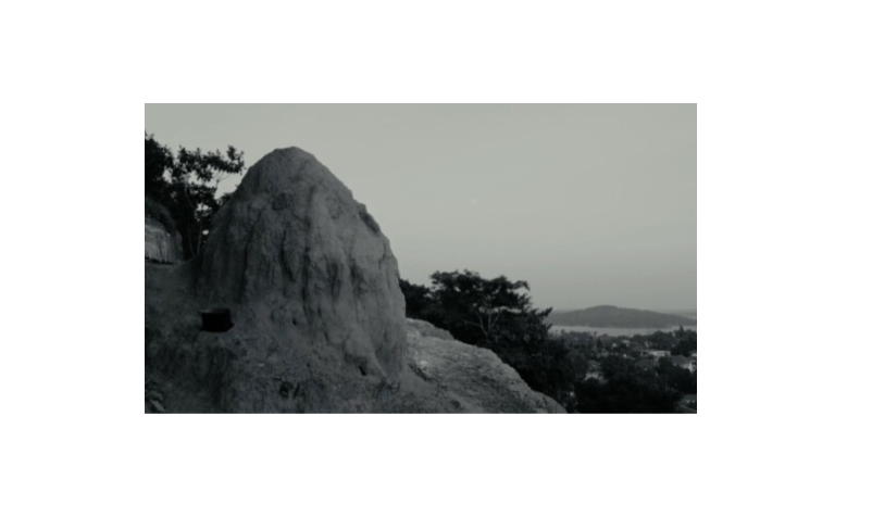
when i click on this image it still works
try this css:
Enter the custom css in "lay options" -> "custom css & html"..col.type-html5video{ pointer-events:none; }for the other points i guess its a no, because there is no setting for that
-
thanks @arminunruh ;)
jes, clicking on images works.
the css works as well, no I can click on the videos.This was still open:
Is it possible to only move to the right in general?And for the text: what would you suggest?
In the end I would like to archive a website, that is slide by slide after each other, only clickable in one direction, so sth like this one: https://www.lutzbacher.com/
thanks for your help!
Daniel -
hi @arminunruh - did you had time for this? thanks
-
hi @arminunruh - did you had time for this? thanks
no i was on an airplane the whole day and i had some other tasks to do
Is it possible to only move to the right in general?
no its not possible as i said :/

the content (a longer text) overflows the browser height. I tried the he "Give elements a max-width and max-height and center them" option, didn't change anything.
can u right click on the text? then try to set widths that are appropriate for desktop, tablet, phone
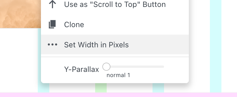
you could also try to use shorter texts
you could also try to use a smaller fontsizeprobably since click only works for previous and next instead of using no cursor it could be wise to use a mousecursor in lay options → fullscreen slider addon
-
thanks @arminunruh
unfortunately it doesn't work with the text page. would it be possible to use custom CSS to have a scroll button on the text page? everything else with the fulllscreen slider works perfect so it would be a shame not to use it.
(i tried with the carousel addon, then the text is cut.)
my goal is a website like https://www.lutzbacher.com/
thanks again
-
hi @arminunruh - did you had time for this? thanks a lot
-
sorry for the late answer
Enter the custom css in "lay options" -> "custom css & html"
in custom css:
.fp-slidesContainer{
overflow-y: scroll;
-webkit-overflow-scrolling: touch;
}
and in custom <head> content:
<script> jQuery(window).on('fpAfterSlideLoad', function(){ // everytime we go to the next slide, scroll to top again jQuery('.fp-slidesContainer').scrollTop(0); }); </script> -
thanks @arminunruh ! that works great. is it possible that the scroll button is only activated on the pages where the content overflows the browser height? now we have a scroll button on every page i.e. on pages where it is not needed.
and for mobile: it does not seem to apply here? would I need another code? (I copy+pasted the code into Custom CSS for Mobile Version, that does not work)
thanks!
-
hi @arminunruh - sorry, did you had time for this? thanks :)
-
can u delete all of the code, now use this instead:
custom css:
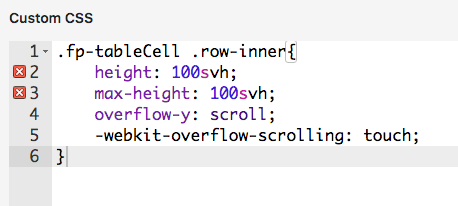
.fp-tableCell .row-inner{
    height: 100svh;
    max-height: 100svh;
    overflow-y: scroll;
    -webkit-overflow-scrolling: touch;
}
custom <head> content:
<script>
jQuery(window).on('fpAfterSlideLoad', function(){
    // everytime we go to the next slide, scroll to top again
    jQuery('.fp-tableCell .row-inner').scrollTop(0);
});
</script>
sorry man pls be a little patient with my response times at the moment
-
oh and remove your password protection if you have more questions so i can look at it on ur site
-
Hi @arminunruh,
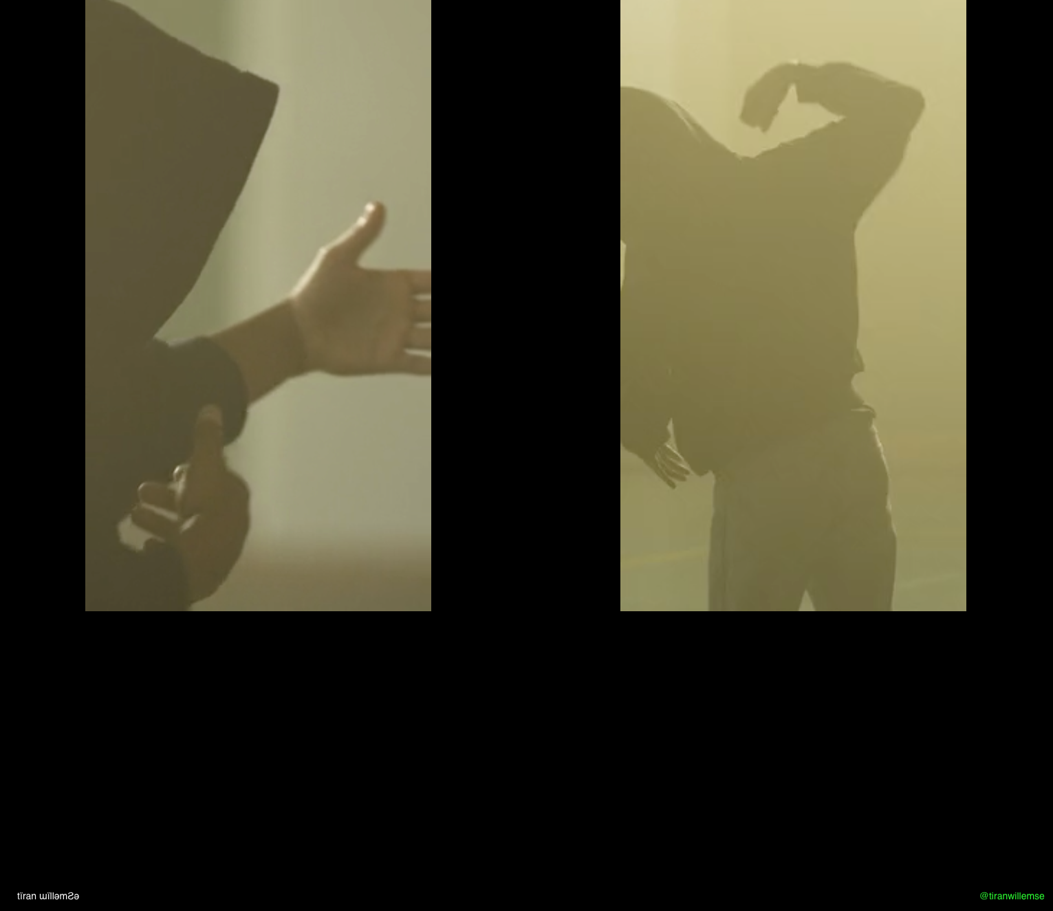
using the fullscreen slider it seems the fullscreen is not applying. Either if I have only one video or two videos in one row the fullscreen doesn't work. Might this because of the custom CSS? I tried to use "Use Browser Height for Row Height" that doesn't work and makes no sense anyways I believe.
It doesn't work for portrait and horizontal videos.
https://tiranwillemse.com/fullscreen1/
Thanks!
-
The Custom CSS has two x so I guess it is not applying.
no, the editor just doesn't know svh so it thinks its wrong css
Either if I have only one video or two videos in one row the fullscreen doesn't work
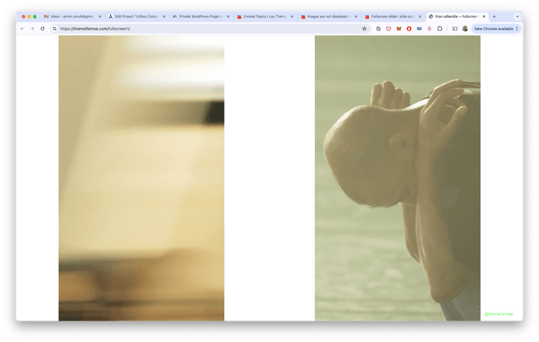
here is one slide with two videos.
i dont understand what u mean
Either if I have only one video or two videos in one row the fullscreen doesn't work.
we have a fullscreen slider where u can scroll up and down in the content
what u mean is the video is not 100% height of the browser right?
yea, any elements are width based. so their size depends on how many columns in the gridder they use.if you want one element to be 100% height of the browser and use fullscreen slider, u can use this setting in lay options → fullscreen slider:

it only works if there is one video in a row
-
thanks. yes that's what I meant. the thing is when use the setting you suggest it affects of course every slide. which I don't want to have.
remember: this fullscreen slider consists of pages that are to scroll because the content is longer then the view height (like a long text).
that's why you send me the code earlier on.
so I guess it is not possible to have SINGLE SLIDES (with one image or video) in the fullscreen slider that are 100% height of the browser?
thanks!
-
hi @arminunruh did you maybe had time for this?
-
hey i think theres no way to do this! the sizes of the elements are based on their set width
I also code custom websites or custom Lay features.
💿 Email me here: 💿
info@laytheme.com
Before you post:
- When using a WordPress Cache plugin, disable it or clear your cache.
- Update Lay Theme and all Lay Theme Addons
- Disable all Plugins
- Go to Lay Options → Custom CSS & HTML, click "Turn Off All Custom Code", click "Save Changes"
This often solves issues you might run into
When you post:
- Post a link to where the problem is
- Does the problem happen on Chrome, Firefox, Safari or iPhone or Android?
- If the problem is difficult to explain, post screenshots / link to a video to explain it
