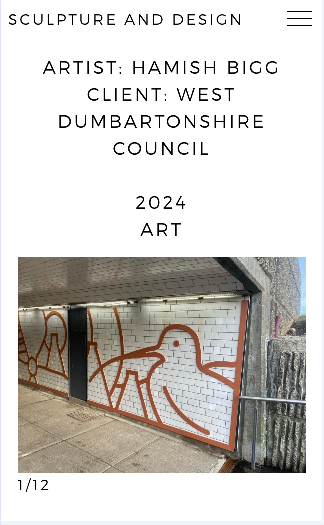
possible to prioritise what sits at top on auto generated phone layouts
-
Hi @arminunruh
On the desktop layout I have text on the left 50% and carousel on the right 50%. I would just like to use an automatic phone generated layout. However, the text goes above the carousel on the mobile and I would prefer the other way around, carousel first then text.
Is there a way to prioritise what element sits at the top on auto generated mobile layouts?
No worries, if not possible.

-
do u have a link
-
maybe we can do sth here.
however, as it works on ur website, thats the normal behaviour -
-
.first-row .column-wrap{
    display: flex;
    flex-direction: column;
}
.first-row .col:nth-child(2){
    order: -1;
}
in custom css for mobile
-
.first-row .column-wrap{
    display: flex;
    flex-direction: column;
}
.first-row .col:nth-child(2){
    order: -1;
}
in custom css for mobile
@arminunruh thanks man
-
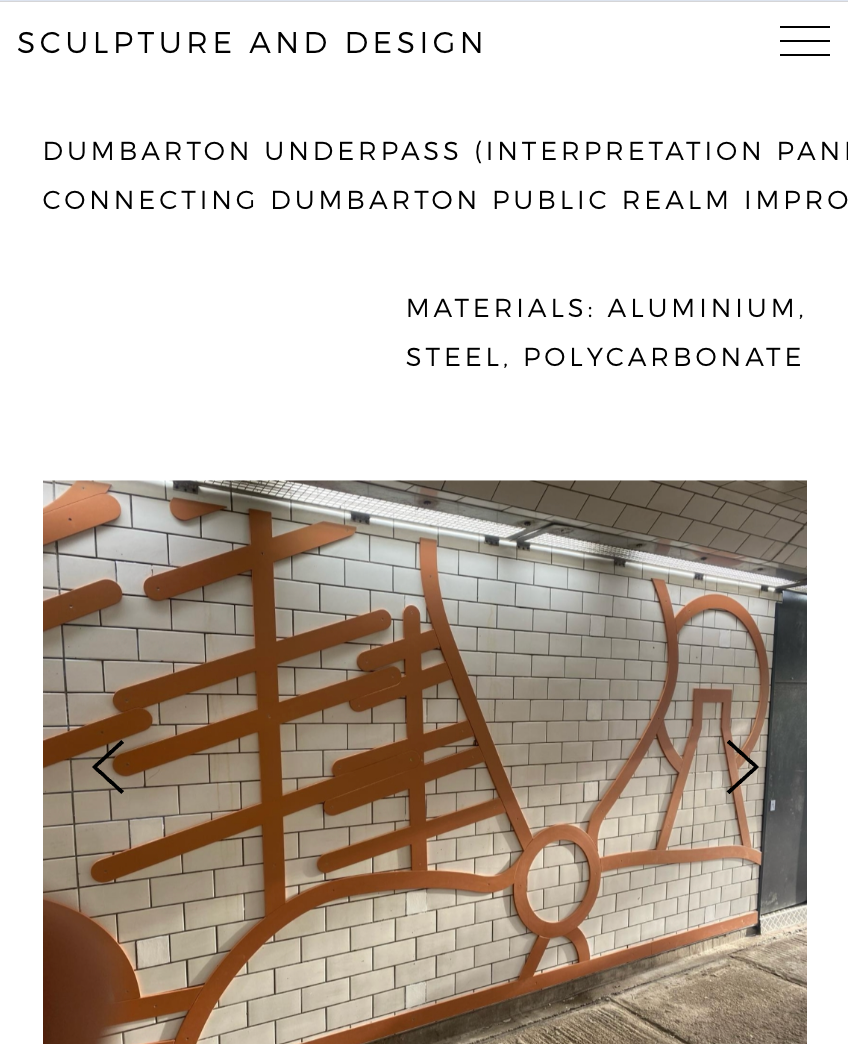
similar question, I'm utilising text footers on the desktop version and wondered if it was possible to add in some responsive options for this feature? The 'materials' text is right aligned on desktop but would be great to have it left aligned on mobile, also notice how the top text is overflowing on the right, could this be responsive? I realise I could make a custom phone layout but would be a great time saver to have it auto generate as there are many projects. If you can let me know that'd be great, cheers as always

-
hey i may be too late, right?
https://sculptureanddesign.com/dumbarton-underpass/this page doesn't seem to use the textfooter anymore for the text u indicated
-
hey i may be too late, right?
https://sculptureanddesign.com/dumbarton-underpass/this page doesn't seem to use the textfooter anymore for the text u indicated
@arminunruh hey, I used the text footer on a duplicated page here:
https://sculptureanddesign.com/dumbarton-underpass-copy/This is going to be the new layout that I'll replicate for the rest of the projects. Be great if the text footer could be more responsive for mobiles. However, if not possible I can just use a custom layout but using the auto generated would be great.
-
@arminunruh hey, I used the text footer on a duplicated page here:
https://sculptureanddesign.com/dumbarton-underpass-copy/This is going to be the new layout that I'll replicate for the rest of the projects. Be great if the text footer could be more responsive for mobiles. However, if not possible I can just use a custom layout but using the auto generated would be great.
Found a solution for the auto generated mobile layout @arminunruh.
If I change the 'white space' css on the <p> tag from 'nowrap' to 'normal' it fixes the overflowing text and 'lay-textfooter-inner' from 'flex' to 'block' it shifts the justified right text to the left.
-
ok glad u found a solution!
I also code custom websites or custom Lay features.
💿 Email me here: 💿
info@laytheme.com
Before you post:
- When using a WordPress Cache plugin, disable it or clear your cache.
- Update Lay Theme and all Lay Theme Addons
- Disable all Plugins
- Go to Lay Options → Custom CSS & HTML, click "Turn Off All Custom Code", click "Save Changes"
This often solves issues you might run into
When you post:
- Post a link to where the problem is
- Does the problem happen on Chrome, Firefox, Safari or iPhone or Android?
- If the problem is difficult to explain, post screenshots / link to a video to explain it