Menu broken after update
-
Recently updated wordpress and Laytheme and my menu is stretched after update.
Please help. www.williameadon.com
I have some custom CSS that has been affected, but not sure how to fix.
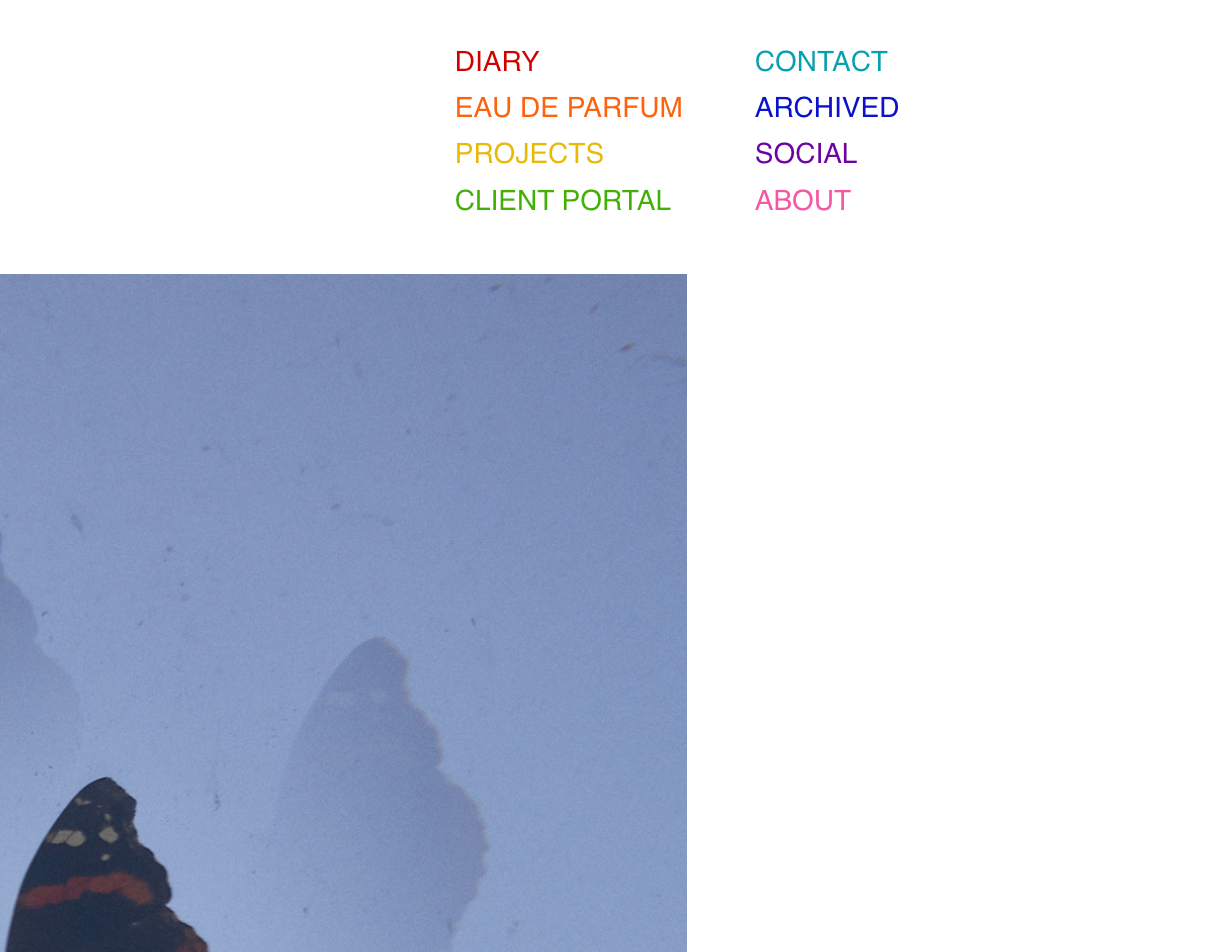
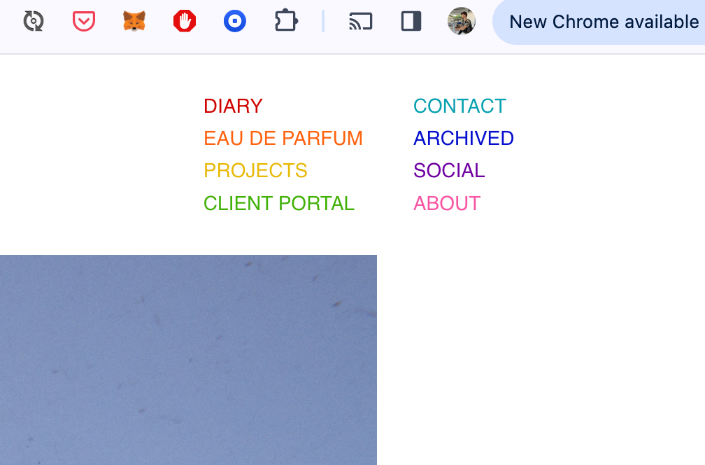
Original menu at top right corner should look like this...

instead looks how it does now...
Here is a copy of the custom CSS that i am using in wordpress for the menu pre update.
Thanks in advance for your help!
William@media (min-width: 601px) {
#laytheme #main-region #grid {
padding-top: 145px;
}
}/*
don't show the William Eadon extra text on mobile
*/
@media (max-width: 600px) {
.sitetitle-txt-inner {
display: none;
}
}body > nav.laynav.primary > ul {
overflow:hidden;
max-width: 300px;
}
/*
below affects menu nav sizing and rows of menu
*/
body > nav.laynav.primary > ul > li {
width: 50%;
line-height: 1.65em;
float:left;
margin: 0;
display:inline;
}/* menu colors */
/* Diary */
nav.primary .menu-item-27 a {
color: #ce0000;
}/* Diary hover */
nav.primary .menu-item-27 a:hover {
color: #a6a6a6;
}/* EDP */
nav.primary .menu-item-28 a {
color: #ff630a;
}/* EDP hover */
nav.primary .menu-item-28 a:hover {
color: #a6a6a6;
}/* Portfolio I */
nav.primary .menu-item-29 a {
color: #e8ba01;
}/* Portfolio I hover */
nav.primary .menu-item-29 a:hover {
color: #a6a6a6;
}/* Portfolio II */
nav.primary .menu-item-30 a {
color: #41b200;
}/* Portfolio II hover */
nav.primary .menu-item-30 a:hover {
color: #a6a6a6;
}/* Contact */
nav.primary .menu-item-31 a {
color: #00a3b2;
}/* Contact hover */
nav.primary .menu-item-31 a:hover {
color: #a6a6a6;
}/* Archived */
nav.primary .menu-item-32 a {
color: #040ecc;
}/* Archived hover */
nav.primary .menu-item-32 a:hover {
color: #a6a6a6;
}/* Social */
nav.primary .menu-item-33 a {
color: #7001a3;
}/* Social hover */
nav.primary .menu-item-33 a:hover {
color: #a6a6a6;
}/* ABOUT */
nav.primary .menu-item-34 a {
color: #f756a4;
}/* ABOUT hover */
nav.primary .menu-item-34 a:hover {
color: #a6a6a6;
} -
hey there!
you can revert back to an older version of laytheme, u can get the earlier versions here:
or you can fix your css or ask the person who did the css to fix it

it seems like u managed to fix it?
what i changed was i now use display: flex; for menus
u can use this css to not use display flex:
nav.laynav ul{
display: block!important;
}
or you can learn a little about flexbox css and use that info to change the css for the menu
nav.laynav ul
is set to display: flex;
flex-direction: row;
is used there too. u change it to flex-direction: column;
also i use gap: 10px; -
thanks..
added
display:inline-block; in "body > nav.laynav.primary > ul {"
was the fix
regards, W
I also code custom websites or custom Lay features.
💿 Email me here: 💿
info@laytheme.com
Before you post:
- When using a WordPress Cache plugin, disable it or clear your cache.
- Update Lay Theme and all Lay Theme Addons
- Disable all Plugins
- Go to Lay Options → Custom CSS & HTML, click "Turn Off All Custom Code", click "Save Changes"
This often solves issues you might run into
When you post:
- Post a link to where the problem is
- Does the problem happen on Chrome, Firefox, Safari or iPhone or Android?
- If the problem is difficult to explain, post screenshots / link to a video to explain it