Hi @arminunruh and thank you so much for pointing me in the right direction! I adjusted all the parent elements and it works now.
Thanks again!
Andrea
Hi @arminunruh and thank you so much for pointing me in the right direction! I adjusted all the parent elements and it works now.
Thanks again!
Andrea
Hello,
I've just finished designing a new website and there is one last aspect I need to solve.
I would like the thumbnails titles to appear on mouseover always in the same position (in the bottom right corner of the page).
As you can see, I managed to place the element in the desired position. However, the titles are often hidden under the thumbnails. Would you know how to make it appear on top of them instead?
Here is the website and here is the custom CSS:
.title {
position: fixed;
bottom: 10px;
right: 5%;
z-index: 10;
}
Thank you very much!
Andrea
Dear @Richard-K / @arminunruh ,
I updated Lay Theme and removed my custom code but unfortunately that didn’t do the trick.
Smooth scrolling doesn’t work unless I add some js-code (or 'html{scroll-behavior: smooth;}' in the custom CSS).
And the menu doesn’t work at all on mobiles (unless I leave the phone layout as it is, without customising it, which unfortunately is not an option. I explained this behaviour in detail here)
Should you have any updates please let me know.
Thanks again,
Andrea
Dear Richard,
Sorry to bother again but I just realised the problem is not about javascript at all.
There appears to be some sort of conflict between navbar and custom phone layout, and this has nothing to do with my custom code.
I made a test by creating a new page and, as you can see, the navbar here works perfectly: it makes you scroll smoothly to the targets, on both desktop and phone layout.
As soon as I create a custom phone layout in the gridder, however (namely: click on the phone icon in the top right corner of the gridder), it immediately stops working on mobiles (you click on the anchors and nothing happens). And this is true whether I start by ‘stacking elements’, by ‘copying the same layout’, or with an ‘empty layout’: I tried them all.
This is the original page with the custom phone layout—which isn’t working—in case you want to check.
Then again, as soon as I delete my custom phone layout, the navbar starts working again.
I’m not sure what the conflict is about but it seems strange, and it’s not caused by my custom code anyway. To be completely sure about this I even removed my own script and adopted an alternative way to create the smooth scrolling effect (by adding “html{scroll-behavior: smooth;}” in the custom CSS). The result is exactly the same.
Is there any way I can customise my phone layout without interfering with the navbar functioning?
If you could help me that would be very much appreciated, and I sincerely hope this whole conversation will be useful for future LayTheme users.
Many thanks in advance,
Andrea
I forgot to forward you the updated link: https://www.tudorbratu.com/
Have a nice day,
Andrea
Dear Richard,
Thanks for your answer.
The accordion works now.
The menu, on the other hand, works well only on the desktop layout. On the mobile layout it doesn't work at all (if you click on the anchors nothing happens).
If you could have a last look I would be very grateful. It's literally the last thing I need to solve.
Thanks a lot,
Andrea
Hi Richard.
Thanks for your answer.
I tried but it doesn't look like it makes any difference.
There must be something else I'm doing wrong...
Dear @Richard-Keith,
Thank you very much for your feedback. I ended up creating all content within one single page and it actually works fine.
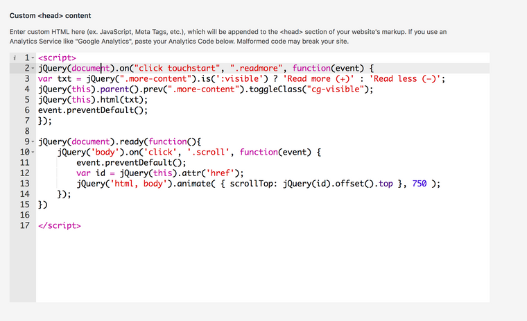
I do have one last issue to solve, however, before I can finally go public. Two scripts I added in the <head> work fine on desktop, but don't seem to work on mobile. Any idea what the reason might be?
The first script creates a "Read More / Read Less" button that shows/hides extra text like an accordion; the second makes the anchors in the navbar scroll smoothly to their targets.
You can find my code in the screenshot attached.
Thanks in advance,
Andrea

Dear Richard.
Thanks for your answer.
Here it is: https://test.tudorbratu.com/
At the moment the front page displays one single project.
What I’d like to achieve is displaying all projects on the front page, ordered by category (“work” projects should appear first; “curatorial” projects after).
If you can think of anything please let me know.
Many thanks in advance,
Andrea
Hello and thank you so much for the theme. It works beautifully.
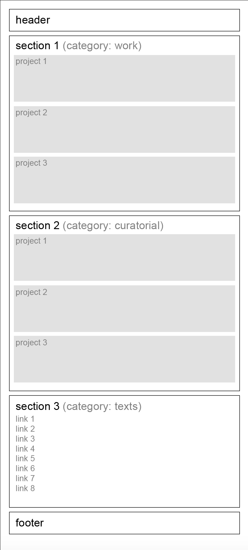
I have a couple of questions about the website I’m currently working on. It’s a single scroll website divided in three sections:
Section #1 displays all projects belonging to category #1;
Section #2 displays all projects belonging to category #2;
Section #3 consists of a series of links to download some PDFs.
A nav bar with anchors allows the page to scroll to the beginning of each of these sections. (I’m attaching a basic wireframe sketch, in case the structure wasn’t clear)
I just figured out how to implement the nav bar, but I’m still trying to understand what’s the best way to structure the website. More specifically:
Could you point me in the right direction?
I spent quite some time looking for similar situations in the forum but I had no luck.
Many thanks in advance,
Andrea
