Skip to content
  • Recent
  • Tags
  • Popular
  • Users
  • Search
Skins
  • Light
  • Cerulean
  • Cosmo
  • Flatly
  • Journal
  • Litera
  • Lumen
  • Lux
  • Materia
  • Minty
  • Morph
  • Pulse
  • Sandstone
  • Simplex
  • Sketchy
  • Spacelab
  • United
  • Yeti
  • Zephyr
  • Dark
  • Cyborg
  • Darkly
  • Quartz
  • Slate
  • Solar
  • Superhero
  • Vapor

  • Default (No Skin)
  • No Skin
Collapse

Lay Theme Forum

B

brinifein

@brinifein
About
Posts
6
Topics
3
Shares
0
Groups
0
Followers
0
Following
0

Posts

Recent Best Controversial

  • Image Hover Addon / disable images on Mobile/touch devices
    B brinifein

    Hi Armin, thanks for your reply.
    I had updated Theme & Addons to the latest version.
    I had also switched off all custom codes, but thought I didn't need to disable all plugins at once. Turns out I'd better do that next time, because that's how I found the problem you pointed out. It's the "WP Fastest Cache" plugin. Just in case anyone else happens to have this problem.

    Thank you very much, Brini

    Addons

  • Image Hover Addon / disable images on Mobile/touch devices
    B brinifein

    Hello everyone,
    A question about the Image Hover Addon:
    How can I deactivate the display of hover images on touch devices? Since an update, unfortunately I don't know exactly when, the images are simply displayed permanently somewhere in the layout. Originally, the hover images were only shown on the desktop when hovering, so I never bothered with the mobile layout. I've also played with various settings in the image hover setup - "Show image on hover only", for example, but unfortunately it doesn't work.

    https://brinifetz.at/about/

    Thanks for your tips!
    Kind regards,
    Brini

    Addons

  • show Bigger Sized images on retina screens + webp express
    B brinifein

    @arminunruh YES! Thank you, now it's working properly! I have updated to Version 5.6.8. :) Super happy, was looking for a solution since days. Haha. ;)

    General Discussion

  • show Bigger Sized images on retina screens + webp express
    B brinifein

    Hello,
    We would like to use fullscreen images on our website (photography portfolio) and use the plugin Webp Express. This plugin also generates thumbnails larger than 2048px in width (screenshot below), however LAY Theme seems to prevent these larger ones from being played out.

    Here is a test link:
    https://www.liaison.wtf/liaison-test-fullscreen/

    I don't want to disable resizing completely because of the page load speed, but on a 4k or 5k iMac or Studio Display the largest possible thumbnail should be displayed.

    Does anyone know a solution?
    (Latest wordpress + theme version)

    Thank you!
    Brini

    Bildschirmfoto 2023-05-30 um 12.04.45.png

    General Discussion

  • backdrop blur on ios
    B brinifein

    I had a similar question two years ago
    http://laythemeforum.com:4567/topic/6198/backdrop-blur-mobile-nav-for-safari/3?_=1685110042396

    (I'm only here to possibly be notified if someone knows an answer).

    Bug Reports

  • Backdrop Blur — Mobile Nav for Safari
    B brinifein

    Hi there,

    I tried a customized Mobile Menu, where the blurry backdrop effect of the menu navbar is also applied to the whole overlay menu.
    Here is a screenshot how it should look — in Google Chrome it works fine, but it seems that safari is not supporting it.

    Bildschirmfoto 2020-11-18 um 08.58.59.png

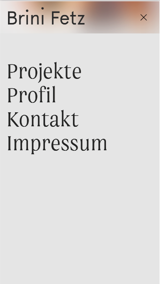
    Heres a Screenshot how it looks in Safari:

    Bildschirmfoto 2020-11-18 um 09.01.05.png

    Now I wonder how you managed to make this effect work applied to the navbar in Safari? Is there a special way to do it that I did not came up with?

    You can find my website via www.brinifetz.at

    I'm using following code in the Custom CSS:

    /* Blurred Mobile Menu */
    
    /* if supported */
    @supports (backdrop-filter: none) {
        nav.mobile-nav {
        -webkit-backdrop-filter: saturate(180%) blur(20px);!important
        -moz-backdrop-filter: saturate(180%) blur(20px);
        backdrop-filter: saturate(180%) blur(20px);
        background-color: rgb(255,255,255,0.1);
        }
     }
    /* Fallback */
    @supports not (backdrop-filter: none) {
        nav.mobile-nav {
        background-color: #e5e5e5;
        opacity: 1;
        }
     }
    
    nav.mobile-nav li a {
        background: none;}
    
    nav.mobile-nav li.current-menu-item>a  {
        background: none;}
    
    /* END Blurred Mobile Menu */
    

    Maybe you have an idea, what the problem is here. :)

    Thank you!
    Brini

    General Discussion
  • Login

  • Don't have an account? Register

  • Login or register to search.
  • First post
    Last post
0
  • Recent
  • Tags
  • Popular
  • Users
  • Search