for the time being, i have applied this instead. kind of works but it seems like it only crops from the bottom so this may pose issues with centered content?
.ph {
padding-bottom: 55% !important;
}
.ph img {
object-fit: cover;
}
for the time being, i have applied this instead. kind of works but it seems like it only crops from the bottom so this may pose issues with centered content?
.ph {
padding-bottom: 55% !important;
}
.ph img {
object-fit: cover;
}
thanks armin! im afraid the above didn't do anything to the thumbnails? i would love to have control over the aspect ratio however that is the director's decision from video to video and would need a system that can integrate these variations in the long run
legend thank you!!
for the thumbnails within, does the client need to reformat everything so that they are all unified in dimensions or can that be done within laytheme at all?
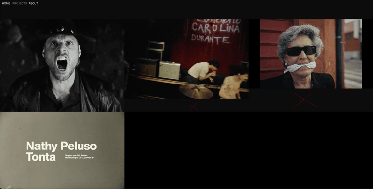
so that these gaps are avoided?
Hi @arminunruh @mariusjopen sorry to chase with this, is the above at all possible to solve?
yes sorry what I am asking is why are the 'Film' projects and 'Experience' projects leaving gaps between each other (2 thumbnails) and in different rows?
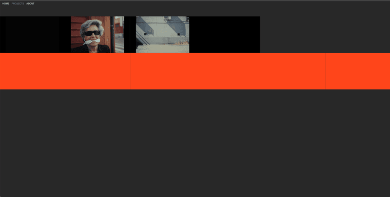
It seems like with thumbnail grids I can only select one category or the other and therefore don't understand how to have ALL projects smoothly visible at once?
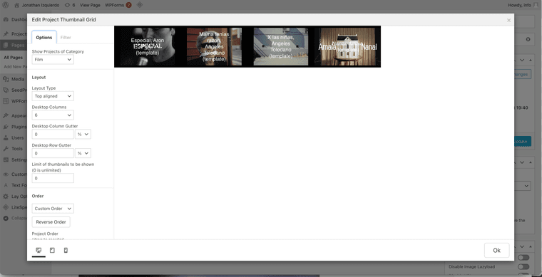
Do you mind explaining what I am doing wrong?
Thanks!
Answered my own question Armin, thanks anyway. The only thing I wonder is, do projects always need to be added individually as I have now to make it work or is there a way to do this in bulk/through thumbnail grids so that it is easier for my client to upload content in the future?
Hey Armin! Awesome thanks so much :)
Was able to add the different for the different categories. Just to clarify, in the project page, when I try to add both Film and Experience, it looks like I can only add one OR the other, however the projects page should show all. What am I doing wrong?
https://www.j-i.live/category/film/
Thanks again for your help as always!
thank you! any recommendations? are they compatible with laytheme?
Hi @arminunruh,
Hope all is great! I was hoping to set this page up https://www.j-i.live/coming-soon/?preview=true whilst still working on the site as I was. I am able to set it up as a Front page/disable the menu through css but some of the general styling of the page needs to be completely different to the final result, how can I work on/edit the page whilst I leave that coming soon page untouched?
Thanks so much,
Christian
Hi @arminunruh hope you are well!
I am aiming to have the page 'Projects' show all of the projects and the sub items in the menu which are currently the categories 'Film' and 'Experience' act as filters of the Projects. However currently, when clicking any of these categories, the pages appear to be empty.
https://www.j-i.live/projects-copy/
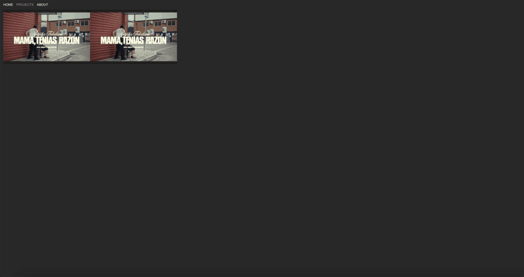

I am sure there is an integration for this but don't seem to find it, within the project thumbnails/category settings, would you kindly be able to point me in the right direction?
Thanks so much for your help!
Hi @arminunruh how are you?
I am currently trying to develop a project grid with two optional filters: film and experience.
The idea would be that the caption for each thumbnail appears at the top of the site upon hovering on the thumbnail. This would show two different kinds of attached info, the big title of the project on the top right and the small basic info next to the menu. This would mean detaching the permanent caption underneath the thumbnail.
Please find the design below
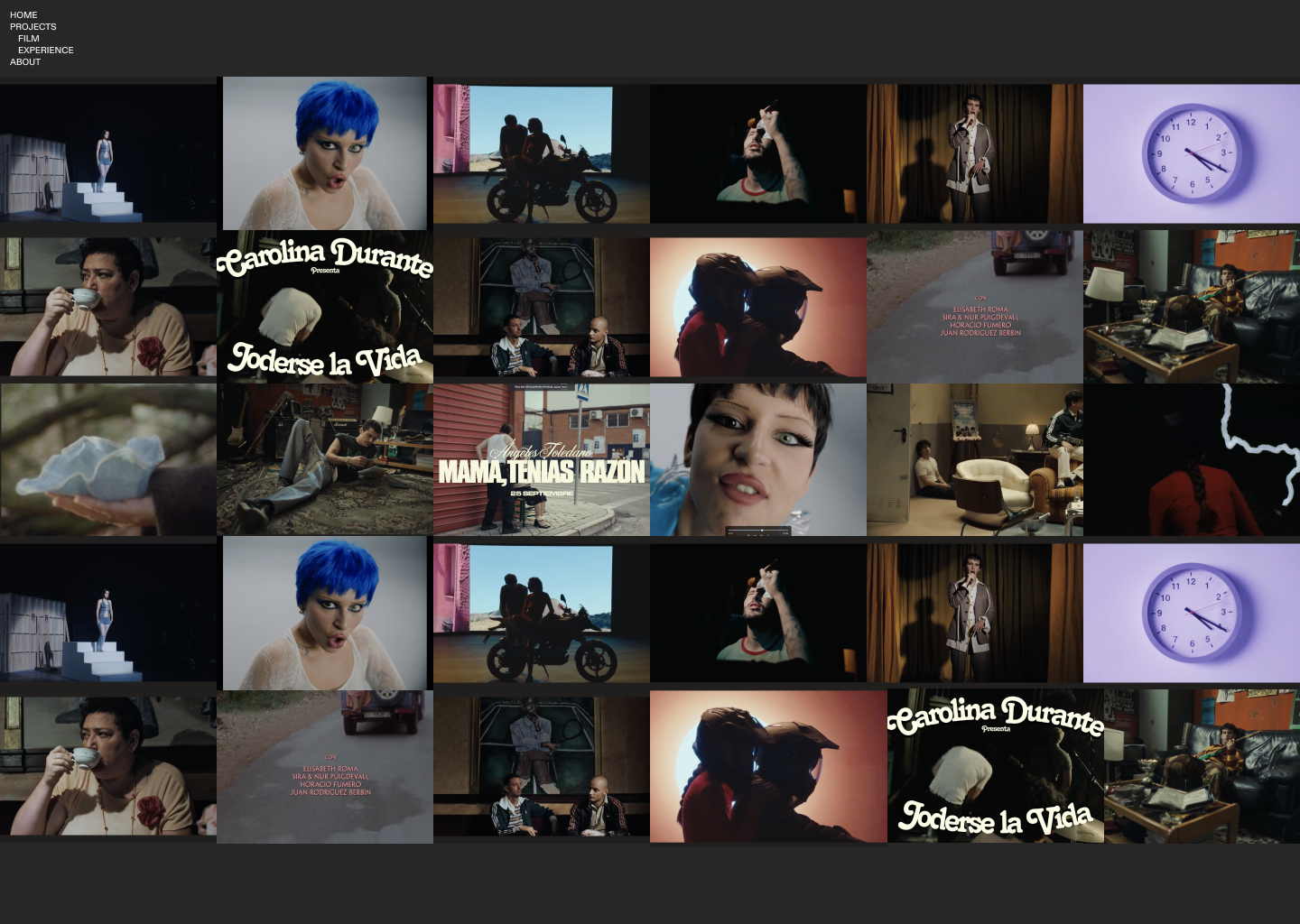
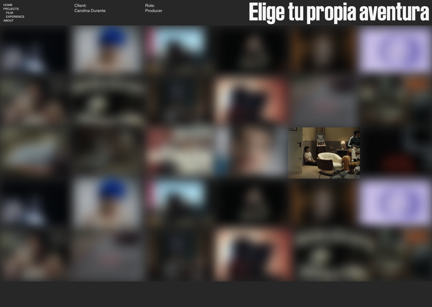
Is this possible/is there any way you could help me determine this positioning/hierarchy define this with css?
This is the link to the page:
https://www.j-i.live/projects-copy/#category-film
Thanks so much either way for your time!
Hope is all well your side :)
Hey @arminunruh hope all is great!
I have noticed my favicon displaying differently on Safari and wondered if you knew why this happened? I have tried changing the size of the transparent png to see if it was a rendering issue, but this didn't change the black background which appears on the tabs. As the image below:

It should just be a white circle on a transparent background. When typing within the address bar in Safari it displays correctly though:

Chrome also gives no issues. Any clues on how to fix this?
Thanks so much for your help!
Christian
Hi Armin,
Thanks very much this is great.
Hopefully last few questions on this:
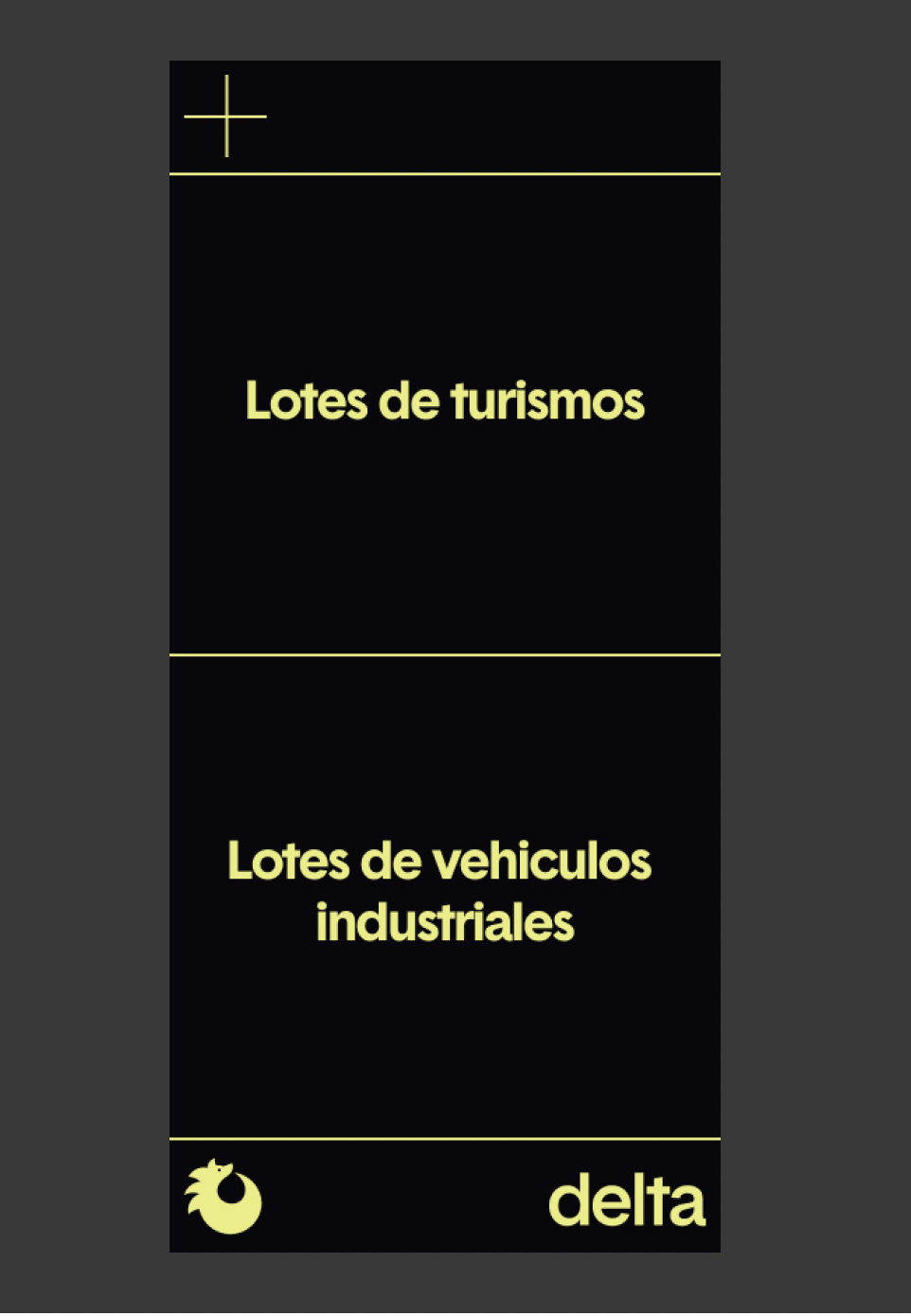
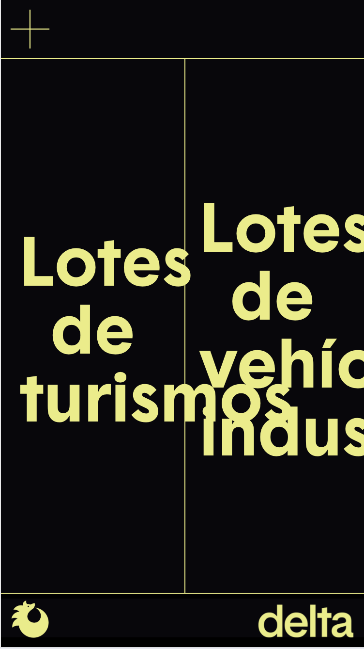
Same thing applies to overlay


How can I make sure I obtain the results you suggested without preventing the rest from working? Thanks again!
Hi Armin,
Thanks for your feedback! So if the first option could work it would be amazing as html is perhaps beyond my expertise unless I know what to input..

However when trying the first option (deleting phone layouts and using textformats) the footer still seems to shrink as per the above attachment, rather than stay within the desired scale — desktop and mobile the same, just the width of the page shrinks as per the below attachment

Any thoughts? Thank you!!!
amazing thanks so much!!
Hi Armin,
Thanks so much, the z index solved the first bit and I was able to solve the custom burger with overlays!
In terms of same layout, this applies to the header (custom burger icon and top key line) and footer (logos and bottom keyline) only like in the below screenshots. The text layouts etc differentiated between desktop and mobile would still be needed though — is this possible?
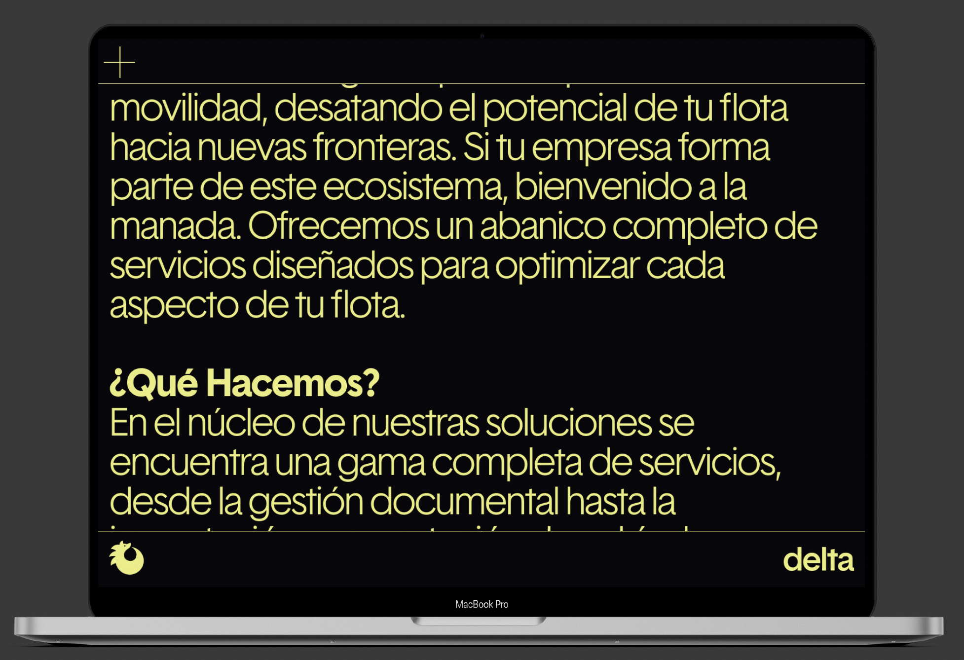

Thanks again!!!!
Hi @arminunruh
Hope you're good! I am currently working on a very simple site that has a page with two CTAs/buttons that split the screen horizontally in desktop and vertically in mobile, as per the screen shots below
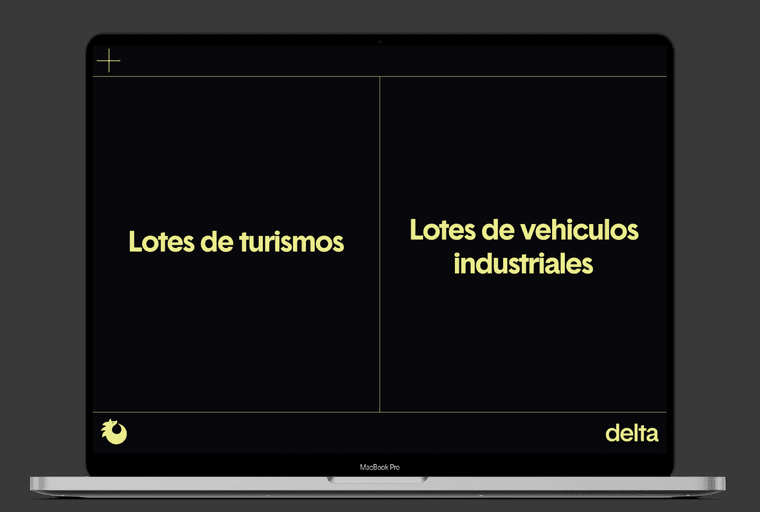

For the desktop version I have managed to more or less create this with a few columns and a vertical key line http://das-fleet.com/home-1-copy/?preview_id=39&preview_nonce=ec5b446376&preview=true
However for the mobile version this doesn't seem to work when using the browser height and I am failing to recreate the above design stacking elements. How would you recommend to go about approaching this?
Thanks a lot for your time and help,
Christian
Apologies, have seen my license needed re-entering regarding locked elements part. would still very much appreciate any help on the above if possible! Thank you :)
Hi Armin,
Hope you are well!
I am trying to design a very simple site that has the same menu/footer in desktop as the mobile version. For this, we need a burger on the top left as per the screenshot attached which I thought should be very simple.

Is there any chance you could give me any guidance on this? I saw something related to overlays but even though I have bought the license it asks me to re-buy (see attached also).
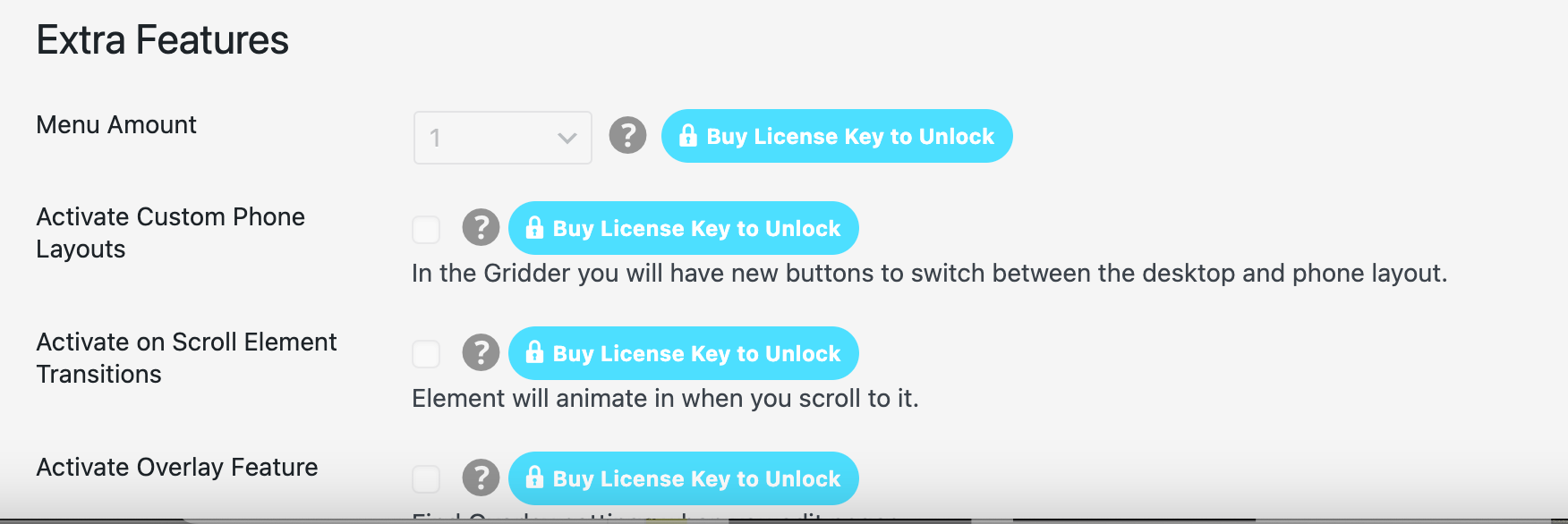
On the other hand, the footer should ideally have a solid background as per the above screenshot instead of being transparent as it currently is here: http://das-fleet.com/home-1/ Where does one determine this?
Thanks so much for your help!
Christian
Hey Armin,
Thanks a lot for your help.
Some pages have sped up, but this page still has some issues with the image hovers (some load, some dont) https://lasalbercas.com/ver-hacer/
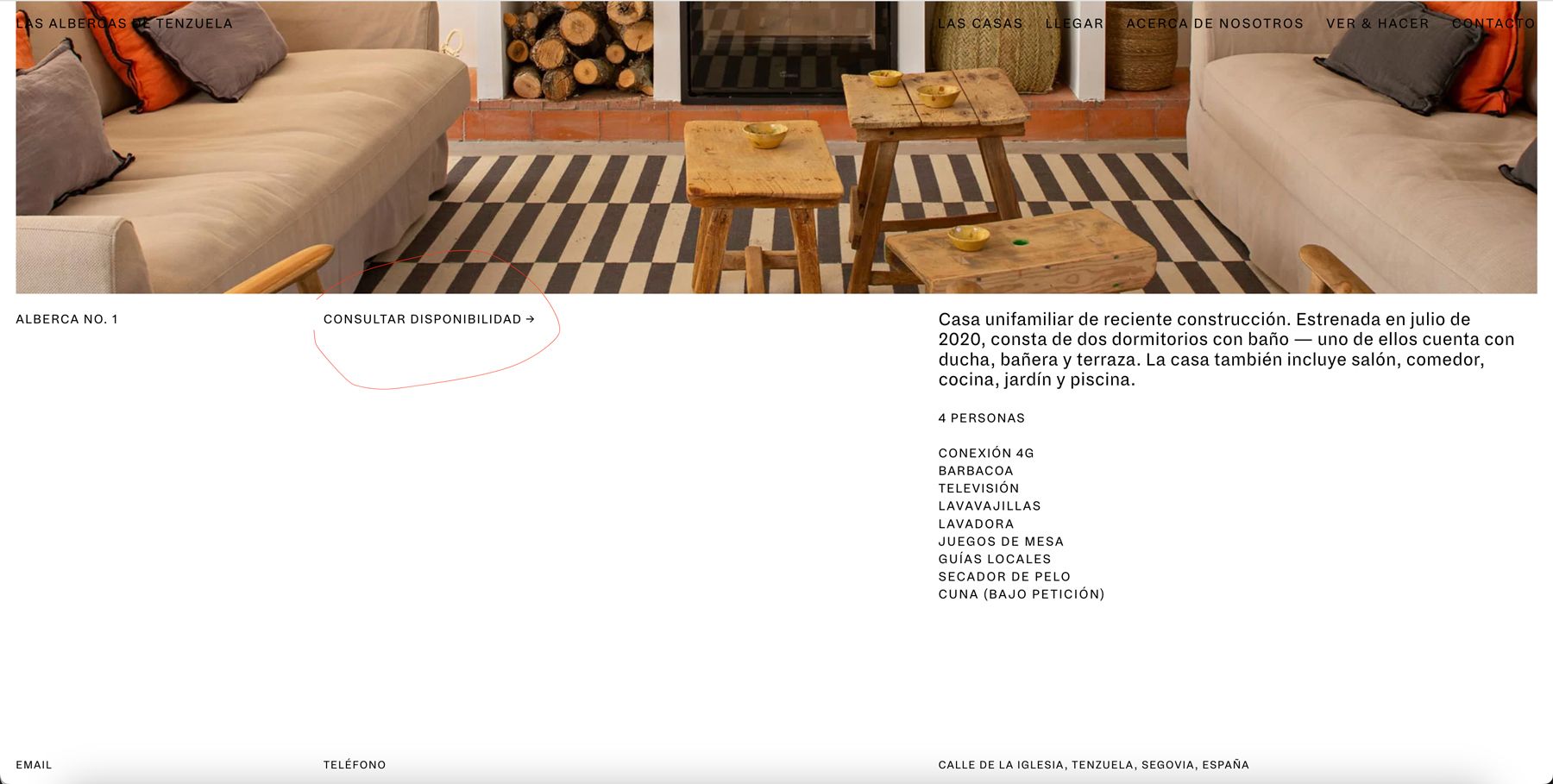
In terms of the booking plugin, the idea was to have something integrated, but it has not become an external link when clicking on 'Consultar Disponibilidad' in the different properties, as highlighted in the attached screenshot.
Do you mind clarifying the implications of turning this page into a static one in terms of editing/updating content in laytheme?
Thank you!
