Cool, thanks!!
Yes, it is only shown while sliding. It is a detail, but it bothered me, especially because I had rounded corners on the images :)
dabu
Posts
-
Adjusting space between images in carousel -
Adjusting space between images in carouselYes, but that option isn't visible when "Aspect Ratio of first Element" is selected. Maybe you can change that?
-
Any options for using an external CSS-editor?for me this is way easier: insert the following line into the custom CSS field:
@import url('/wp-content/themes/mylay/additionalstyles.css');
Then you can save a css file named additionalstyles.css in the themes-folder /mylay/…, and this file you can open with for example Transmit (FTP-Client) & Sublime text (Editor), save, and in 2 seconds its done. then clean the browser cache and reload your website.
-
Adjusting space between images in carouselThat didn't work for me, but here is my solution, if you have single slides:
.lay-carousel-slide.is-selected {
margin-left: 3%;
left: -3%;
}

.lay-carousel-slide.swiper-slide-prev {
left: -3%;
}
The numbers you can change to your liking, but they should all be the same.
-
$tags$ not working inside stackThat's perfect, thank you so much!
-
$tags$ not working inside stackhi @arminunruh could you have a look at the problem with $tags$ inside stacks? I would really appreciate that, thank you!
-
$tags$ not working inside stackThe new $tags$ feature is great! I found out it is not showing up if the text is inside a stack. Could you correct that?
Furthermore, it would be nice if it came with a specific (span) class that I can target. Now it is only text inside a <p></p>, so I cannot style it with CSS.
My point is to make the tags like labels (coloured background). Hope I can get rid of the comma as well somehow :-)
-
Event plugin: show lay header and footer on event pageI installed Eventon Plugin as an event calendar, which works fine with shortcodes inside a page of lay theme.
The plugin also generates a page for each event (custom post type?), and I was able to configure it, but it doesn't work perfectly:
- example of an event: https://tonhalle.at/eventon/der-toepferbrunch-21/
- if logged in, the page shows the event, the site title (logo) and the hamburger menu, and a "back to all events" button which I hard coded into the plugin page template
- but it doesn't show the footer
- if not logged in, it even shows only the site title (logo) and the event, but no hamburger, no footer and no "back to all events" button
Below you can find the code of the php file that is used by the plugin for the single event pages. It's a mix from the lay theme page.php and from the plugins code.
Could anybody help…
- why are some parts only shown wenn logged in?
- why is the footer never shown?
It's probably just some small changes in the php below, but I don't know where (tried a few things already, nothing worked).
Thanks in advance!
<?php get_header(); ?> <?php echo LayIntro::getMarkup(); echo LaySearch::getMarkup(); if ( post_password_required( $post ) ) { echo get_the_password_form(); } else { if ( class_exists('WooCommerce') && have_posts() ) { global $post; $content = get_the_content(); if(trim($content) != '') { ?> <div id="lay-woocommerce" class="lay-textformat-parent"> <?php the_content(); ?> </div><!-- #lay-woocommerce --> <?php } } // Exit if accessed directly if ( ! defined( 'ABSPATH' ) ) { exit; } do_action('eventon_before_header'); // you can also pass a lang value in below function to create fixed lang single event page. // this value will be overriden by language corresponding events do_action('eventon_before_main_content'); ?> <div id='main_single'> <div class='evo_page_body'> <?php do_action('eventon_single_content_wrapper');?> <?php /* The loop */ ?> <?php while ( have_posts() ) : the_post(); ?> <?php evo_get_template_part('content','single-event');?> <?php endwhile; ?> <div class="eventpage_button"><a class="laybutton1 laybutton" href="https://tonhalle.at/events/" data-title="Event-Übersicht" data-type="page">Zur Event-Übersicht</a></div> </div> <?php do_action('eventon_single_sidebar'); // DEP ?> <?php do_action('eventon_single_after_loop'); ?> </div><!-- #primary --> <?php do_action('eventon_after_main_content'); $layout = Lay_Layout::getLayoutInit(); echo $layout; ?> <div id="lay-overlays"> <?php echo Lay_Overlays::getOverlays($layout); ?> </div> <?php echo ProjectsOverlaysOptions::getMarkup(); ?> <?php } get_footer(); -
Pagespeed performing much slower on mobileI mean the caching plugin: WP Fastest Cache
-
Pagespeed performing much slower on mobileDid you install the plugin mentioned here? https://laytheme.com/documentation/speeding-up-your-website.html
For me it helped! -
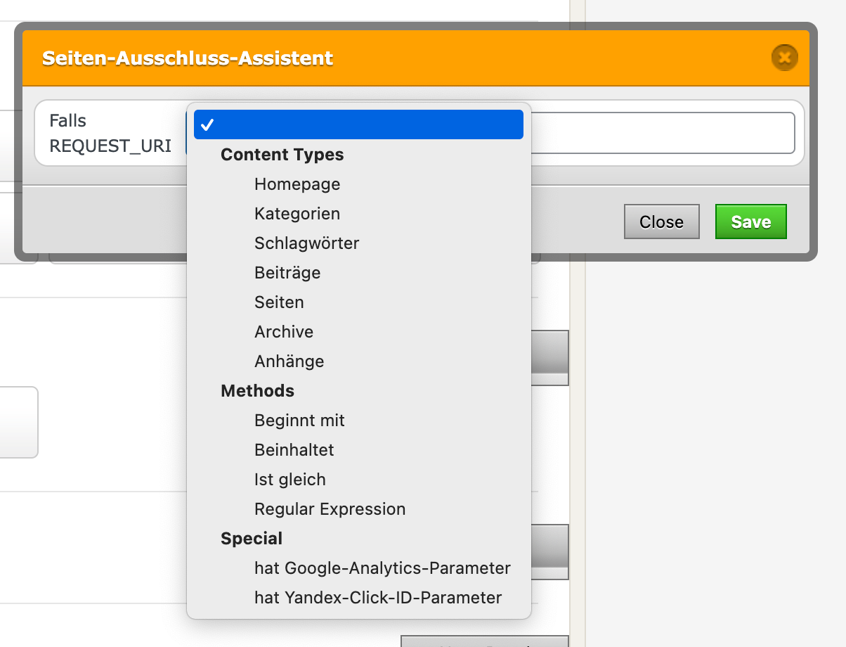
plugin wp fastest cache: Exclude projects?I need to exclude all the projects from being cached by the plugin you recommend for a faster website. Can I do this by excluding posts (Beiträge), are these the projects?

I need to exclude them because of some php loading from an external service, which is not correctly updated if caching is on (strangely, only on smartphones, not on desktop).
-
Custom css for backend editorGreat, thank you so much Armin!
It worked with this code:
function wpdocs_theme_add_editor_styles() {
    add_editor_style( 'https://www.thisismydomain.com/wp-content/themes/lay_eigenes/admin-style.css' );
}
add_action( 'admin_init', 'wpdocs_theme_add_editor_styles' );
/themes/lay_eigenes/ is just a folder with my CSS files, no child theme.
-
Custom css for backend editorThank you! I'm aware that Lay doesn't support child themes, and I want to avoid changing stuff in the lay theme folder.
The above mentioned function (function kd_custom_style()) I added with the CodeSnippet Plugin. I was trying to do the same with the tinymce-CSS, but didn't succeed.
I found your line in the setup.php file, but I didn't find out how I can use it by putting the code in the CodeSnippet that runs in the backend.
Changing the URL to my file didn't do the job, seems like there needs to be more code. So if you or anybody else can give me more hints, that would be greatly appreciated!
tinyMCE has some help with the topic, but I didn't manage to make it work. That's what I found:
tinymce.init({ selector: 'textarea', // change this value according to your HTML content_css: '/myLayout.css' // resolved to http://domain.mine/myLayout.css }); -
Custom css for backend editorSome of my custom CSS for the frontend I also need in the backend text editor for it to be clear for the user.
I noticed that the CSS of the text editor is defined in:
…/themes/lay/setup/assets/css/tinymce_defaults.css
Is there a way to add another CSS file to the tinyMCE editor?
I was able to do it for the Gridder preview with this function:
function kd_custom_style() {
   wp_enqueue_style('admin-styles', '/wp-content/themes/lay_eigenes/admin-style.css');
}

add_action('admin_enqueue_scripts', 'kd_custom_style');
But that doesn't work in the tinyMCE editor, because it opens as an iframe. How can I insert the CSS-file to this iframe?
-
Product Filter with WooCommerceHi @arminunruh , are there any news on that topic (filter for woocommerce products)?
Best,
David -
Overlay burger menu not showing on most pagesOk I found it out myself, sorry…
But for anyone else having this problem: It was the plugin "WP fastest cache", I had to delete cache and mimized CSS (both!), now it works on all browsers and iPhone. -
Overlay burger menu not showing on most pagesI installed the overlay burger menu, but it only works flawlessly on Firefox (neweset version, Macos).
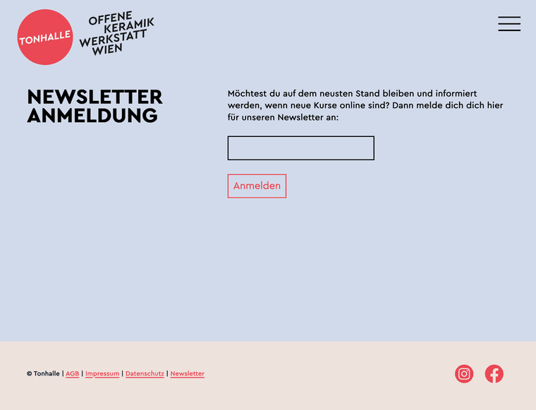
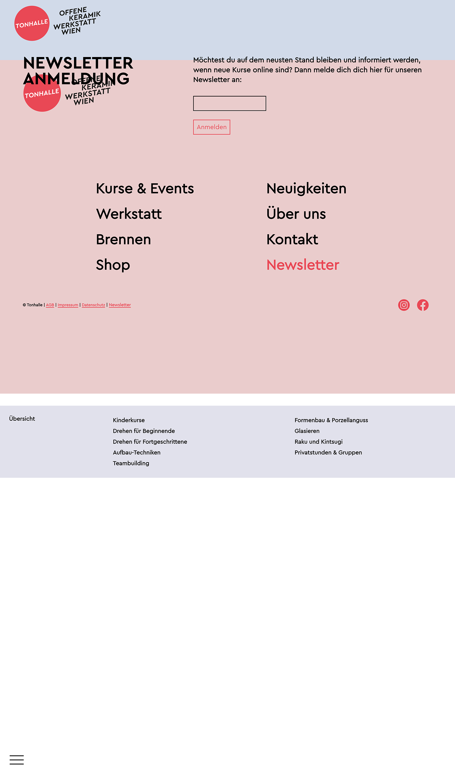
On Chrome, Safari and on my iPhone the Overlay burger isn't positioned floating on the top right, but it gets displayed at the end of the page content. Strangely on one of the pages it works correctly (https://tonhalle.at/kurse/), but on all the other ones it doesn't.
I have to say that there are two overlays on this site, but they both don't work where they should.
Could you please help me @arminunruh ? Thanks a lot!
Attached:
first image: how it should look (and how it does on Firefox):
second image: how it looks on Chrome, Safari and iPhone:


-
Overview page for tags / link to filtered tagsCool, thanks! Let me know if this is implemented some day :-)
-
Overview page for tags / link to filtered tagsThere is a page for each category, e.g. www.mywebsite.com/category/mycategory/
When I open the tags in the backend, there is no possibility to create such a page for each tag. Did I miss something, or is there a reason why it doesn't exist?
Other than that, it would be nice to be able to use an URL for the filtered state.
For example, if my projects are on www.mywebsite.com/projects/ it would be nice to be able to link to something like www.mywebsite.com/projects/?tags=tagone,tagtwo, then showing the page with those tag filters active. Can I create this on my own, @arminunruh, do you have any tips?Thanks!
-
Tags (next project and display of tags)It works with the plugin Taxopress. There is an option for "Terms for Current Post", where you can get a shortcode, which you can put in every project. For me the Shortcode is [taxopress_postterms id="1"].