Hi @mariusjopen
thanks for your message! I don't think I've given individual margins (correct me if I'm wrong tho!).
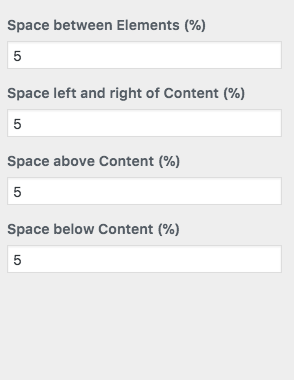
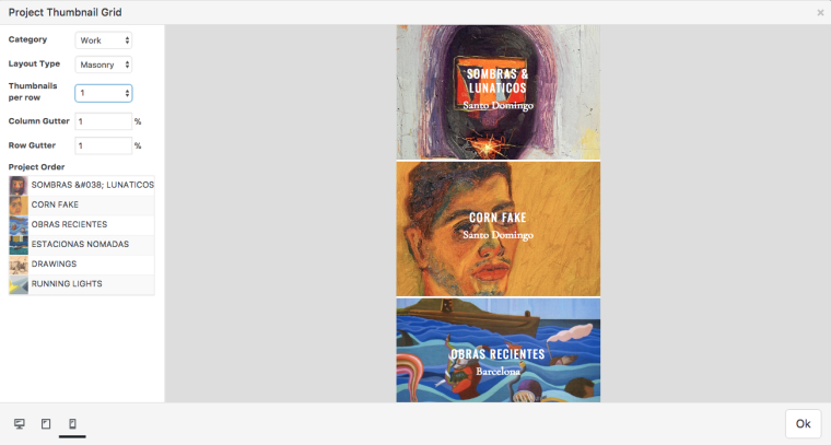
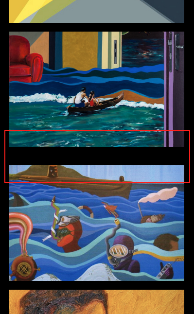
Here is what the mobile space percentage looks like in the customization tool, along with the "Work" category thumbnail grid and Gridder. It seems like the row gutter and spacing % is the same everywhere, so that's why I'm a bit confused as to why there's that random space between the second and third thumbnail. If you could have a look at it, that would be really helpful!
Thank you!


