Here’s another website I smoothly built with Lay:
dmncn
Posts
-
Creative agency -
Clone doesn't workHi Armin,
after the update to v8.3.8 it seems that the Clone button doesn't function anymore.
-
creative director website -
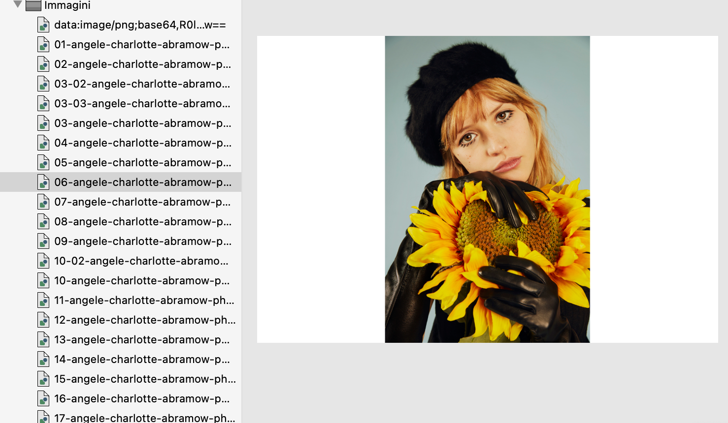
How to make horizontal and vertical images in Carousel have the same sizeI think a workaround was used on the page https://www.charlotteabramow.com/angele/
All the images are the same size (1500x1000 pixels), including the vertical ones, which have blank spaces on the sides.

-
Search resultsYes, because that is a development server and I deleted some images because the storage space was full.
The final site is acastelletti.com, but it is much slower. I think I need to migrate it to run properly
-
Search resultsYes it works!
-
Search resultsOk, thank you
-
Search resultsThe search results look accurate now, thank you!
Will this change be included in the next update? Because in the meantime I have published the site on the final server.
-
Search resultsIt’s checked but it doesn’t work. I can provide wp-admin access if needed
-
Search resultsHi Armin,
what I mean is that if I filter the projects by category, for example Cinema, and then enter one of them, I would like to navigate only through the 10 filtered results, while it currently scrolls through all 75 projects.
The same applies if the projects are filtered by tag or keyword search.
-
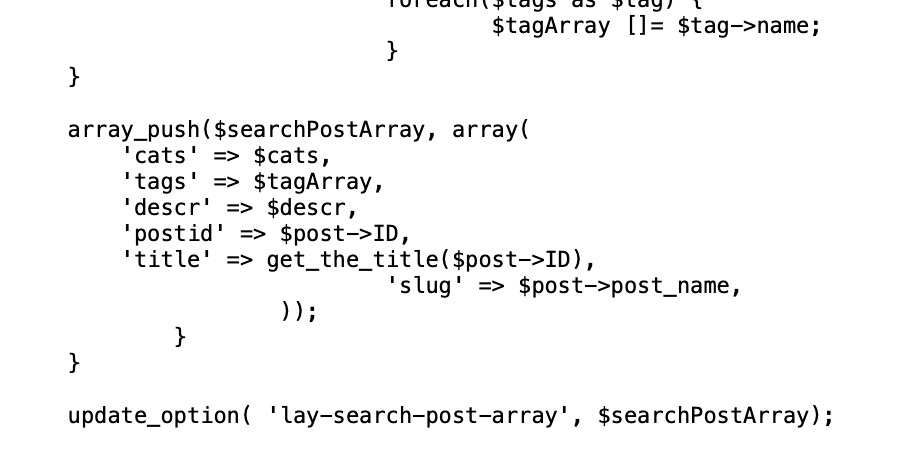
Search resultsLooking at the code of search.php it seems that it searches also in the project description.

Indeed if I search for "butthead" I’ve got the project that has that word only in the description.
-
Search resultsHi, thanks for your suggestion.
I’ve separated the words with commas in some of the project descriptions, like this: “Cantina, dei, Colli, Ripani”.
However, they still don’t appear in the search results as expected :(
It seems the search doesn’t only consider the first word, since there are two projects with the description "Tenuta Cocci Grifoni" that show up for "tenuta" and "cocci," but not for "grifoni".
-
Search resultsHi,
on this site I’m working on, it seems that the search results are not accurate:
acastelletti.demetriomancini.it
The words in red under the thumbnails represent the Project Description for Thumbnail.
If I search for "cantina," I get 15 projects with the description "Cantina dei Colli Ripani."
However, if I search for "colli" or "ripani," only 2 or 1 projects are displayed.
If I search for "spiriti" I get no results, even though there are 2 projects that contain that word in their title or description.
Is this a bug or am I doing something wrong?
FEATURE REQUEST: It would be great if the arrows for navigating between projects would scroll only through the filtered ones
Thanks in advance
-
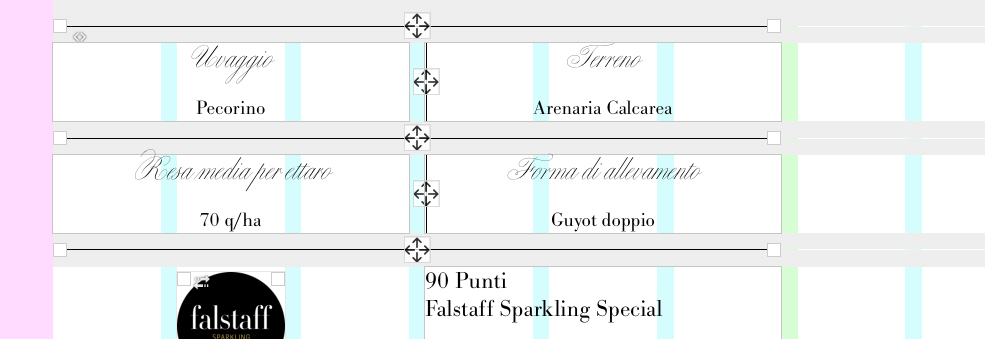
feature request: Snap to the center of the column gutterThe idea came to me while I was working on this layout, with vertical rules separating the blocks of text.

In this case, with short centered text, it’s not a significant issue. However, with longer texts, aligning the vertical line to the side of the gutter might unbalance the overall result. And if there were images instead of text, the vertical line would stick together with one of them.
That said, your idea to align objects to the opposite side of the gutter could also open up new possibilities.
And I totally approve the option to size images by pixel width or height!
-
feature request: Snap to the center of the column gutterIt would be extremely useful to have the ability to align images and vertical lines (and even text boxes, why not) to the center of gutters, in addition to the current option of aligning them to borders. This would unlock new layout possibilities, like placing multiple images side by side in a single row without gaps.
While this can be achieved right now by setting the column gutter to 0 and adjusting the padding of the elements, having a visual alignment option would be a game changer.
-
Website for organic sparkling winesHi,
this is the latest website I made with Lay:
Just the straight theme with some css lines, except the interactive map on the page “The land / Il territorio” that was custom coded (only if viewed from desktop).
-
next project title -
next project titleThanks Armin!
I’m using both: project arrows (the thumbnail on the right) and the project link on the footer
-
next project titleHi,
at the bottom of each project, I would like to replace the “project title” words with the effective name, the one that is stored on the data-title attribute:
https://acastelletti.demetriomancini.it/purgatorio/
Thanks in advance
-
Multiple text area on fullscreen sliderThat’s great, I had never considered this possibility.