Sorted. After the update, links were back set to 1 in the theme customisation options
DoggettJones
Posts
-
Thin lines under my text links which are meant to have no text decoration for links -
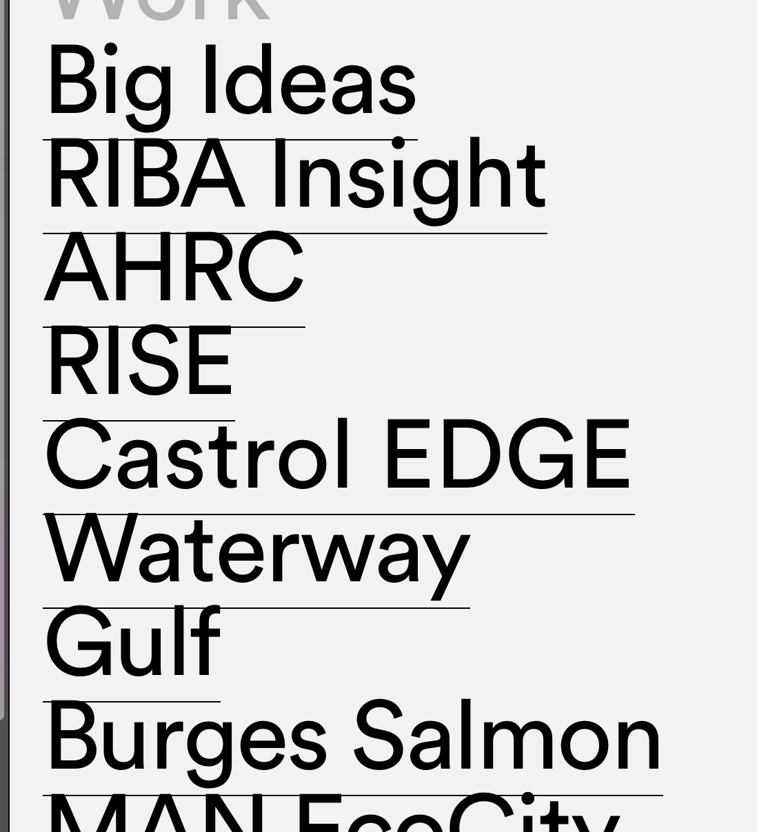
Thin lines under my text links which are meant to have no text decoration for linksI've just updated the them, and now I have thin lines under the text links
https://www.doggettjones.com/work-contents/
Why every time I update I get issues.
-
Full screen slider has stopped workingAnother update appeared. Now it works
-
Full screen slider has stopped workingHi, I've updated wordless and lay theme today, and now Full screen slider has stopped working. No custom cursor shows and the pages are not clickable. It was working fine before I updated. I have no other plugins running. The website is https://www.doggettjones.com/rise
All project pages do not have the slider working. Please advise
-
Mobile view broken since updating Lay theme@mariusjopen Hi, Another update to the theme 2.9.7 was just released. I did that and it has fixed the problem!
-
Mobile view broken since updating Lay theme@mariusjopen Hi, as I developed the site in local by flywheel I'll look to move the site to our web server, and once done send you the details. I have deleted all CSS, deactivated Full Screen Slider and set text with default font and still none of the text boxes are centred in mobile view.
If I delete mobile layout, the view is still messed up. Here's another project page, as you see the text goes to the top when it should be centred.
/Users/Dean/Desktop/Screen Shot 2020-02-28 at 09.19.56.png
Dsamn, I can't attach pictures again to the lay forum!!!! This keeps happeningI'll send you login details once I get the site server side next week, Thanks for giving this your time! I really need help to fix this
-
Mobile view broken since updating Lay themeHi, apologise for so many reply's, just trying to show you all scenarios I've attempted!!
For the mobile layout, I have just tried to set in one gridder two text boxes, one set to centre, one to bottom. You will see from the screen shots that this results in them both being at the top, I've highlighted the text in the safari window that is size for mobile, you can see they are overlaying
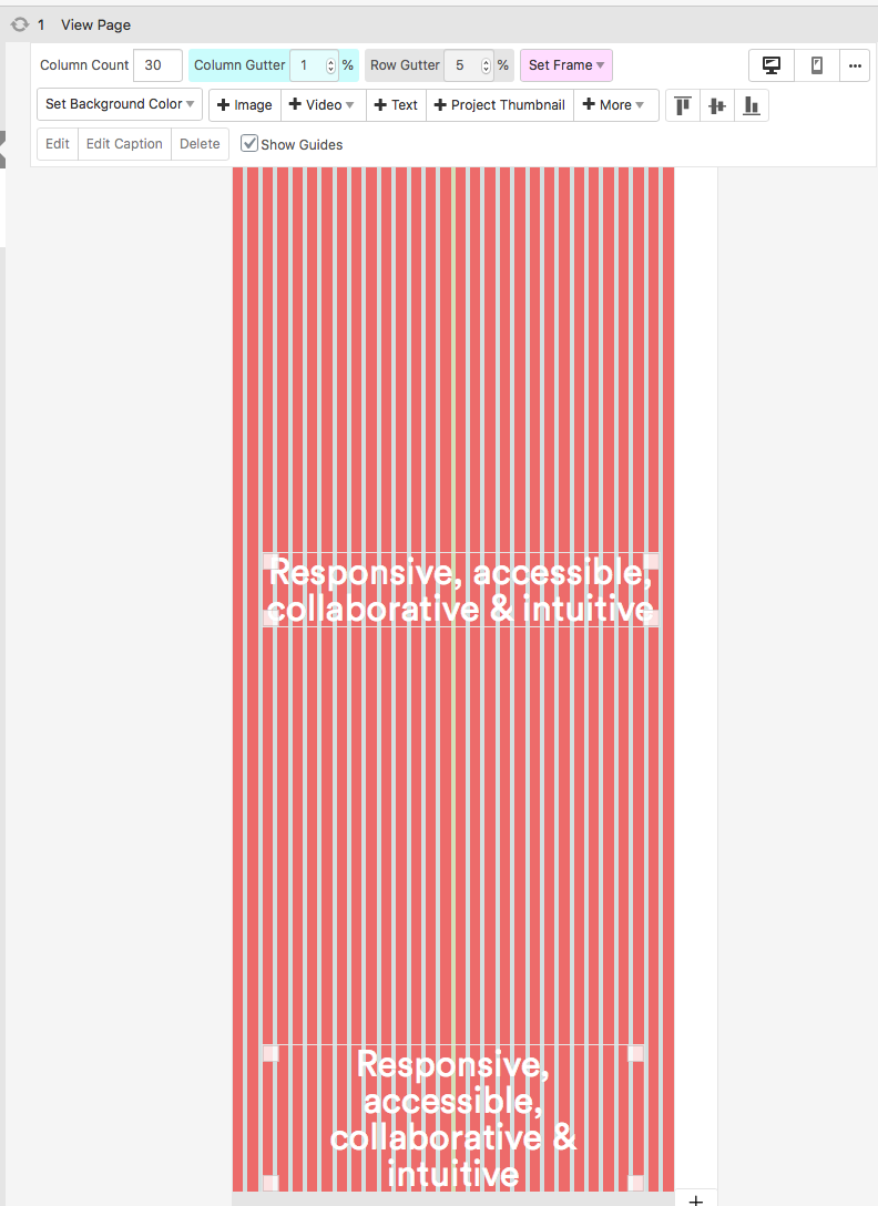
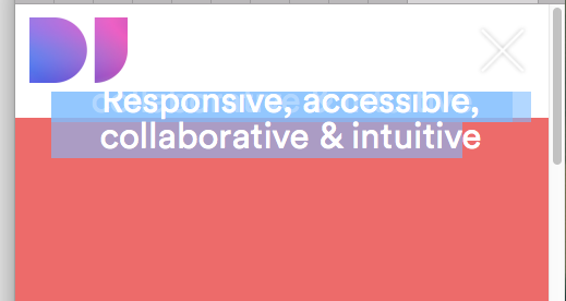
Every page I have created is now displaying wrong for mobile. Even if I delete the layout, then set new mobile layout same as desktop, it displays wrong.
I am in desperate need of help. Can I back grade the plugin? To see if that resolves it?
I appreciate your time. Thank you
-
Mobile view broken since updating Lay theme@mariusjopen The text in gridder is a single text box centred. It is not working and the red should fit to browser window height, that too is not working on mobile. I have hunted high n low and can't work out why it is happening.
I have also created a new page with only a single text box, and remove all custom CSS and as you can see it still is not entering the text box.
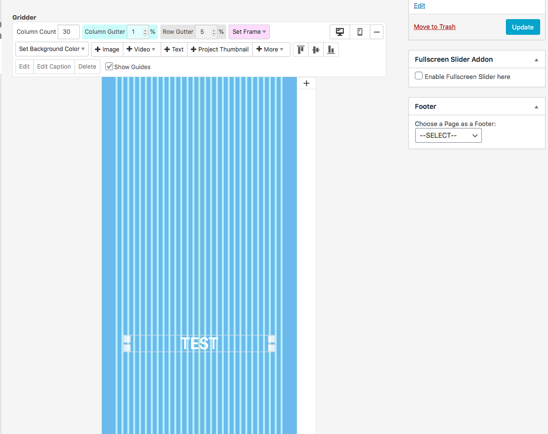
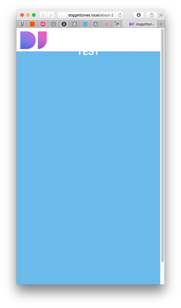
I really hope you are able to point me to a solution!! Thanks in advance
-
Mobile view broken since updating Lay themeHi, in the plugin I have it disabled for phone. It should only be active for desktop. It use to preview correctly when I changed the safari browser window to the size of a phone. How can I view this correctly to be sure it works as expected on mobile?
I have changed the user agent in safari to Safari for iPhone but it still displays all messed up. Please see screen shots. This was viewing fine before I updated to the latest version. I was only 2 versions back before!
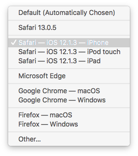
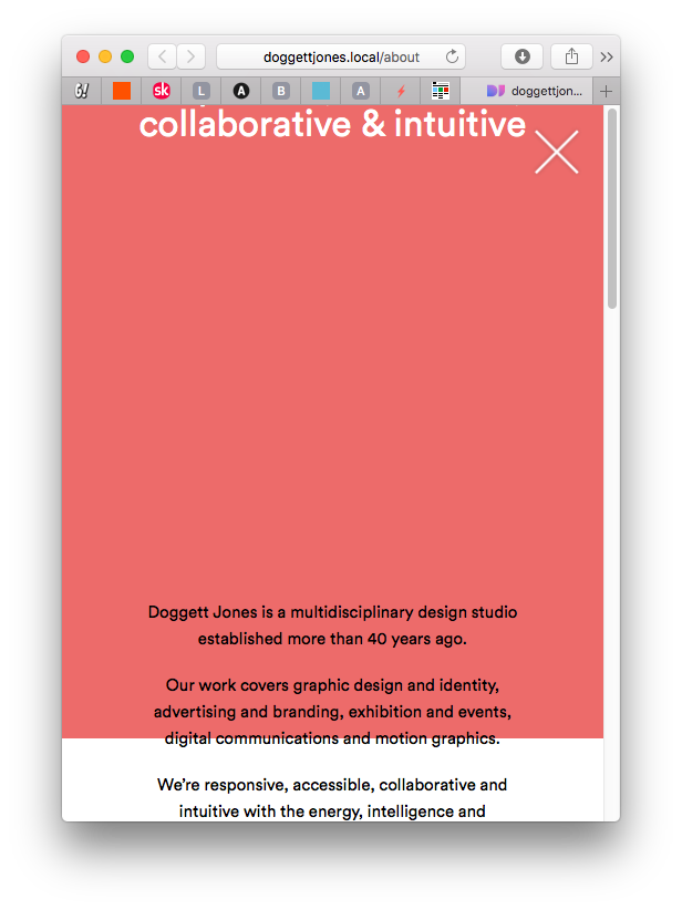
Any advice greatly appreciated.
-
Mobile view broken since updating Lay themeHi
Since the last Lay update, all of my pages are view correctly for mobile layout.
If a text box is set to centre within the full screen gridder the text box is at the top:
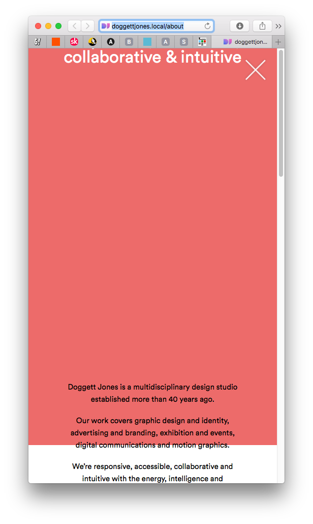
This was previewing in Safari fine before. Any ideas?
Thanks -
Fixed button not on topWith rollovers, I didn't know if it was possible to have say a fade effect, is this already possible?
Thanks
D -
Fixed button not on topHi, thanks for replying.
I worked out how to make the button on top. I had to set a z-index value to the first gridder, so that each one after stacks on top. So by setting it to one, it ensured that all others went as 2,3,4 etc, so having a value set to 100 on my button makes it placed on top.
Your theme is excellent and I'm considering using it for a couple of other sites. Can I ask, do you think rollover transition effects will be added to the theme in the future?
Again, thanks for your support.
-
Fixed button not on top -
Weird code at top -
Fixed button not on topHi. I'm currently developing the site locally in local by flywheel.
Also, apologise but I can't seem to upload images to support this post to you. I keep getting an error as follows:
Can I come back to you in a couple of weeks once I migrate the site to our web space?
-
Fixed button not on topI am attempting to implement a close button as per several previous threads I've read, however, the positioning and size work fine, yet nothing I can do can places the button on top of images placed in the gridder. If I set row image background it appears on top. The problem is the images are awfully cropped in mobile layout, so I just want the images to stack on top of each other in the grid.
How can I make the close button stay on the top?
Here is my CSS:
/* Project Close Button */
.fixed-close-button {
display: block !important;
position: fixed !important;
top: 20px;
right: 20px;
height: 52px !important;
width: 52px !important;
z-index: 1000000 !important;
} -
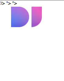
Weird code at topFound it. Its when I added the google Meta tag for my page in lay options. So, how do I add meta tags?
-
Weird code at topHi
All my pages which I am developing locally have this odd code at the top, even on a new page with no content.
I've disabled the fullscreen slider plugin and removed all custom CSS to see if it goers, but it remains no matter what.
I had just updated the theme, is this an issue? See the screen shot below. Its in a bar along the top of every page.
-
position tagline in the right cornerI've removed the tagline and now positioned it as text in a fixed position with CSS.
I've had to set the index at 1000000 for it to appear over the top of all elements in grinder, but is working fine as far as I can tell.
I'm now going to use this method to add a back button on pages as we don't want to use menus.
Thank you.