I have resolved this issue. These elements were being targeted by their ID. In the HTML DOM, the phone layout now appears underneath the standard desktop layout (I am not sure if this was always the case). So, the elements could not be targeted by their ID because they were appearing in the DOM for the second time. That is why the styles were being applied in desktop, but not mobile. Changing them from IDs to a class resolved the issue. Of course this is best practice, but I was unaware that the phone layout is a different set of DOM elements than the desktop layout.
hddunlap
Posts
-
Mobile Styles Not Working -
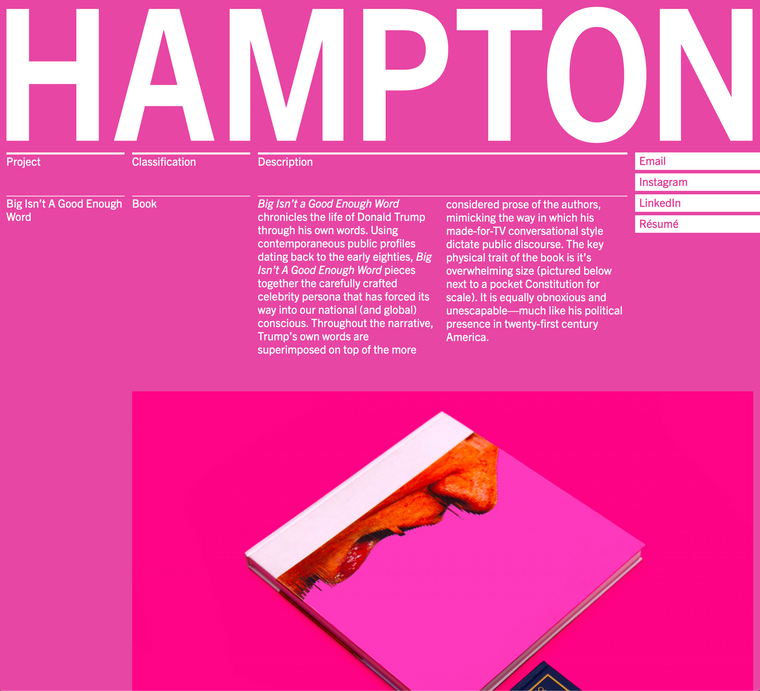
Mobile Styles Not Workinghttp://hampton.design/bigisntagoodenoughword
I am experiencing an issue where styles (which are page-specific and have been applied via jQuery) are not being applied correctly on mobile. What is confusing is that they continue to work fine on desktop (please see screenshots). This is happening across browsers. The issue first started appearing after the most recent update.


-
Mobile Site Broken After UpdateI was able to fix the layout issues be reaffixing position:fixed in the mobile css styles. Page-specific styles, which are triggered via jQuery, are still not working however. It appears the issue is jQuery not working once the browser flips to mobile. Any ideas why this might be the case with the new update?
-
Laytheme V3 footers issueI experienced the same issue. I was able to resolve it by giving the footer a position: relative and a higher z-index.
-
Mobile Site Broken After UpdateI recently updated to the new build of Lay Theme. I just went to my site and noticed that the mobile version is completely broken.
I use custom css to have fixed elements positioned behind the gridder, which I use to show images. While the desktop site still works fine, the mobile site now has elements which were previously fixed that are now scrolling in line with the gridder. There are additional styling attributes which are not being applied either.
What is strange is that it is only certain elements are affected, while others still behave normally. This makes me think that it is an issue with properly targeting the elements, but I have not changed any of the class or ID names.
This issue is occurring across all three browsers I tested: Firefox, Safari, and Chrome.
I do not want to have to completely rebuild my mobile site, so any insight would be helpful, thank you.
-
Carousel Focal PointI am using a full-screen carousel slider with both portrait and landscape images set to full height. It is working well, except for one issue: I am unable to set the focal point of cropped images. Is there any way to manage this? I have tried to use another plugin (wp-smartcrop), but it does not work. For example (view in mobile if possible): http://www.lagabstyle.com/jaylene-for-saturne-mag/
-
Carousel 100vh on mobile not working@melo_lenosier Was this issue ever resolved? I am running into the same problem myself.