hgbnd
Posts
-
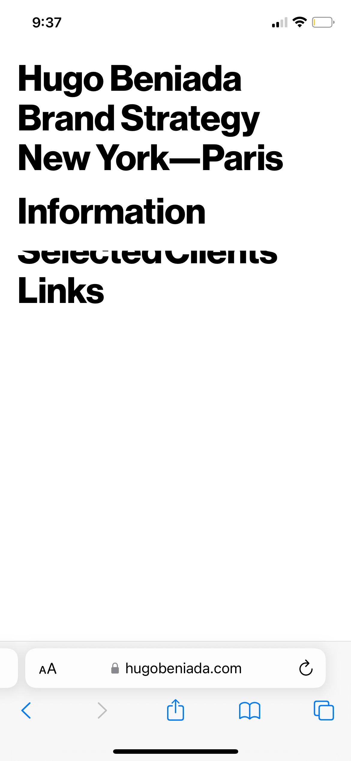
Link cropped on mobile -
Link cropped on mobileThe text 'selected client' is cropped on mobile and I can't figure out why. It's been driving me nuts. Can someone please help?
-
Disable links text hoverHi there,
I love to image hover plug-in but I don't want to use it with links. Just plain text.
Is there a way to keep using it without any sort of redirection? I don't want the text to be clickable.
Page example (WIP): https://bit.ly/3Lr72fr
Thanks!
-
Lightbox Mobile doesn't workHey! Any news on this? It'd be much appreciated.
-
woo commercehey guys,
as mentioned buy many users here, we seriously need a woo commerce integration.
it would make this theme the best ever.
please please please make that possible
-
Drop down menu@mariusjopen Works great now, thank you! However, how do I increase the space between sub menu items?
-
Drop down menuHey @arminunruh, would you be able to help? That'd be highly appreciated. Thanks!
-
Drop down menuHey Armin, I tried to use your code but it doesn't really work on my website. The main menu category slides to the left.

My website is hugobeniada.com
Also, how can I add vertical space between sub menu items?
Thanks so much for your help!
-
About menu type.@pentru Hey! Do you mind sharing your custom CSS for the dropdown menu ?
-
Help needed with a few things: menu and carouselThanks for your help!
I should have read the entire documentation - my bad.
However, when using a custom aspect ratio for the carousel, it applies to both the mobile and desktop versions of the page. Meaning that If I use a 16:9 ratio for desktops, it does the same on mobiles - which makes the carousel looks small.
I'd like to have a 16:9 ratio for desktops and no ratio on mobiles.
Is there any way I can do such thing?Otherwise, what would be the alternative?
Images are either too small or too big on one device, and the opposite on another.
-
Help needed with a few things: menu and carouselHey Armin,
I have been trying to do tweak your theme all by myself but I’m reaching certain limits:
- How can I create some spaces between different elements of the menu ? Here and there are some inspiration.
- I tried but I can’t figure out how to make the background of my About page menu to be transparent on mobile. Or at least the same color as the page background.
- For the carousel, how can I have the vertical images look bigger? Just like for my blog page.
- Finally, Is there a way certain elements or rows can always be centered? No matter what the device or size screen is. As I’m only using one row for my projects, that would be great.
Thanks in advance for your help!
