Website is here: https://www.jack-kimberley.com/index/
when viewed on an iphone the font changes to a sans serif rather than the specified font 'Starling'
Any fixes would be greatly appreciated - thank you
Website is here: https://www.jack-kimberley.com/index/
when viewed on an iphone the font changes to a sans serif rather than the specified font 'Starling'
Any fixes would be greatly appreciated - thank you
@mariusjopen Worked perfectly, thank you so much again for your time
Hi,
I am trying to hide the navigation of a mobile site on the holding page, but it cant get it to work.
The site is pollardstreetprocessing.com . the page that comes up is the page i am trying to hide it on.
i am using the custom css:
.slug-holding_page .mobile-title {
display: none !important;
}
is there something I am missing?
Thanks for your time,
Jack
Hi everyone.
I am having a problem with fixing an element, I have done this in the past and on other lay theme sites but for some reason it isn't working.
Website is here: http://pollardstreetprocessing.com/index-6-2. Password: layhelp
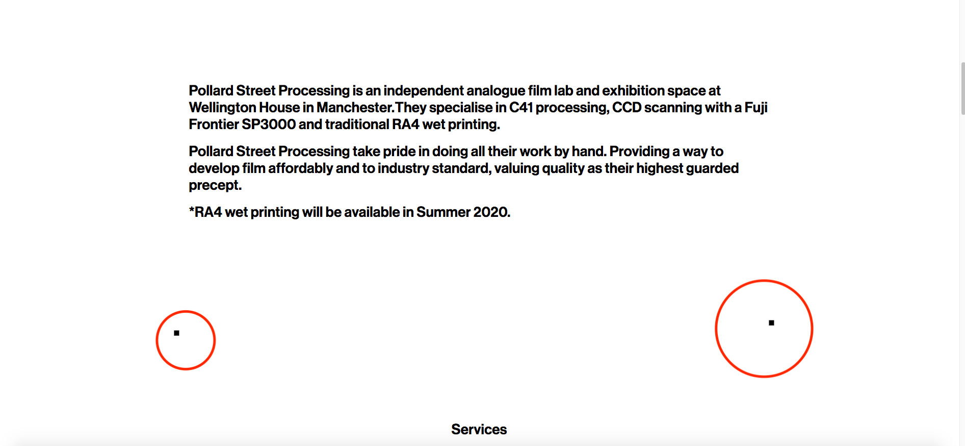
I am trying to get the black square (circled in red) to be fixed in position while the page scrolls, but they scroll with the page instead.
My CSS for the item is here:
.fixed-box-2 {
position: fixed;
bottom: 20px;
right:20px;
z-index: 1000;
}
Positioning is not final, I just want to get them fixed first and I will position them after. Ideally they are positioned where they are now, just fixed 20px from the bottom of the page.
Can anyone help? What am I doing wrong?
Thanks,
Jack
Hi Marius.
This worked perfectly, thank you again for your help. I was making it more complicated than it needed to be.
The single page scroll works with anchor tags and then the custom link menu function.
Thanks so much
Jack
Hello,
I'm having a little trouble with some CSS on a website I'm working on and wondered if anyone could help me please. I am a beginner so apologies if this is basic stuff, but I'm a little out of my depth.
I have a menu that uses custom links to jump to sections of a one page website. I do this with appearance>menus>add menu item>custom link> URL: #05 and then in the source code of the text box in gridder I add <a name="05">anchored item</a> .
However, when I click the menu item at the top and it jumps down the page to the anchor tag, the tagged item appears at the very top of the browser window. I would like to have a little padding between the top of the screen and the tagged item.
I understand from research (google) a good way to do this is the the ::before CSS selector.
for example:
??::before {
display: block;
content: " ";
margin-top: -285px;
height: 285px;
visibility: hidden;
pointer-events: none;
}
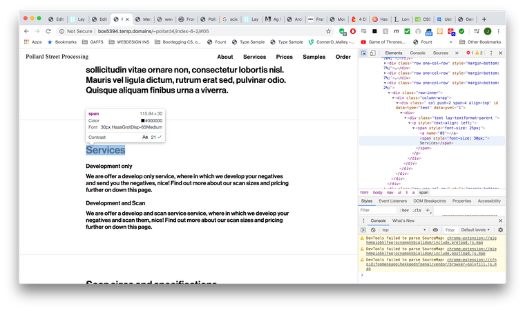
However, when I try to find my anchored item with inspect element I can't see the a class of the item to attribute the CSS above to. Please see my screenshot attached (1) as opposed to how it looks on the Laytheme custom CSS documentation (2)
so as I don't know what the css selector for the item is, my code is looking like this:
body.slug-index-6-2 .WHATGOESHERE?::before {
display: block;
content: " ";
margin-top: -285px;
height: 285px;
visibility: hidden;
pointer-events: none;
}
The webpage is accessable here: http://box5394.temp.domains/~pollard4/index-6-2
password : Layforumhelp
Id appriciate any help very much.
Thanks,
Jack!
[alt text](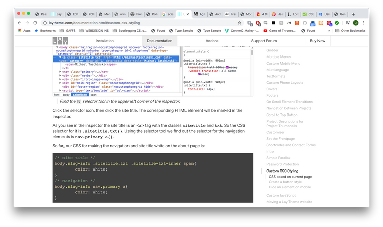 image url)
@Anders @mariusjopen Wow! That worked absolutely perfectly. I wasn't aware of space above and below values! This has worked perfectly. Thank you both so much for your time
Hi Marius.
A link to the (incomplete) site is here :http://box5394.temp.domains/~pollard4
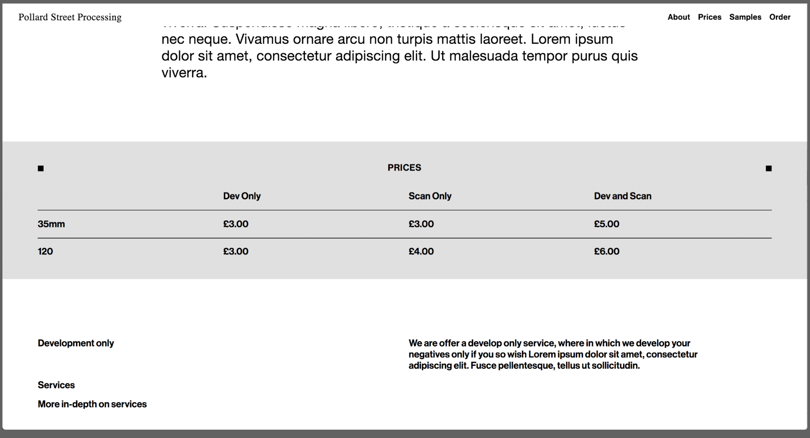
and this image is roughly how I'm trying to get the prices section to look, as described above
Thanks,
Jack
A good example of what I mean would be this website: https://anime-architecture.org/
P.S.
I have tried the stack element but this table requires multiple elements to be on the same row and attached to columns for responsive-ness reasons.
It is also hard to make the table neat enough when using the stack element (as I know it is not intended for this purpose).
Thanks again
Hi guys,
Thanks so much for the theme. Its great and easy to use.
I was wondering if it is possible to add a back ground colour to multiple rows and the row gutter between them?
For example here:
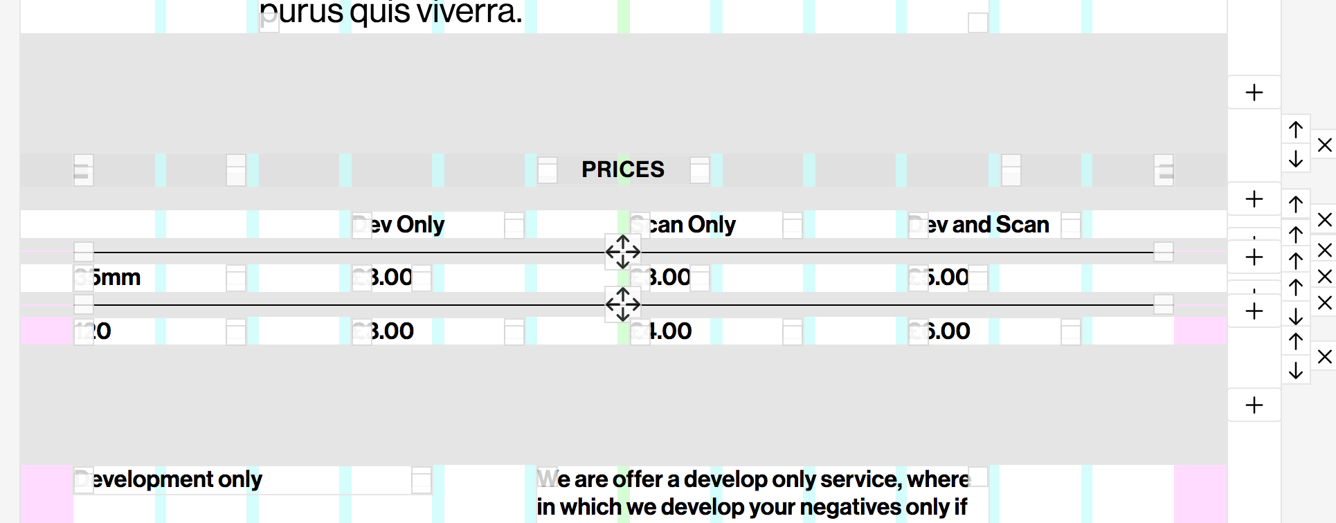
I want to apply a background colour to that entire 'prices' section.
I'm aware I can set background colour of the individual rows, but not the spaces between them. I can also use custom classes and CSS colour the rows, but the space between the rows would still be the background colour of the page back ground.
I want this section to have a big box of colour around it to separate it from the normal page background colour.
Thank you for your time,
Jack