insert love emoji here
J
Jens
@Jens
Posts
-
different links for Project Thumbnail Videos on mobile -
different links for Project Thumbnail Videos on mobileHi @arminunruh!
Thanks for getting back. -Yes, I am using the thumbnail grid. It would be a great feature to have options for the three device types.
-
different links for Project Thumbnail Videos on mobileJust found this thread and was wondering if there are any plans to have a look at this issue?
File size is one aspect. However for me the main issue is that a 16:9 thumb doesn't look good on a 9:16 mobile screen and vice versa.
If there's anything I missed I'd love to be pointed in the right direction. And if not it would be interesting to know how to start tackling this issue. What to look at and where.
I assume this isn't something that can easily be resolved with a bit of css and java?
-
Project Thumbnail Grid: 1 column to 2 column switch / transitionJust had a go and it works like a charm. Vielen Dank nochmal.
-
Project Thumbnail Grid: 1 column to 2 column switch / transitionHi Armin, the forum update went into the spam so I only saw this now.
Thank you so much. Amazing. Sending digital drink your way!
-
Project Thumbnail Grid: 1 column to 2 column switch / transitionUsing the Project Thumbnail Grid I would like to display a button in a row above the grid that will switch the number of columns being used between single and double.
I tried to identify the element that defines the number of rows but wasn't able to do so so far. If you could point me into the right direction that would be lovely.
In case you feel this will be very complicated to achieve please also let me know. I am not a huge expert with web stuff but I get by.
-
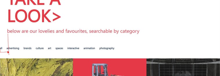
Thumbnail grid, category filter text marginsDear Armin,
many thanks / vielen dank ;)
-
Thumbnail grid, category filter text marginsHi there,
I am trying to add margins to the categorie text displayed, so they sits neatly at the red line i drew. The project thumbnails however should continune to stretch across the full width of the site.
How / where would I go about adding this? Unfortunately inspect did not lead me anywhere useful.
https://www.jensblank.com/projects/#category-all
(site is under construction)
-
Carousel Numbers in the ImageNevermind, just saw the new feature in the options for them to be on the carousel!
Perfect, exactly what I needed.
-
Carousel Numbers in the ImageI just had a look at this thread as I also wanted to have the number appear above the images.
I tried to implement your above solution by altering the frontend.style.css of the carousel. Unfortunately it did not work for me. I tried various things, like replacing and adding to the css. The numbers did always stay at the bottom right. No matter what I tried.
Then again I don't know much about css, but I was hoping you could point me towards the right direction with my issue.
-
Gridder Defaults don't work properlyI have at one point and it kinda shuffled everything around in a very bad way. I've almost finished building my website now so I don't really want to go there again.
Thing is, I followed the getting started video right at the start when I started building my page and it did not work right out of the box. The 'Apply Desktop Gridder Defaults' button was not visible there so I did not check it. Later I did and as mentioned above things went funny.
I did not manage to fix it, just a workaround. I made the menu bar thicker so it gives the illusion that there is more space. However what it really does is simply cover, and in this case crop part of your top video / image as it is in front of it,
Since I don't seem to be the only one with this issue, it would be great to get a reply from an admin here if possible.
-
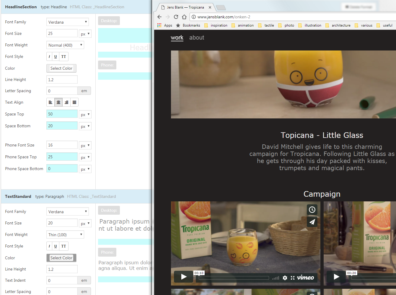
Font Weight not workingHia
I can't get the font weight to work in all its nuances. It seems I have the option between normal and bold. Anything in between does not show up regardless which font I use. Might be that not all fonts have the 'thin' etc. option, but I've tried helvetica and helvetica neue and I am pretty sure those should at least have more than normal / bold.
I've set my standard text to thin and my headlne to normal, yet they appear identical as far as the weight is concerned. I tested in chrome and firefox so far,
Here's a screen with the text formats and the corresponding look on the website.
website is jensblank.com
thanks in advance for any pointers on how to get this resolved
-
Gridder Defaults don't work properlyHi Armin,
first of, thanks for creating this great theme. Kinda put some fun back into something that would otherwise be very frustrating for me.
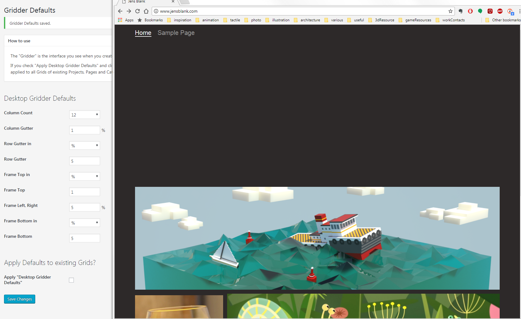
I'm having an issue with the Gridder defaults. I've been following your video tutorial and am trying to increase my frame top space.
However it seems, whatever pixel value I enter the space between my menu and the first row always stays the same. In the example below I exaggerated the value on purpose. But as said as above, it does not seem to matter wheter I enter a value of 1 or 999.
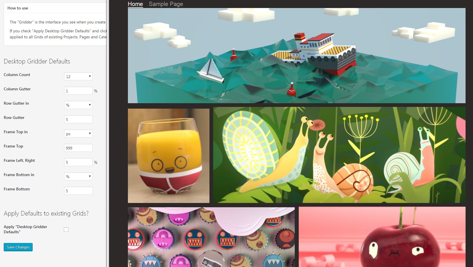
The problem is similar, when I switch to percentage, but the problem seems to reverse. Instead of having a tiny space I get a vast space regardless of the value entered. 1% or 99% does not seem to make a difference. Both values look like the image below.
website is:
Apologies in advance if this is something obvious I have missed. Unfortunately I am far from being an expert when it comes to webdesign.
Thanks in advance for any hints and help
Jens