jmmc
Posts
-
Fixed text in mobile -
Fixed text in mobileHi everyone!
I am trying to get a block of text fixed and I actually managed to get it fixed over desktop and tablet. See here www.joaochaves.co.uk but in mobile it breaks completely and the text goes under the images as well.
I am not super handy in coding, so maybe I am missing something.
What I am using so far is:.textproject{
position:fixed;
z-index:1000;
}I feel like I need to specify something for mobile only but not really sure how.
Could anyone give me any hints?Thanks a lot,
João -
Text at the bottom of the page gets cut when using 1440x900 resolution screenThanks @Richard . Apparently I was using set browser height(...). Once I turned that off it was working fine again! Appreciate the help.
Best,
João -
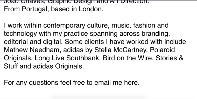
Text at the bottom of the page gets cut when using 1440x900 resolution screenHi everyone, this is an odd one and I only realised when seeing my site on a macbook air. My main laptop is using 1680x1050 screen resolution and the site looks fine, but once I switch to 1440x900 the bottom part of my text gets cut and the is no scroll available to get there. If you enter full screen it sorts it out, but when not in that it doesn't work. Is it a bug? Anyone seen this before?
Site is www.joaochaves.co.uk
Appreciate it
This is an image at 1440 where you can see the bottom text cropped

This is the window full screen
