Hi,
at the time no caching plugin was active, I've send you an email with a lengthy theory what might be going on, and an account to wp-admin
best
Hi,
at the time no caching plugin was active, I've send you an email with a lengthy theory what might be going on, and an account to wp-admin
best
Hey, I updated the theme now, unfortunately the bug still persist:
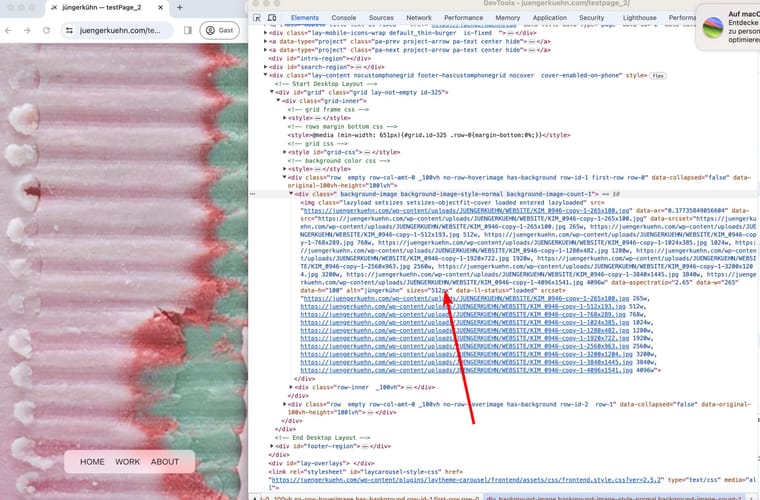
here is a screenshot from the backend aswell; nowthing special: 100vh row and a background image, no custom css applied to the elements.
Link to the original image: https://juengerkuehn.com/wp-content/uploads/JUENGERKUEHN/WEBSITE/KIM_0946-copy-1.jpg
EDIT: I tested also on mac 15" retina display with the same result:
*forgot to include some images:
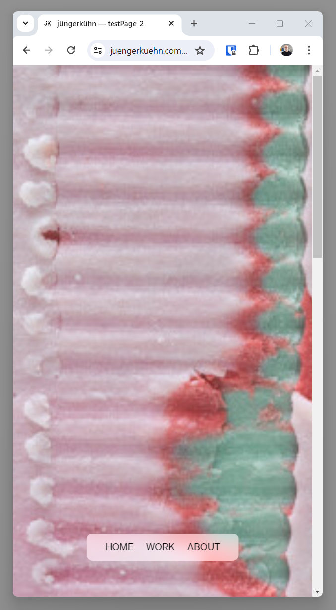
the effect is same for mobile
Hi Armin,
I created the page just for illustration, the other images on the site are not in this vector style, so unfortunately svg is not an option.
here is an example of an more typical image with the same effect.
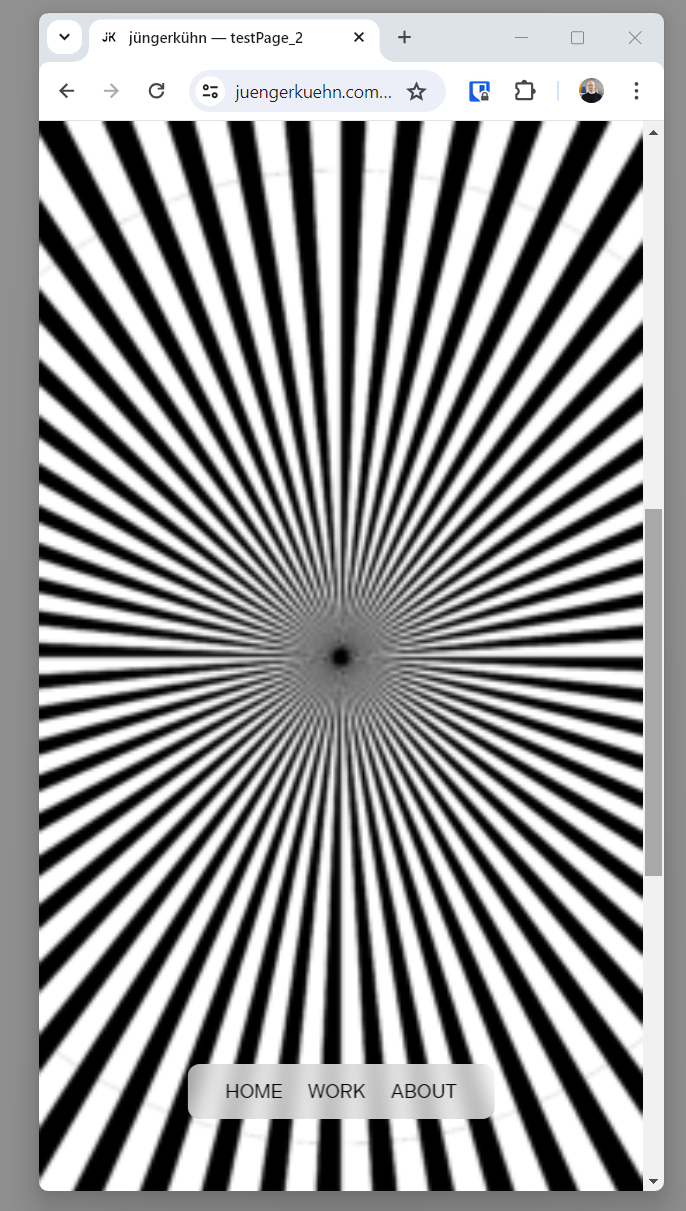
I am on windows and with the most recent version of laytheme and chrome I get the following result with a browser window 500x1000px:
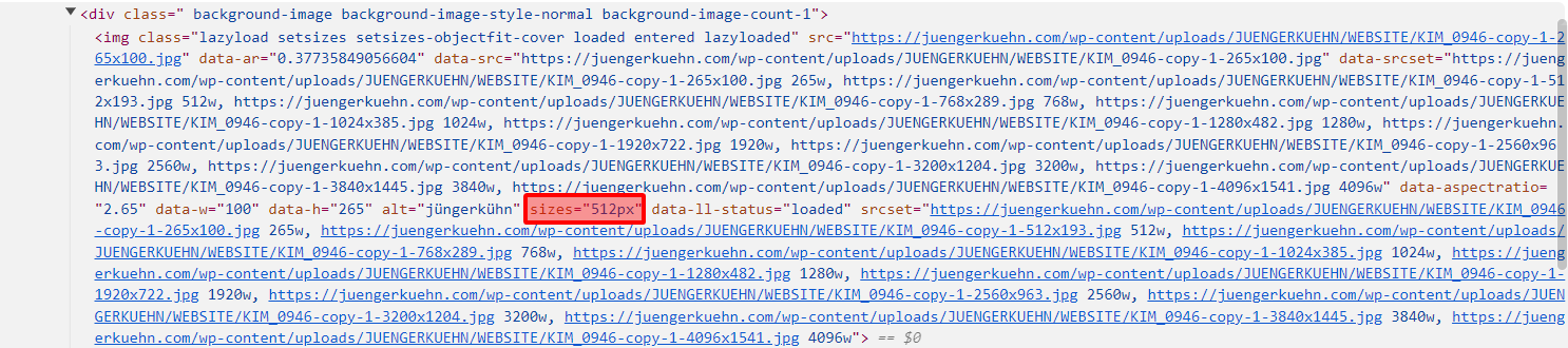
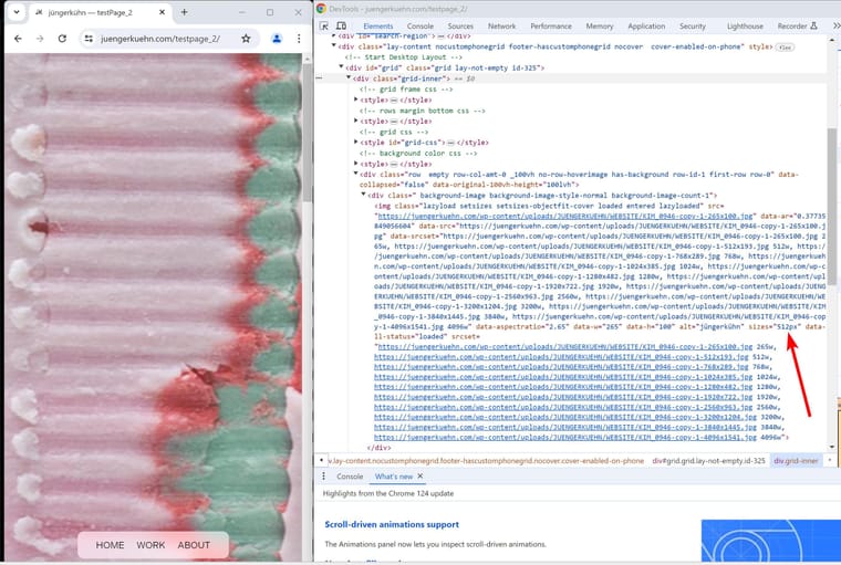
The "sizes" variable does update based on the browser width: when I increase the width over 512px the next larger size (768px) is displayed,
(of course once a larger version has been loaded once it always will display a higher res version so you have to "empty cache and hard reload")
For widescreen images that are "cropped" by a skinny tall browser window or on mobile, "sizes" should be the natural width of the image not the container, I think :-)
best konrad
look at the image, i think the image itself is blurry:
the image is uploaded as 4656x1752px and should be sharp
The slight blur you are noticing stems from the scaling algorithm wordpress uses to create the scaled down versions of the original image. When you are uploading an image, WP creates different size variations that are then displayed based on the browser resolution.
In this case the original image was 4096x2060px and sharp. Since WP uses bilinear scaling as supposed to something like lanczos to generate the smaller sizes they are sometimes blurred (and depending on prior compression even larger in filesize than the original).
Long story short: It's Worpresses fault and its a mess.
you could author Individual images for each sub-size in eg. Photoshop and upload via FTP to your server, but this is pretty elaborate.
Alternatively you could tick the box to never display scaled down versions in the image/media section in the laytheme options, but then always the original image is being displayed which might be quite large/ slow to load.
If you are on windows you could use XL converter to use the pretty new and awesome jpegli encoder to compress images with much less artifacts as usual, with that i recompressed your image from 2.4mb to 580kb with quite ok quality. This could be a reasonable compromise between quality and page speed.
This might be related to this postbut I didn't wanted to hijack the thread
Images set in a ways that they fill their container, like background images are displayed sometimes blurry. This stems from the way the "sizes" variable is calculated in JS. I am not a developer, but I suspect "sizes" is somehow derived from the parent container, then the next larger image size is selected.
This behavior results in a bug for widescreen images that are displayed in a skinny browser window or on mobile. See this site on mobile / skinny tall browser; the size is set by the size of the container/ browser window but the image is scaled to fit resulting in a image width that is actually larger than the container and thus a too small and blurry image is displayed.
Possibly the .naturalWidth function as opposed to the getboundingclientrect might help to get the actual size of the image.
On our site we use background images quite often so it would be awesome to have a fix to it :-)
Wow that was quick! Thank you for the support and frohe Ostern noch :-)
Hi,
this is more of a question: How is image rendering handled in Lay Theme? Besides lazyloading, there seems to be a JS function that only displays the images, once they are fully loaded. Is that correct?
With Jpeg and now with JpegXL progressive loading is speeding up the loading times. Especially with JpegXL you can get a high quality preview at 100kB and the rest of the file is then progressively loaded in. Is there an option to enable the display of images before they are fully loaded?
Thanks
perfect, it works now. Thank you again
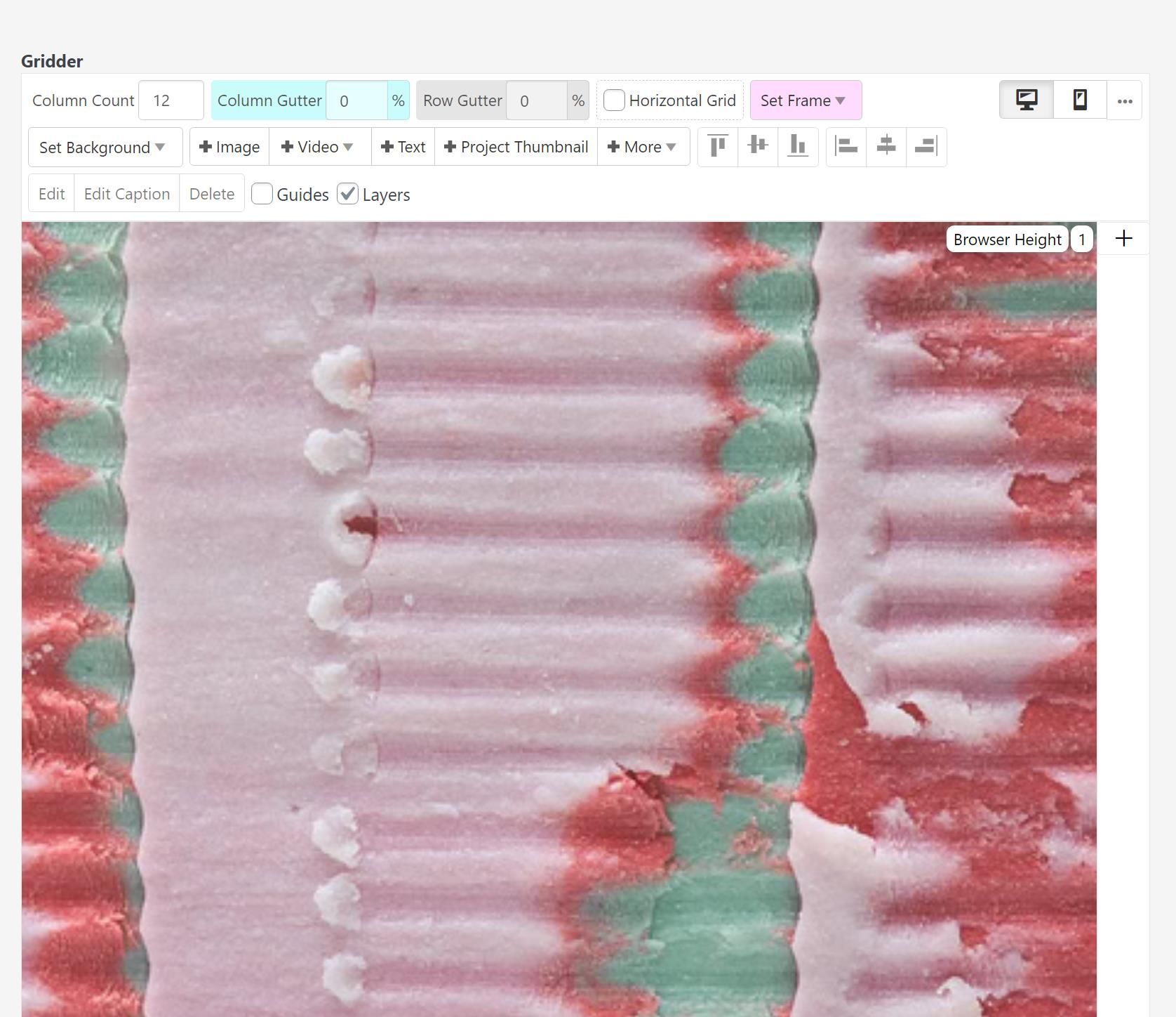
hmm -- even with the simple image ( not background) the browser does often choose a unnecessary large image, I set up a test page : left background image Right: normal image
Hi,
I have the same issue and wanted to add the following:
When setting an image as a column background, the sizes attribute is not set: NaNpx
When setting the same image as a regular image within the column the correct, intended size is updated and the browser chooses the correct image in srcset
["Never show resized versions of your images" was not checked]
as background:
<img class="lazyload entered lazyloaded" src="https://juengerkuehn.com/wp-content/uploads/Untitled-6-265x353.jpeg" data-ar="1.3320754716981" data-src="https://juengerkuehn.com/wp-content/uploads/Untitled-6-265x353.jpeg" data-srcset="https://juengerkuehn.com/wp-content/uploads/Untitled-6-265x353.jpeg 265w, https://juengerkuehn.com/wp-content/uploads/Untitled-6-512x683.jpeg 512w, https://juengerkuehn.com/wp-content/uploads/Untitled-6-768x1024.jpeg 768w, https://juengerkuehn.com/wp-content/uploads/Untitled-6-1024x1365.jpeg 1024w, https://juengerkuehn.com/wp-content/uploads/Untitled-6-1280x1707.jpeg 1280w, https://juengerkuehn.com/wp-content/uploads/Untitled-6-1920x2560.jpeg 1920w, https://juengerkuehn.com/wp-content/uploads/Untitled-6-2560x3413.jpeg 2560w, https://juengerkuehn.com/wp-content/uploads/Untitled-6-3200x4266.jpeg 3200w, https://juengerkuehn.com/wp-content/uploads/Untitled-6.jpeg 3840w, https://juengerkuehn.com/wp-content/uploads/Untitled-6.jpeg 4096w" data-aspectratio="0.75070821529745" data-sizes="NaNpx" data-parent-fit="cover" alt="jüngerkühn" sizes="NaNpx" data-ll-status="loaded" srcset="https://juengerkuehn.com/wp-content/uploads/Untitled-6-265x353.jpeg 265w, https://juengerkuehn.com/wp-content/uploads/Untitled-6-512x683.jpeg 512w, https://juengerkuehn.com/wp-content/uploads/Untitled-6-768x1024.jpeg 768w, https://juengerkuehn.com/wp-content/uploads/Untitled-6-1024x1365.jpeg 1024w, https://juengerkuehn.com/wp-content/uploads/Untitled-6-1280x1707.jpeg 1280w, https://juengerkuehn.com/wp-content/uploads/Untitled-6-1920x2560.jpeg 1920w, https://juengerkuehn.com/wp-content/uploads/Untitled-6-2560x3413.jpeg 2560w, https://juengerkuehn.com/wp-content/uploads/Untitled-6-3200x4266.jpeg 3200w, https://juengerkuehn.com/wp-content/uploads/Untitled-6.jpeg 3840w, https://juengerkuehn.com/wp-content/uploads/Untitled-6.jpeg 4096w">
as regular image
<img class="lay-image-responsive lazyload entered lazyloaded" src="https://juengerkuehn.com/wp-content/uploads/Untitled-6-265x353.jpeg" data-src="https://juengerkuehn.com/wp-content/uploads/Untitled-6-265x353.jpeg" data-srcset="https://juengerkuehn.com/wp-content/uploads/Untitled-6-265x353.jpeg 265w, https://juengerkuehn.com/wp-content/uploads/Untitled-6-512x683.jpeg 512w, https://juengerkuehn.com/wp-content/uploads/Untitled-6-768x1024.jpeg 768w, https://juengerkuehn.com/wp-content/uploads/Untitled-6-1024x1365.jpeg 1024w, https://juengerkuehn.com/wp-content/uploads/Untitled-6-1280x1707.jpeg 1280w, https://juengerkuehn.com/wp-content/uploads/Untitled-6-1920x2560.jpeg 1920w, https://juengerkuehn.com/wp-content/uploads/Untitled-6-2560x3413.jpeg 2560w, https://juengerkuehn.com/wp-content/uploads/Untitled-6-3200x4266.jpeg 3200w, https://juengerkuehn.com/wp-content/uploads/Untitled-6.jpeg 3840w, https://juengerkuehn.com/wp-content/uploads/Untitled-6.jpeg 4096w" data-ar="1.3332435344828" alt="property of juengerkuehn" data-w="3712" data-h="4949" data-id="270" style="aspect-ratio:3712/4949;" sizes="768px" data-sizes="768px" data-ll-status="loaded" srcset="https://juengerkuehn.com/wp-content/uploads/Untitled-6-265x353.jpeg 265w, https://juengerkuehn.com/wp-content/uploads/Untitled-6-512x683.jpeg 512w, https://juengerkuehn.com/wp-content/uploads/Untitled-6-768x1024.jpeg 768w, https://juengerkuehn.com/wp-content/uploads/Untitled-6-1024x1365.jpeg 1024w, https://juengerkuehn.com/wp-content/uploads/Untitled-6-1280x1707.jpeg 1280w, https://juengerkuehn.com/wp-content/uploads/Untitled-6-1920x2560.jpeg 1920w, https://juengerkuehn.com/wp-content/uploads/Untitled-6-2560x3413.jpeg 2560w, https://juengerkuehn.com/wp-content/uploads/Untitled-6-3200x4266.jpeg 3200w, https://juengerkuehn.com/wp-content/uploads/Untitled-6.jpeg 3840w, https://juengerkuehn.com/wp-content/uploads/Untitled-6.jpeg 4096w">
@paulcalver May I ask how you serve avif, or what plugin you use?
Thanks!