Hello Armin,
YES!! I cant believe I missed it, it was right under my eyes.
Thank you so much for your quick reply.
I designed the website in 2020 and I forgot what was part of the original wordpress and what was a plugin. That plugin definitely got me confused.
Have a nice day!
Mariannep
Posts
-
Thumbnail Grid : How do I put classify my projects in different categories ? -
Thumbnail Grid : How do I put classify my projects in different categories ?Hi everyone,
I feel like I'm missing a piece of information and I don't know how to google it to find the answer I'm looking for !
I watched the tutorial to create a thumbnail grid and it's perfect, it's exactly what I need.
However, I need to create three pages for threee types of projects ("PRESSE", "PROJETS", "MOBILIER").
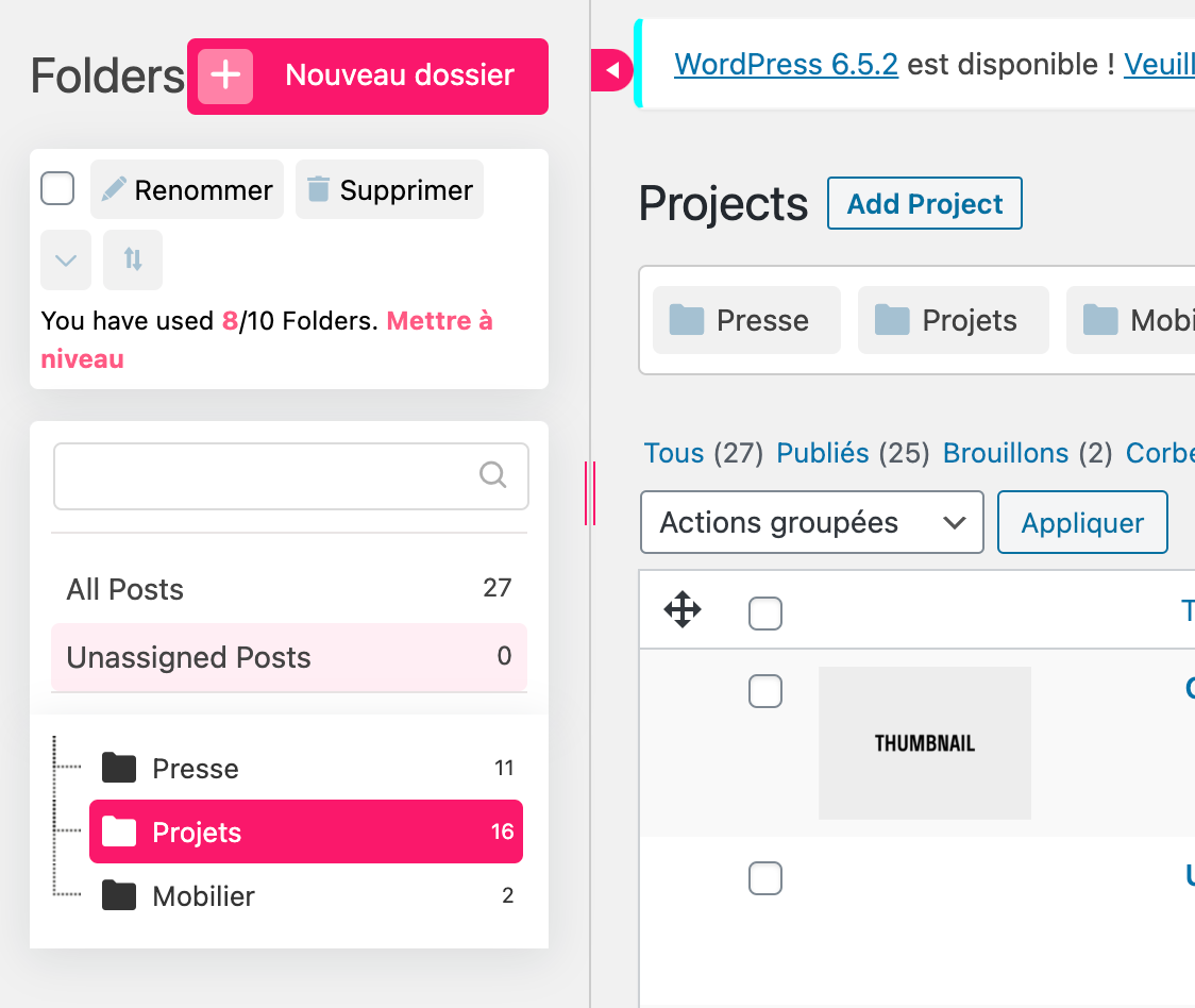
My projects are already dispatched in folders with those names in the project area on wordpress.
My issue is when I select "Show projects of category", it seems like all my projects are in the same category ("PROJETS"). All the other categories appear as empty, and the "PROJETS" adds all the thumbnails mixed together.
I'm at a loss ... Where should I specify which project belongs to which category?
I tried adding etiquettes but it doesnt seem to be working.
Thanks ! -
Strange behavior of "Use Browser Height for Row Height" on mobileHello Richard,
Thank you for your reply!
I'm working mostly on Chrome, but I tested it on Safari and Firefox and the issue is the same. I did not install the last update yet because ... I was afraid of losing my design and didnt think I would need it because it's almost finished :(I found a temporary solution by using a "translate" function on CSS, but since I wont be the one to update the website I'm worried that it wont work for every case.
Removing the CSS doesnt seem to change anything - the space is still happening on mobile.
However, when I dont use "use browser height for row height", the space disappears on mobile! Is there a way to disable "use browser height for row height" on mobile? I tried to find it in CSS but I couldnt...Thanks for your help,
Marianne
-
Strange behavior of "Use Browser Height for Row Height" on mobileHello !
I'm working on a website where I would like to start some pages with a row that uses "Use Browser Height for Row Height", like here :
http://gautyqi.cluster030.hosting.ovh.net/gabarit-projet-2
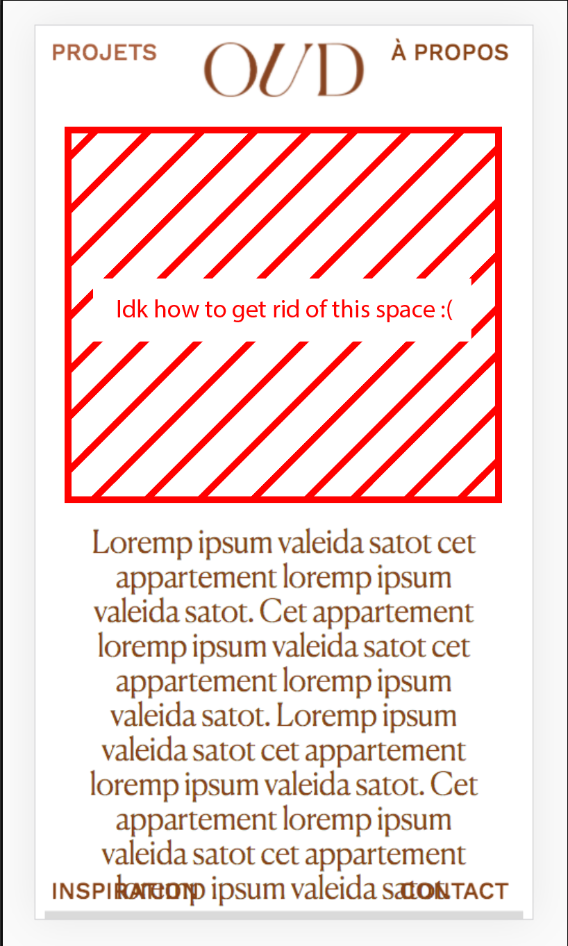
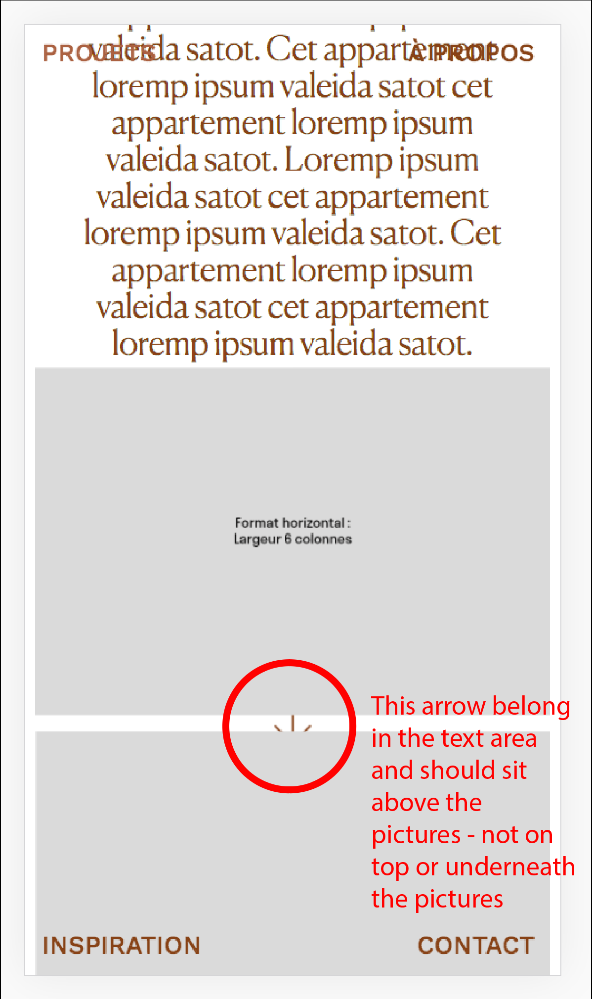
My probleme is that on mobile, the text that's supposed to be in the middle of the browser get moved to the bottom of the page - and the images that follow appear on top of the text area !
Like this :
It might come from a part of my custom CSS - but I couldnt pinpoint the source of the problem.
Has anyone encountered something similar?Thanks,
Marianne -
Text in front of Carousel@Richard-K Hi Richard, it's me again!
I found a solution by browsing the forum.
I added a class "hide-row" to the row where I put my text, and in the CSS I wrote :.hide-row { height: 0px; }It works pretty well, however it would be even better if there was a way to make sure the text is always centered in the browser height - right now it's not the case because it's positioned with the offset measures.
If anyone has found a solution, it would be great to read about it! :) -
Adding color to a row gutter / adding a title to a carousel@Richard-K
I wrote a first answer then deleted it (I had not activated the custom phone layout option and didnt understand why I wasnt seeing the little phone/desktop buttons).
So now your solution works perfectly. Thank you!! -
Text in front of Carousel@Richard-K Hello Richard,
So sorry for replying so late! I missed your message before going on vacation.
I did remove the text to be able to show a "cleaner" preview to my client, but I am still trying to find a way to make it work.
I added the text back - and the white row underneath is back too:
http://gautyqi.cluster030.hosting.ovh.net/I found a way to get rid of the little piece of html for the white version of the logo that was still underneath the main row.
Thanks again, best,
Marianne -
Adding color to a row gutter / adding a title to a carouselHello,
it's me again ! I'm working on a website and I'd like to put a carousel with a title above it and captions underneath - and this needs to be on a strip of color.
Like this :
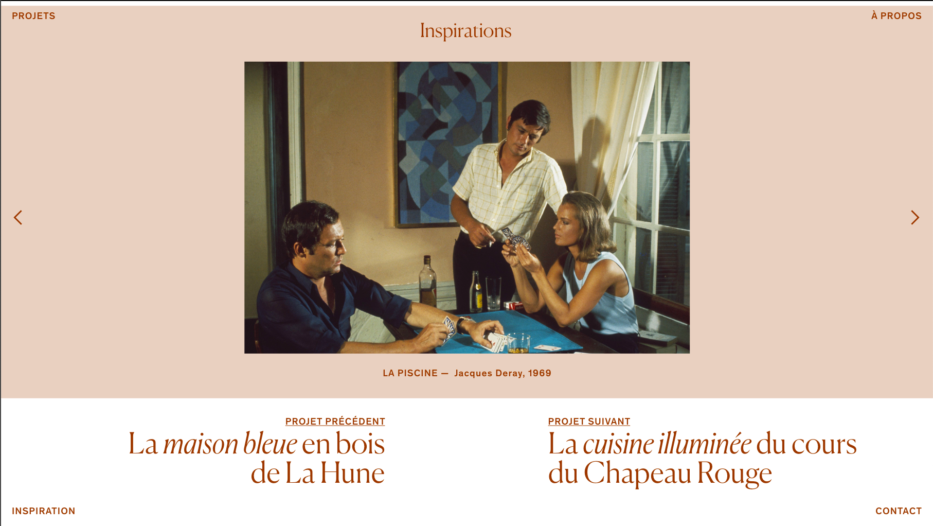
I used a row for the title "Inspirations", and a row for the carousel, then I set the row gutter between these two rows to 0. My problem is that on the mobile version, the row gutter goes back to 5px or so, and a white strip appears between the two rows, like this :
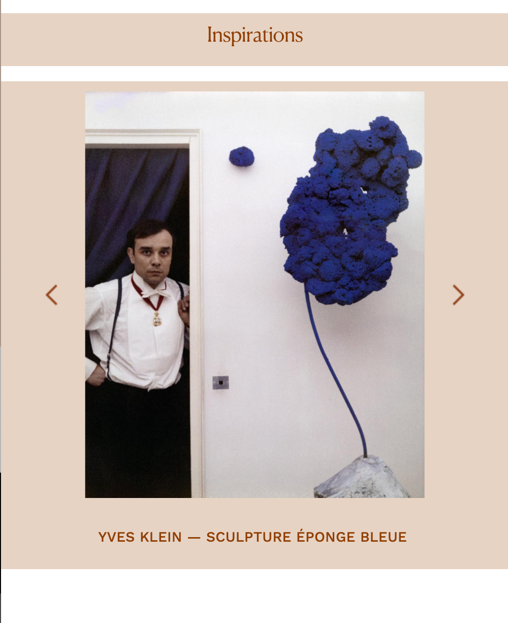
Does anyone have a hint on how to solve this problem?
I have tried making the row for "Inspiration" white, and offsetting the word "Inspiration" tu "push it" just above the carousel, but on mobile the word appears outside of the color stripe.
Thanks in advance!
-
Mobile Menu in four corners of screen@Mariannep Nevermind, I found the solution !
I only needed the following CSS :
/* POSITION MENU 4 CORNERS*/
/* PROJET*/
#menu-item-41 {
position: fixed;
top: 10px;
right: 10px;}
/A PROPOS/
#menu-item-40 {
position: fixed;
top: 10px;
left: 10px;}/CONTACT/
#menu-item-52 {
position: fixed;
bottom: 10px;
right: 10px;
}/INSPIRATION/
#menu-item-176 {
position: fixed;
bottom: 10px;
left: 10px;}
I dont know how I didnt find this solution earlier.
-
Mobile Menu in four corners of screenHello !
I am currently working on a website where the 4 big "categories" are accessible through 4 buttons on the corners of the browser page :http://gautyqi.cluster030.hosting.ovh.net/
In the mobile version, I would like to keep these buttons in the four corners - and not have them in a hamburger menu.
In Customize > Mobile > Mobile Menu, I selected the "Desktop menu style" to have the four buttons visible.
My problem is that I dont know how to position these elements to have them stay each in their corner. Right now, as you can see, I have managed to put them in the general area where they should be by "pushing them" around with margins... but it's not really working.
I looked at leberg.com because they have the exact menu that I'm trying to make. It seems that they put the top buttons in a div called "navbar-mobile-top" and the bottom buttons in a div called "navbar-mobile-bottom". I wanted to try that, but I'm not sure how to implement these HTML elements in the code.
Did anyone stumble upon the same question? What would be the best way to do this? Would it be possible to maybe... delete the menu specifications in the mobile CSS to have the desktop menu by default?
Thanks in advance !
Marianne -
Text in front of CarouselHello @Richard-K ,
thank you for replying so quickly!
This is the website I'm currently working on:
http://gautyqi.cluster030.hosting.ovh.net/On a side note :
I was thinking that maybe it would be better to use the "full-screen slider addon" instead of the carousel addon. But I found a piece of CSS/HTML that allows me to have the logo in white only on that page, and I didnt dare to disturb what I had already achieved.
In the row below the carousel row, I have this piece of code:<!doctype html>
<style>
.sitetitle img {
content: url(http://gautyqi.cluster030.hosting.ovh.net/wp-content/uploads/2020/12/OUD-LOGO-BLANC.png);
}
</style>This may be part of the problem?
Thanks a lot,
Marianne
-
Text in front of CarouselHello everyone !
I find myself in the same situation as @TE for a website I'm working on : I would like to have a text in front of my full-page carousel. I have managed to put the text on top following your recommandations, but I cant find a way to get rid of the blank space below the carousel either.
By any chance, did anyone here manage to solve this problem?Thanks in advance !