Looking for Help with a portfolio website for an artist
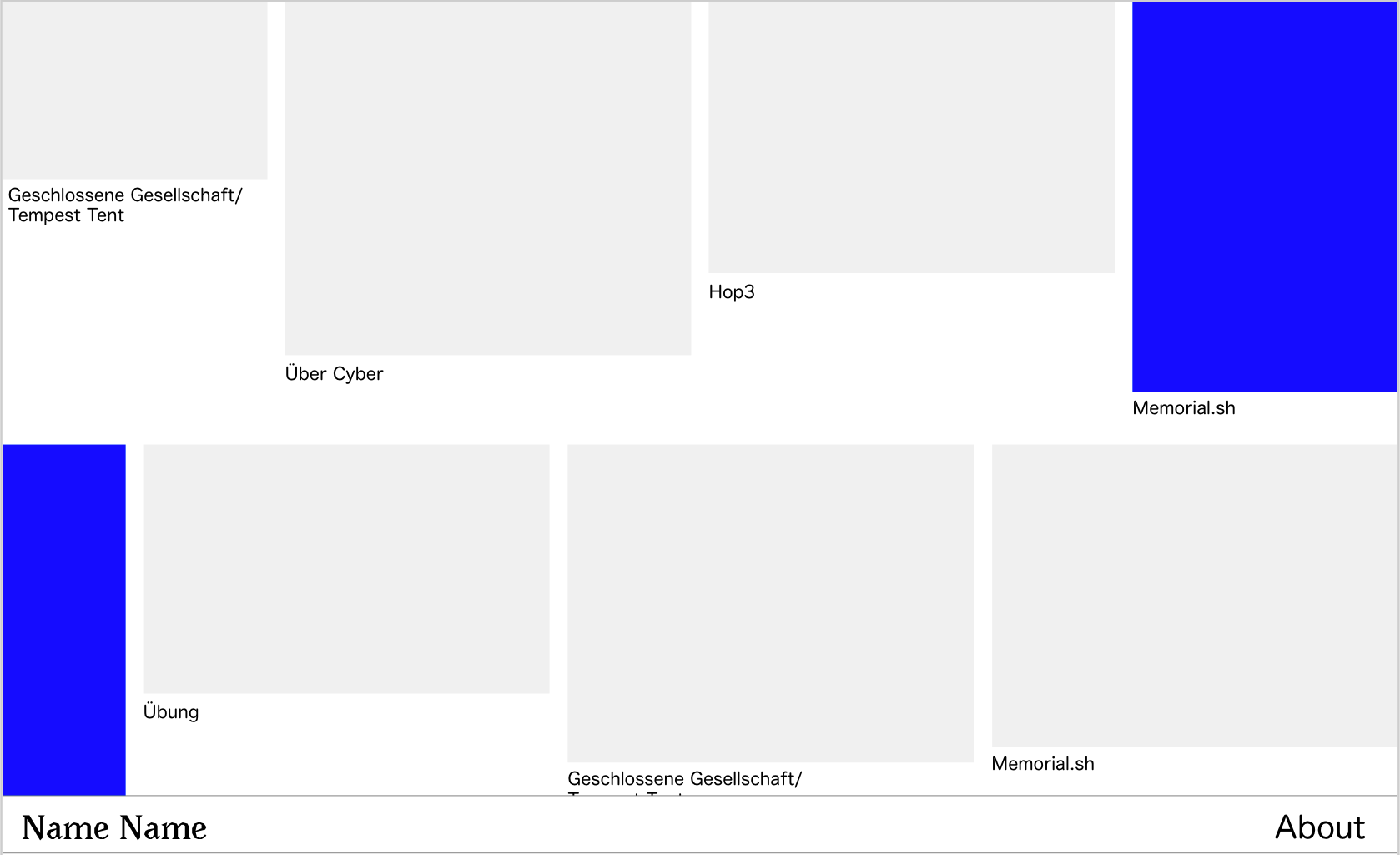
Idea: The idea is to have a horizontal grid, where the last image overflows the width of the page and is repeated in the next row (the part that is cut-off.
The sketch aims to illustrate this. The blue rectangle is one example of an image that is "bigger " than the page width and therefore is repeated in the next row...
(payed job, of course)

Thank you!
best
Marius