panteley
Posts
-
scroll slider -
scroll slider@arminunruh waiting..
-
scroll slider -
scroll slider@panteley said in scroll slider:
one more issue:
The Website Title or Logo does not display at all on mobile if:
The page uses the Scroll Slider Addon, even if on the addon settings I have 'Always disable for phone' Checked on, if I turn that off, the logo/site title shows up.(check on phone)
update: neither the mobile menu isn't displayed when the addon is active
@arminunruh just don't foget this :D
-
scroll sliderone more issue:
The Website Title or Logo does not display at all on mobile if:
The page uses the Scroll Slider Addon, even if on the addon settings I have 'Always disable for phone' Checked on, if I turn that off, the logo/site title shows up.(check on phone)
update: neither the mobile menu isn't displayed when the addon is active
-
scroll sliderFirst of all, well done on such an amazing work with the scroll slider, 👏
I just added it on my website, and I have only two small things for a feedback.
-
When you resize the browser screen to mobile than revert it to normal view, the images get smaller.
-
I use also on the same page the 'Use a Lightbox for this Page', and maybe it is intentionally but with only the 'Scroll Type: Infinite' selected, it doesn't work to click on pictures.
Thank you,
Best, -
-
(sUGGS.) Load More for project indexHi,
I think would be a good thing to add some sort of 'Load/Show More' for the Project Index,
Would be useful on cases when you have lots of rows in the index (like here for ex.) , but you want to set a limit on how many will be displayed initally, so it doesnt take a lot of real estate at first visit,
Just an idea to consider,
Thanks :) -
super slow 'add to card' processHeyy, thank you a lot for the answer.
I went throughout the steps, and it was a plugin (Not Lay ones) that was causing that issue.
Arigato
-
super slow 'add to card' processHi,
Any idea why the 'Add to cart' take so long inhere: https://www.shkodraelektronike.com/shop/
Thanks,
-
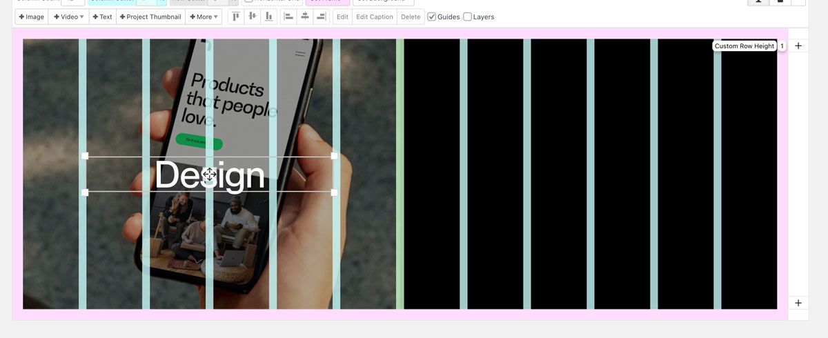
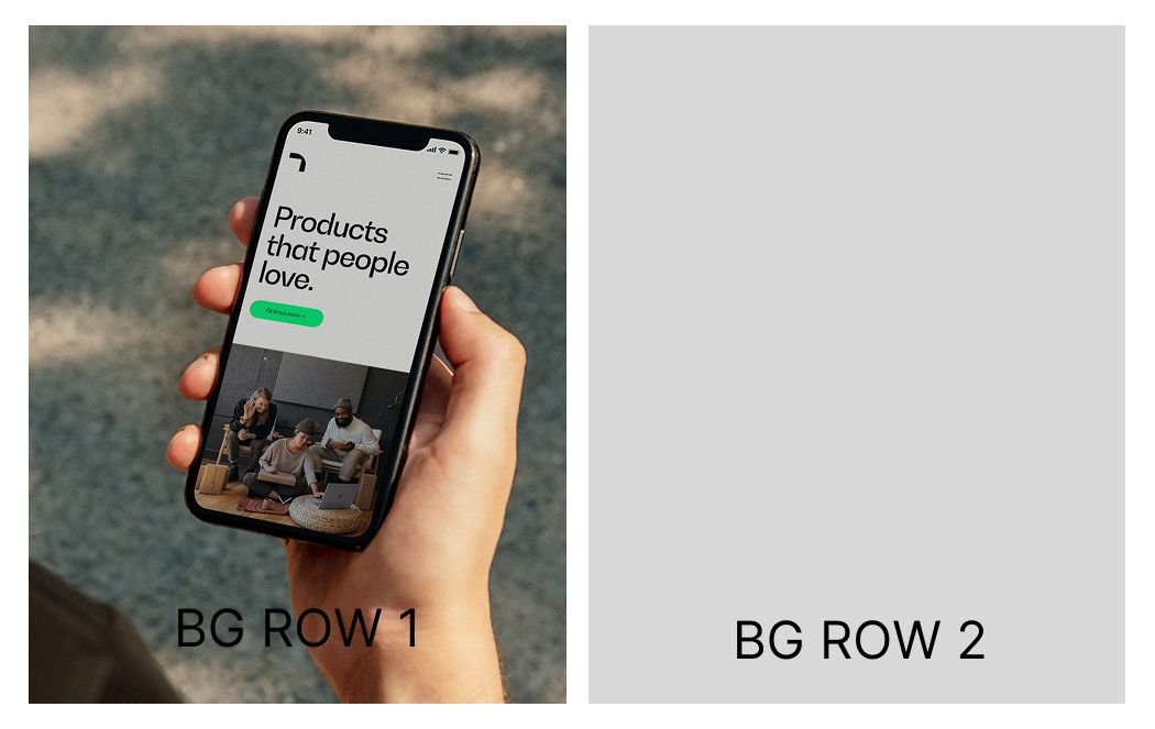
Left/right background image to have marginsHi there,
I was wondering, doesn't like make more sense when you want to have in the same row, Left and Right background image, for it to contain the margins and the space set in between as in the Editor mode?
-
focing another link to a project with disabled linkHi,
Now that there is this capability to disable the link of a project, is it possible to force it with another link?
-
on hover images are blurredHi,
Just updated to 8.0.0 coming from 7.7.4 and I noticed that in the overlay menu, where I have Hover image for the menu items, are now a bit blurred, not in full quality as it previously was.
Here is the website. [menu]
Thanks,
-
split left & right backgroundVery much appreciated!
-
split left & right backgroundHi,
How can I split or at least create a certain px space between these two background rows?
Thank you,

I'm using this CSS to create 8px space on both sides
.bg { left: 8px!important; margin-right: 1%!important; width: 99vw!important; } -
[FIXED] wp editor shows generic font after changing domain[FIXED]
Use a plugin like Better Search Replace:
- Install and activate the plugin.
- Search for your old domain (e.g., old-domain.com) and replace it with the new one (new-domain.com).
- Test it with the dry run option before executing changes.
-
[FIXED] wp editor shows generic font after changing domain*beside reinstalling the font, bc i have to many of them (+font formats etc.)
-
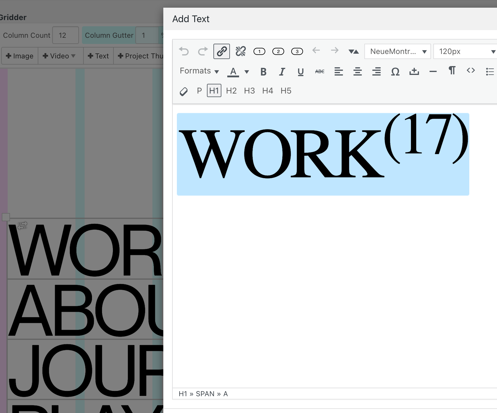
[FIXED] wp editor shows generic font after changing domainHi,
Recently I have moved[changed] couple of domain names running Lay Theme. Although almost everything went smoothly, the only thing seems to break is the font on editor.
Is there anyway how to 'bring back' showing the right font even while editing?
Thanks,
