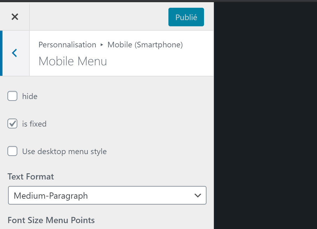
Yes, in the customize panel, go to Mobile (smartphone) > Mobile Menu
The checkbox "Use desktop menu style" should be there
Yes, in the customize panel, go to Mobile (smartphone) > Mobile Menu
The checkbox "Use desktop menu style" should be there
After looking into it. There doesn't appear to be an easy way to enable this via third-party plugin without basicaly copying entire files, disabling natives classes and use the extended ones. Which wouldn't be update friendly anyway.
Would really appreciate if this could come in a future update.
It's should be a 10 lines update max (adding checkbox and everything) and this could be the result.
.
Would just need to add this option in layoptions.
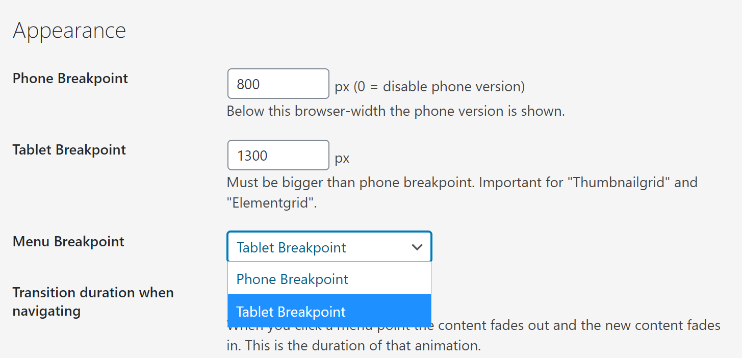
Then in the git diff shown above, instead of directly changing phone to tablet, use get_option('menu_breakpoint', 'default') option to use appropriate breakpoint.
This would be pretty neat I think.
From what I've seen it doesn't break page layout if you keep those options in wp_localize_script( 'frontend-app', 'frontendPassedData', <options>)
(just as in the git diff)
'breakpoint' => MiscOptions::$phone_breakpoint,
'tabletbreakpoint' => MiscOptions::$tablet_breakpoint,
Same problem, I have a pretty large menu.
Idealy I would be able to either set a custom break-point for the menu OR state that I want the burger style menu to start from tablet breakpoint instead of mobile.
This way I could have an adaptive layout for content : desktop > tablet > mobile.
But a menu that goes directly to desktop > burger style, starting from tablet breakpoint.
UPDATE : I have been able to do exactly that by changing just four lines of code in the theme
Desktop layout | Tablet layout | Phone Layout |
---|---|---|
Classic Menu | Burger Menu | Burger Menu |
This is a bit "rough" but adding a checkbox would be a piece of cake.
This is the git diff for current changes
I will also try to make a snippet that you can add to custom plugin that i'll use in case you don't intend to implement it.
warning: LF will be replaced by CRLF in themes/lay/customizer/css_output.php.
The file will have its original line endings in your working directory.
warning: LF will be replaced by CRLF in themes/lay/frontend/frontend.php.
The file will have its original line endings in your working directory.
diff --git a/themes/lay/customizer/css_output.php b/themes/lay/customizer/css_output.php
index b793d93..570ab02 100644
--- a/themes/lay/customizer/css_output.php
+++ b/themes/lay/customizer/css_output.php
@@ -564,7 +564,7 @@ class CSS_Output{
// mobile menu fontsizes
$mobileStyles .= CSS_Output::generate_css('nav.mobile-nav li a', 'font-size', 'mobile_menu_fontsize', Customizer::$defaults['mobile_menu_fontsize'], '', 'px');
- $breakpoint = get_option('lay_breakpoint', 600);
+ $breakpoint = get_option('lay_tablet_breakpoint', 600);
$breakpoint = (int)$breakpoint;
$tablet_breakpoint = get_option( 'misc_options_textformats_tablet_breakpoint', 1024 );
@@ -1159,4 +1159,4 @@ class CSS_Output{
}
}
-new CSS_Output();
\ No newline at end of file
+new CSS_Output();
diff --git a/themes/lay/frontend/frontend.php b/themes/lay/frontend/frontend.php
index b3a177d..c984660 100644
--- a/themes/lay/frontend/frontend.php
+++ b/themes/lay/frontend/frontend.php
@@ -414,10 +414,10 @@ class Frontend{
echo
'<!-- lay media query styles -->
<style>
- @media (min-width: '.(MiscOptions::$phone_breakpoint+1).'px){
+ @media (min-width: '.(MiscOptions::$tablet_breakpoint+1).'px){
'.MediaQueryCSS::$desktop.'
}
- @media (max-width: '.(MiscOptions::$phone_breakpoint).'px){
+ @media (max-width: '.(MiscOptions::$tablet_breakpoint).'px){
'.MediaQueryCSS::$phone.'
}
</style>';
@@ -712,7 +712,7 @@ class Frontend{
'misc_options_thumbnail_video' => $misc_options_thumbnail_video,
'misc_options_thumbnail_mouseover_image' => $misc_options_thumbnail_mouseover_image,
'breakpoint' => MiscOptions::$phone_breakpoint,
- 'tabletbreakpoint' => get_option('lay_tablet_breakpoint', 1024),
+ 'tabletbreakpoint' => MiscOptions::$tablet_breakpoint,
'shortcodes' => LayShortcodes::$shortcodes_array,
'bg_color' => $bg_color,
'bg_image' => $bg_image,
(END)
Could come handy especialy when working width white text on dark backgrounds.
@arminunruh & @mariusjopen I found a very little change to make laytheme compatible with the new qtranslate-XT plugin.
https://github.com/qtranslate/qtranslate-xt
The only thing is to update this bit in frontend.php
// $is_qtranslate_active = is_plugin_active('qtranslate-x/qtranslate.php');
// replace with
$is_qtranslate_active = is_plugin_active('qtranslate-x/qtranslate.php') || is_plugin_active('qtranslate-xt-master/qtranslate.php');
and that bit in gridder.php
// 'qTranslateX' => is_plugin_active( 'qtranslate-x/qtranslate.php' )
// replace with
'qTranslateX' => is_plugin_active( 'qtranslate-x/qtranslate.php' ) || is_plugin_active('qtranslate-xt-master/qtranslate.php')
Going further, I think you could come up with a "fork/version blind" test for qtranslate activation like
$is_qtranslate_active = function_exists('qtranxf_init_language');
But it might complicate things especialy for laygridder as qtranslate must be loaded BEFORE 'qtranxf_init_language'
is tested.
I didn't test 100% of the translation functionnalities ( in every blocks : carousel / stacks / grids etc ) but this should still be a no-cost improvement to implement :) !
Hi Guys,
I think qTranslate is dead since 2016 (the author vanished).
Some guys are turning the plugin in a community driven plugin (https://github.com/qtranslate/qtranslate-xt) and I tested it early may 2019 and it worked flawlessly with layTheme.
It is now broken, but I don't think it's because of a layTheme/qTranslate-XT update but rather a wordpress core update.
Maybe there is not much to chance to make it work again ?
I'll try some tweaks to make it work today.
It is working on layTheme !
I don't know if you did roll out the same fix for layGridder because I'm don't have a subfolder in the url anymore. But I did update layGridder plugin and it now shows a absolute url in the code instead of the relative url. So I'm guessing it's working there too.
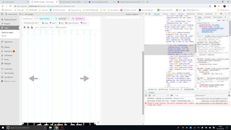
There is no doubt it will happend 100% of the time. This screenshot joined with the wordpress documentation holds all the information we need.
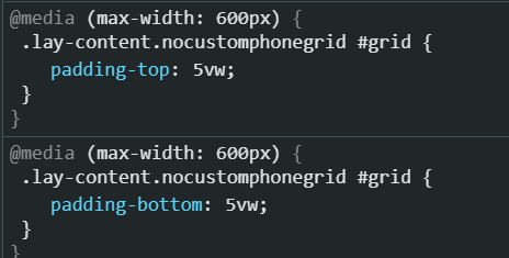
The background-image url for the gridder's back-end in the inspector is url(/wp-content/etc)
.
I did not write that url, layTheme did and layGridder does the same.
Obversations/Statements :
1 - So we can first state that in the backend, layTheme and layGridder are using relative url.
2 - Looking through the documentation we can see that wordpress mostly returns absolute urls.
3 - layThemeGridder is most likely using a custom solution to build that url.
4 - One other point to make is that wordpress has no native way to return the missing part between the domain and wordpress folder.
Problem :
Because the relative URL starts with a /
it uses the domain as a starting point. Without the first /
it would start with the current folder as a starting point. Since oversation n°4 states that wordpress is not able to provide you the difference between domain root and wordpress root : If wordpress root is not the same as the domain root, the relative URL will fail 100% of the time.
Solutions :
There is two solutions. One that keeps using the relative url (if that is important for some reason) and one that is using the absolute url (the easiest one).
With relative path :
The problem is the use of the first /
that uses the domain as a starting point.
if instead we use the current page as a starting point (which is in wp-admin) the fix is to add ../
at the begining of the url : ../wp-content/etcetc
. This will go up one folder from "wp-admin" essentialy landing you in the wordpress's root, than add the relative path to the url.
Howerver, it might still be an issue with some very edge cases. Some plugins allows you to restructure wordpresses urls. changing the login url, wp-admin urls, etc etc. Because relative URL are not talking at all to wordpress, and are only using their own logic. It is still possible that "something is different"
This is why I would recommend using the stantard following solution
With absolute path :
Just fetch the image url with a wordpress function, it will return the absolute url to the image. Whether you did some weird things to your wordpress or just put wordpress in a subfolder.
I'm actually amazed that this issue wasn't brought up before as it is pretty common to put wordpress in a subfolder. Though maybe, because it works in the front-end, people either don't understand it's an issue or those who do are fine with it.
Now if that is a high priority issue or not is up to the team to decide. I actually don't mind that much (hense what I just said).
And you may need testing to fix the issue : How many different blocks and functionnality use those relative urls in both layTheme and layGridder. For exemple it's not working for background-video, background-images and the carousel plugin. I think "plain images" elements (the ones you drag and drop) are fine ?
But if I can avoid you some testing to determine if it's an edge case : it's not.
There is no way it will work with the current configuration on a wordpress located in a subfolder.
in the front end of the gridder it's not relative (it's a full uri : protocole, www, subdomain, domain, extension, folders, files),
in the back-end, "background-image" in the gridder : paths are relative ( exemple url(/wp-content/uploads/2018/12/RED-STAR_DOCUMENTARY24-1024x1195.jpg);" and don't use the absolute url.
see screenshot :
Like I said, it does this with background-images, with the carrousel plugins, with background-video and maybe other things. I did not test extensively. But once I saw it did not work on every current project with laytheme/gridder I decided to post here because I think that being able to see what you are building is one of the best feature of the lay family and it should not be too hard to fix.
This will happend with every setup for which the wordpress folder isn't the domain root folder.
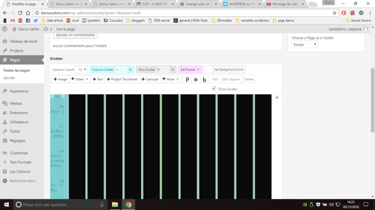
I have noticed that for Laytheme aswell as for Laygridder, on certain modules and functionnality, the gridder doesn't use the right URL in the backend (editor page). So images, doesn't show.
To me this happend with the row background-image and row background-video on laygridder, and the carousel plugin on laytheme. (I didn't test it extensively, just came accross it).
Both with the layGridder and with the layTheme had in common that I wasn't using a "standard" url.
For laytheme because website is still in development, I put wordpress in a sub-folder
http://website.com/wpsubfolder/[imagepath]
In the console I get failed to load resource error and the URL without the "/wpsubfolder/"
part.
Failed to load resource: the server responded with a status of 404 (Not Found)
.
For laygridder the error was pretty similar except I was running the website on localhost.
I'm guessing this might be due to the use of relative path instead of absolute url to load the media ?
On the front-end, the content shows perfectly.
I'm guessing you could set your own CSS to have 80% of browser height as your carousel height :
select your row "add custom class or id" : custom-class
Then add this code to your custom css :
custom-class . lay-carousel-wrap {
height: 80vh;
}
To set the transition speed of your carousel you have to change the "friction" and "attraction" parameters. Add this code to "custom HTML and CSS at bottom" general laytheme option
window.Frontend.GlobalEvents.on("projectpageshown", function(a) {
setTimeout(function() {
jQuery('.lay-carousel').flickity({selectedAttraction: .005, friction: .2 }) ;}, 100) });
Did not tested the first CSS thing, not sure this all works. The last bit of code should.
I've reworked my code to make it "sort of update proof", this might interest you @wow123
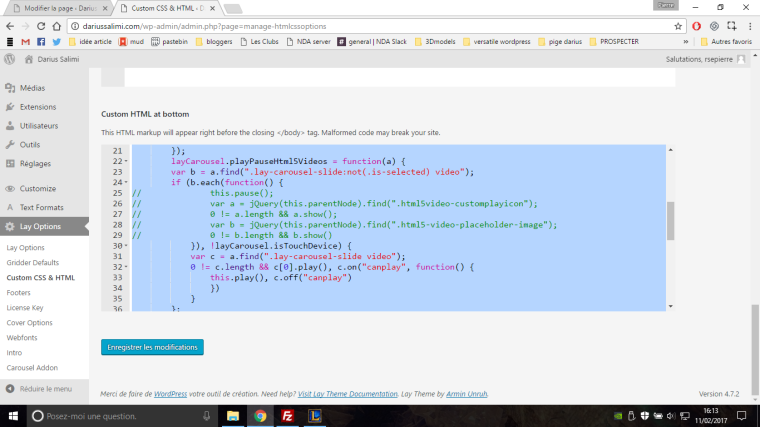
Now all you need to do to have this feature is to add this code to the "Custom HTML at bottom" option in Laytheme parameters
<script>
(function() {
function layCarouselResize() {
layCarousel.sizeCarousels();
layCarousel.sizeCaptions();
layCarousel.repositionSliders();
jQuery(".lay-carousel:not(:hover)").flickity( 'next' );
console.log('custom autoplay');
}
setInterval( layCarouselResize, 4000 );
window.Frontend.GlobalEvents.on("projectpageshown", function(a) {
setTimeout(function() {
jQuery('.lay-carousel').flickity({selectedAttraction: .005, friction: .2 });
/*jQuery('.lay-carousel').on( 'settle.flickity', function() {
console.log('slide-end callback');
// callback not working well
layCarouselResize():
});*/
}, 100)
});
layCarousel.playPauseHtml5Videos = function(a) {
var b = a.find(".lay-carousel-slide:not(.is-selected) video");
if (b.each(function() {
// this.pause();
// var a = jQuery(this.parentNode).find(".html5video-customplayicon");
// 0 != a.length && a.show();
// var b = jQuery(this.parentNode).find(".html5-video-placeholder-image");
// 0 != b.length && b.show()
}), !layCarousel.isTouchDevice) {
var c = a.find(".lay-carousel-slide video");
0 != c.length && c[0].play(), c.on("canplay", function() {
this.play(), c.off("canplay")
})
}
};
})();
</script>
<style>
.multiple-slides-view .lay-carousel-slide {
width: auto !important;
}
.multiple-slides-view img.h100 , .multiple-slides-view .video-slide.h100 video {
position: relative !important;
-webkit-transform: none !important;
transform: none !important;
-ms-transform: none !important;
left: 0 !important;
}
.multiple-slides-view .slide-inner a, .multiple-slides-view .slide-inner {
width: auto !important;
position: relative !important;
height: 100% !important;
}
.multiple-slides-view .slide-inner {
margin-right: 1vw;
}
</style>
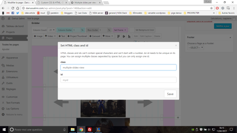
And then add "multiple-slides-view" class to the row in which you wan't that carrousel, like so :
flickity used in layTheme is not compatible with "imageloaded", so my "hack" is to update the layout everytime change slide (every 4000ms in my case).
And because the layCarouselResize() updates all carousels at once, i had to create my own autoplay so all carousels are synchronized.
setInterval( layCarouselResize, 4000 );
jQuery('.lay-carousel').flickity({selectedAttraction: .005, friction: .2 });
The layTheme Carousel/SlideShow addon is able to handle images, video, images thumbnails but not video thumbnails.
Think it would be a great addition to the plug-in. Cheers
Browser don't work like images softwares. I doubt this is due do laytheme but more of a general issue with web.
Open the image on your computer from the browser (drag&drop the file to your url bar should do the trick). If the issue appears, it's definitly a browser issue.
(If not, you can still give it a try, but i'm not sure this will solve that !)
My fix :
First step (this is probably the issue) check the image color profile. Prefer basic sRVB, Web coated RVB (i think).
Check color depth (should be 32bits/8 bits per layer). Thought exporting to jpg or png should set will this anyway.
If you have lots of images you can do a photoshop script to export all.
Once your files are ready, you can fine tune the colors if any modification happend during the process. But now : what you see should be what you get on (though it might never be exactly the same).
Hope this helps !
@arminunruh Ah cool, it is better ! Didn't know we could do this, so i will use it on mine too !
@paubo yes sorry what i said couldn't work because a bit of code was missing to what I said, you should have added <style></style> like so :
<style>
.sitetitle, .primary a {color:white !important;}
nav.primary a span {border-bottom-color: white !important;}
</style>
BUT
you should defenitly use armin's solution now !
Current fix for this could be to insert menu via a shortcode in the footer using an extension like thoses :
(specific to inserting menu via a shortcode)
https://fr.wordpress.org/plugins/menu-shortcode/
https://fr.wordpress.org/plugins/smart-menu-shortcode/
(pack of shortcodes, more users (better support) and includes menu shortcodes too)
https://fr.wordpress.org/plugins/shortcodes-ultimate/screenshots/
My fix for this is to insert HTML in the homepage
(in the page editor [ + MORE ] > [ + HTML ] ), place it where ever you wan't in the page
with this code :
.sitetitle, .primary a {color:white !important;}
nav.primary a span {border-bottom-color: white !important;}
or this code if you wan't to exclude the phone theme :
@media (min-width: 900px) {
.sitetitle, .primary a {color:white !important;}
nav.primary a span {border-bottom-color: white !important;}
}
of course instead of "white" insert the color you want
Hi,
I'm using an iframe on the website i'm building. I think it would be cool to be able to insert them without any coding.
It is easy enough to code it ourselves using the "+HTML" button.
But maybe it is easy to implement this to the "+embed" button.
I'm guessing the +embed button is compatible with certain webpage using "oembed" or something. (In the video i tried to use dead youtube link, but it works with full ones :) )
Instead of showing "Error, no embed found for this URL." the +EMBED could suggest to import the page through an iframe.
"This URL has no embed tag, if you press OK, we will use an iframe"
see video : https://www.opentest.co/share/901ba510ccd511e6abf79735dfd95770
Hi,
I wan't to suggest a new feature for the carousel addon.
I think it would be really good to be able to show multiple slides per view (see video).
https://www.opentest.co/share/0e7f78d0cc6f11e688ecd510bcea4514
I tweaked the laytheme carousel plugin to get this result, but the result is poorly implemented and will probably be lost in the next update, so i'm posting here hoping you could consider implementing later on.
What i did :
I changed the CSS for when "multiple slides" is checked, each slide is sized according to the images. I think I added the "loop" functionnality from flickity to the slider so we could infinite scroll through the slider (wrapAround: true), but maybe it was already there.
The main issue is that we must rezise the slider once images are loaded in order to be clean, if i hit the following command in the console or if I resize the window, everything works fine.
layCarousel.sizeCarousels(),layCarousel.sizeCaptions(),layCarousel.repositionSliders()
There is also an option within flickity that could solve this issues (imagesLoaded:true). I imported the full flickity.pkgd.js to be able to use it but for some reason it doesn't work. (i'm guessing you did some custom coding there)
I know you are using flickity only if the slider transition is to "slide", I think this is not an issue because it's only with the "slide" option that the "multiple images per view" carousel is interesting.
I hope you would be interesting to add this functionnality !
Cheers.
P.
@rsepierre of course, after an hour strugling, it took me 3 minutes after posting here to fix the issue. All clean.