Hey Armin
Oh wow. Thank you very much for your quick reply and the suggested solution via plugin. And even better that this will soon be possible directly as a setting in LayTheme. Thank you very much!
Hey Armin
Oh wow. Thank you very much for your quick reply and the suggested solution via plugin. And even better that this will soon be possible directly as a setting in LayTheme. Thank you very much!
Hello.
Is there a way to exclude only a specific page from indexing by Google? On one of my websites, which doesn't have that many pages, the footer is also listed by Google. If you click on it, you will only see the page title, the menu bar and the footer.
Aaahhh! Good to know that the order is saved via the category. With the workaround it now works perfectly. Thank you very much!
Is it possible to select a different “Project Order” for the “Project Thumbnail Grid” for desktop and mobile? Because if the number of columns is different, it would be great to be able to play with the arrangement of the portrait and landscape formats. Or make more visually appealing combinations. What works for two columns does not necessarily look equally good with three or more columns.
And even if I don't synchronize the “Project Thumbnail Grid” element and then change the order in mobile, for example, it is also changed on the desktop. Is there no way to make the order different?
Thanks!
I probably have the same problem. Submenu doesn't open anymore…
All right. Thanks for your answer (and the update). And so: Please excuse the stress!
Heeello!
I'm also getting the following error from WooCommerce:
Your theme (Lay Theme) contains outdated copies of some WooCommerce template files. These files may need updating to ensure they are compatible with the current version of WooCommerce.
These are the outdated templates:
lay/woocommerce/checkout/form-checkout.php – Version 3.5.0 is out of date. The core version ist 9.4.0
lay/woocommerce/global/quantity-input.php – Version 7.8.0 is out of date. The core version ist 9.4.0
I have activated automatic updates for Lay Theme and always use the latest version of Lay Theme.
What to do?
Thanks!
Hey Armin
Thank you for your reply! I activated this option but you were thinking right, it didn't fix the problem … I'll send you an email. Thanks!
Hello
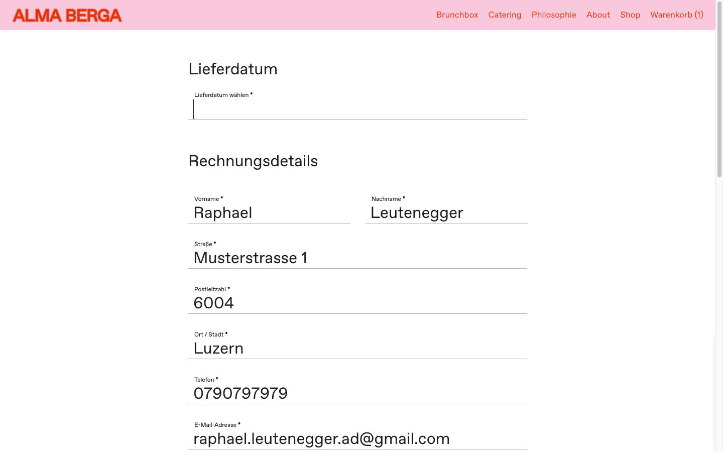
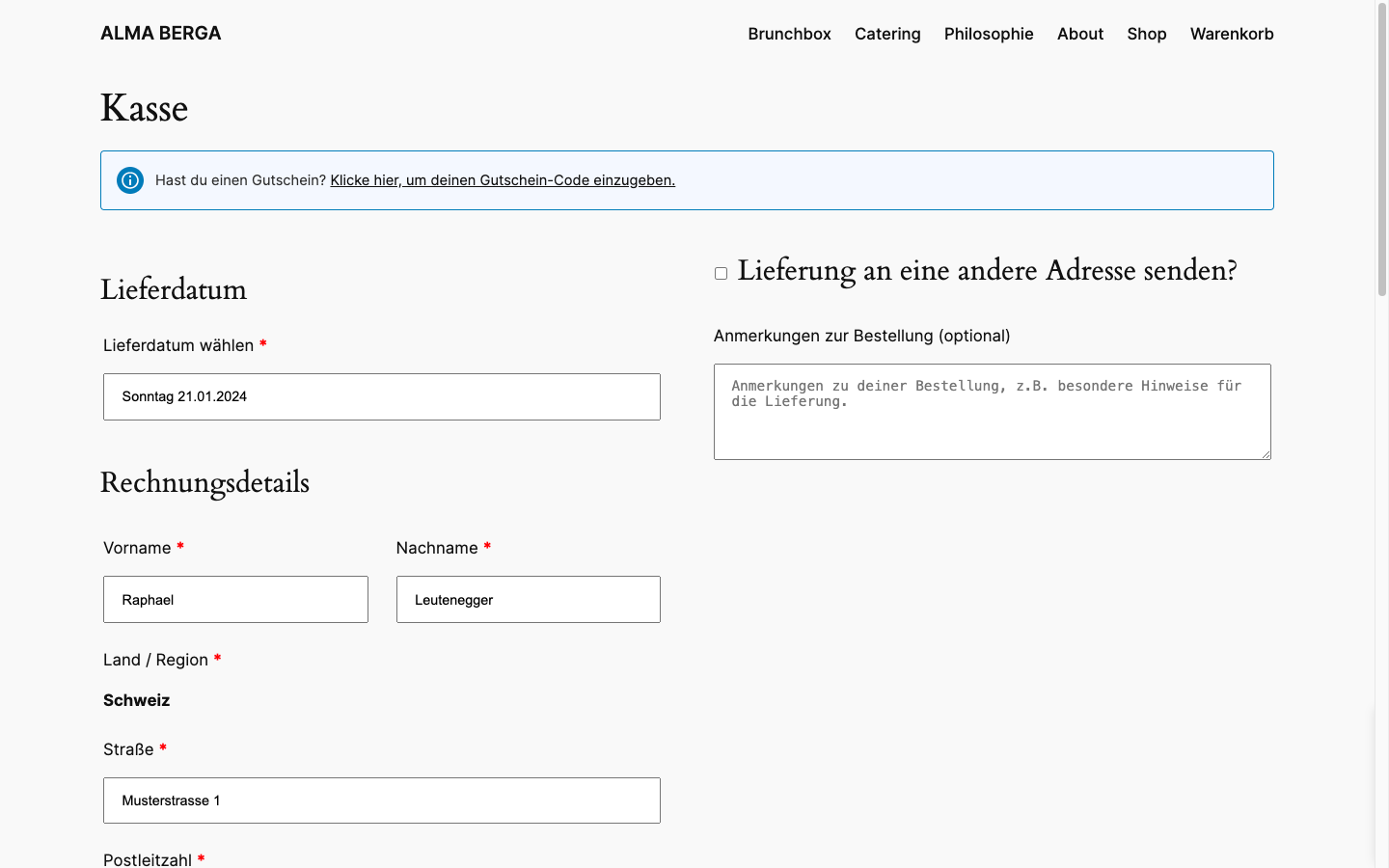
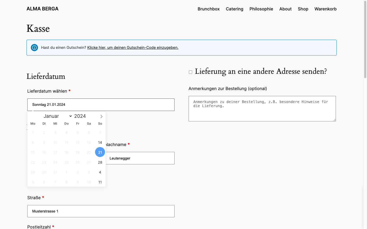
I have designed a website including a store for a customer based on LayTheme (https://almaberga.ch/). However, she is dependent on customers choosing a day as a delivery date. I have found a great plugin for this. However, nothing is displayed to me in combination with LayTheme. The fields to select a delivery date are completely missing. Now I have managed to display them. However, I can't manage to display the pop-up calendar. If I switch to different standard themes such as 2024 from Wordpress, it works perfectly. What is the reason for this?
(Of course, I wrote to the plugin developers first. But since the plugin works perfectly with other themes on my site, they insist that the fault is not theirs)
Many thanks in advance!
Raphael
«navbar position-top is-fixed» suddenly had a z-index of 10. After I gave it a 19 (logo and menu items seem to be at 20) everything looks normal again.
Since the last update, the z-order of the menubar is completely random. While scrolling it positions itself above or below elements as it feels like.


@arminunruh Thanks for your reply, Armin. But that was of course the first thing I tried myself.
The top part looks now exactly how I want. But, in Chrome (iPhone) the carousel is with that code 50px (Menu bar height) too short in height. Seems like on mobile Lay Theme subtracts the Menu bar height before displaying the carousel with 100vh. Only on desktop, 100vh is really covering 100%.
Btw. in Safari there is the additional problem that 100vh is not covering 100% of the viewport and there is always a whitespace blow the carousel.
Best, Raphael
Hi
On the homepage I use a 100vh carousel and a light grey, transparent menu bar which blurs everything in the background.
With the height being 100vh the carousel on desktop is being shown below the menu bar and there it's slightly blurred. This is how I want it to be.
On mobile however, the same carousel with a height of also 100vh starts only after the menu bar.
How can I have the carousel full screen on mobile and the menu bar being displayed on top of that?
Best, Raphael