Skip to content
  • Recent
  • Tags
  • Popular
  • Users
  • Search
Skins
  • Light
  • Cerulean
  • Cosmo
  • Flatly
  • Journal
  • Litera
  • Lumen
  • Lux
  • Materia
  • Minty
  • Morph
  • Pulse
  • Sandstone
  • Simplex
  • Sketchy
  • Spacelab
  • United
  • Yeti
  • Zephyr
  • Dark
  • Cyborg
  • Darkly
  • Quartz
  • Slate
  • Solar
  • Superhero
  • Vapor

  • Default (No Skin)
  • No Skin
Collapse

Lay Theme Forum

T

this

@this
About
Posts
11
Topics
3
Shares
0
Groups
0
Followers
0
Following
0

Posts

Recent Best Controversial

  • Videos & Single Images width & height
    T this

    Dear @mariusjopen

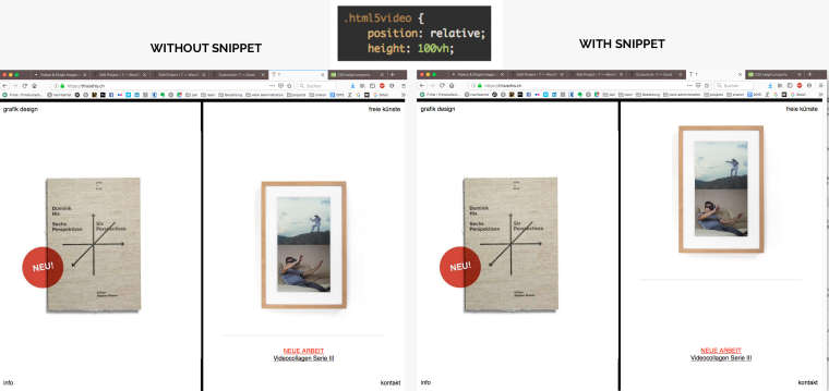
    I did give "height: 100vh;" to the video element as you suggested, but this resulted in a missplaced video element on the front page, as shown in the screenshot above.
    I also added "object-fit: cover;" to the parent element (which is .ph I think?), but it didn't help.

    Here's all the costum CSS I use right now, maybe you see a flaw?

    .col .lay-carousel {
    height: 100vh;
    top: 0px !important;
    margin-top: 0px !important;
    padding: 0px !important;
    }

    .flickity-slider {
    height: 100vh;
    top: 0px !important;
    }

    .lay-carousel-slide {
    top: 0 !important;
    height: 100vh;
    margin-top: 0px !important;
    }

    .col .lay-carousel img.h100 {
    height: 100vh !important;
    top: 0;
    object-fit: cover!important;
    width: 100%;
    }

    .videothis video {
    height: 100vh !important;
    object-fit:cover !important;
    }

    .html5video {
    position: relative;
    height: 100vh ;
    object-fit: cover !important;
    }

    .ph{
    object-fit: cover !important;
    }

    General Discussion

  • Videos & Single Images width & height
    T this

    Dear @mariusjopen

    It works!
    Only problem is, the .html5video class also effects other elemtens like the one on the right side of the homepage. This Video now moves up?!

    I added a sketch for reference because I didn't want the snippet to stay in there.
    I tried to switch classes or to reset some properties in another class, added to that video on the homepage - without success...

    Also I was not able to strech a single image the same way like the Video, I tried adding the snippet to the .img class and added my own class .einzelbild to the image in the lay editor, but I could not get it to work...
    https://thisisthis.ch/rush-hour

    Thank you so much for all your help!
    Joel !

    0_1565263047576_Snippet.jpg

    General Discussion

  • Videos & Single Images width & height
    T this

    Dear @mariusjopen
    I tried that already, this snippet simply sticks the video to the top, but it doesn't cover the whole height or get's scaled up in any way...
    Would you like to have access to the site so you can see more details?
    Best
    Joel

    General Discussion

  • Videos & Single Images width & height
    T this

    Dear @mariusjopen
    With the video beeing also adressed, it just sticks to the bottom now:
    https://thisisthis.ch/durst

    Maybe this example gives you another idea/hint of where the problem may lay?
    Thanks a lot!
    Joel

    General Discussion

  • Videos & Single Images width & height
    T this

    Dear Marius
    Thank you for your Feedback, I created a class .videothis for the video and added

    .videothis {
    height: 100vh !important;
    object-fit:cover !important;

    }
    But this is the result:
    https://thisisthis.ch/durst

    any ideas what I could be missing?
    I tried a lot but I can't seem to strech it over the whole side when.
    When the window is resized to a smaller desktop/Tablet size, the video keeps at full width, but sticks it to the top?
    Thank you!
    Joel

    General Discussion

  • Videos & Single Images width & height
    T this

    Hey Guys
    I have a simple split screen scenario where I present content on either side. I figured our how to keep the carousell slider "Fullscreen" (on one side of the screen) all of the time, but single images and videos still get resized the wrong way (white space on the left/right side or on top/bottom), depending on the size of the Browser window.

    Examples of a single image: https://thisisthis.ch/rush-hour

    Example of a video: https://thisisthis.ch/durst

    I'd like the single images and videos to be resized to fill the right side all of the time, no matter the Browser window size.
    Like this carousell slider for example: https://thisisthis.ch/versus_installation/

    Thanks for any Tips!
    Cheers

    General Discussion

  • Resize Images in Slider
    T this

    Hi Marius
    Thank you so much, this is alredy a big improvement!
    It does fit the height of the portrait-shaped images to the height of the browser.

    Unfortunately it stops doing that when the browser width exceeds 1715px of width.
    After that, the image will get a left and right hand white border again.
    https://lay.thisisthis.ch/versus_installation

    Also I found out something else which was very confusing… I tried to increase the size (pixels) of the images because I thought maybe a bigger image would fill the box completely. So instead of images with 954 × 1073px (standard size of all images), I uploaded an image with 1500x1688px.
    It didn’t work, there’s still white space left and right of the image, just like with the other, smaller images.
    It’s the second last of the versus images in the carousel.

    Then something really strange happened: Out of curiosity, I exported the image as a PNG for web and it was somehow cropped by 1px in height, so the size was 1500x 1687px. I realised this only when I uploaded I, because this image inverts the effect described above!

    With this image, if the browser is smaller than 1715px in width, the image has a white space on top and bottom of the image.
    If the Browser is bigger than 1715px in width, the image is displayed correctly… how is this possible? It did blow my mind a little :)
    It’s the last image in the carousel, maybe you know why it’s behaving that way?
    Did the slight change in ratio (that happened by accident), change the behaviour of the image within the carousel?

    Maybe there's only a little tweak to your prepared css code that'll make all images fit the browser, no matter the ratio of the image, nor the size of the browser?
    Thank you so much again for your support!

    General Discussion

  • back and forth and fullscreen Slider
    T this

    Hi Guys
    I was wondering if - besides the options to go back and forth - if there's an option to click on a image and make it fullscreen? Would it be possible to add this functinality by reducing the hovering space left and right on the image and leave some place in the middle to click and make it fullscreen?
    Like in this example here: https://lay.thisisthis.ch/versus_installation/
    Would it be possible to create an area in the middle of the image where one could click to make it pop up fullscreen?

    Thanks for any Hints!

    0_1533015953716_Screen Shot 2018-07-31 at 07.39.30.png

    General Discussion

  • Resize Images in Slider
    T this

    Dear Marius
    Thank you very much for looking into it!
    best
    Joel

    General Discussion

  • Resize Images in Slider
    T this

    Hi Marius

    Thank you very much for the reply.
    Unfortuinately I only know a little about CSS, but I will try!
    I figure I must add this attribute:

    .some class {
    object-fit: cover;
    }

    to the corresponding class?
    I tried some stuff, but I couldn't find the right class, could you give me a hint?
    Thanks a lot and have a nice day
    Joel

    General Discussion

  • Resize Images in Slider
    T this

    Hi there
    I'm wondering if there's an option to set the height of slider images to auto?
    I'd like to remove the white space on the top and bottom of the image when the browser is a not using the full widith of the screen or on a Tablet view.
    Also maybe you know a small trick to center the images in the slider when using a real wide screensize?

    https://lay.thisisthis.ch/le-grutli-flotte

    Basically I would like the image to fill out the right hand space, always centered, no matter the screen size. I'm very much looking forward to any suggestions and ideas.

    BTW there's a thin white line at the left border of all images, you can irgnore that, it's within the images for now and I will remove it later.
    Thank you very much!

    General Discussion
  • Login

  • Don't have an account? Register

  • Login or register to search.
  • First post
    Last post
0
  • Recent
  • Tags
  • Popular
  • Users
  • Search