Thanks a lot!
treh16
Posts
-
Limit project index to a number of recents? -
Limit project index to a number of recents?@arminunruh hmm, thanks for the tip but that's not really a workaround for us - we would need to be updating the category manually.
Is it maybe possible to limit it by date? Say we limit the Project Index by only showing the last three months of projects? -
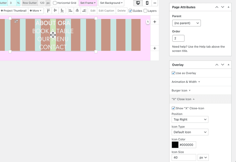
Overlay on mobile missing X button@arminunruh https://ora.bookawizard.com/
- Browse to mobile layout
- Click +
- Overlay opens
- Close X is missing

-
Limit project index to a number of recents?Hi there, is there a way to limit the Project Index output to let's say 20 latest projects only?
Thanks
-
Overlay on mobile missing X buttonhi there! Somehow the X button of an overlay page doesn't show on mobile, when burger icon is disabled. If I enable burger icon, then the X shows up. Is this a bug?
Desktop overlay doesn't have this issue.Are mobile overlays created via the "phone layout" section of a page?
Thank you!
-
Different menu on landing page VS. other pages / combining mobile burger vs. non-burger menuHi there,
two questions, is it possible to configure Laytheme as follows:
- different menu on landing page vs. other pages
- combining mobile burger vs. non-burger menu
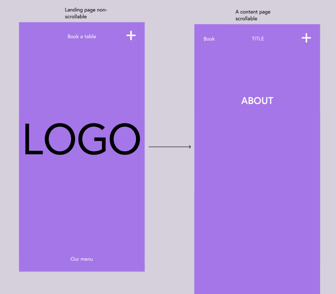
See screenshot of the wanted outcome. Basically it's a combination of an Overlay menu and normal menu, which I see is possible on Desktop layout but couldn't find the options on Mobile layout.
Also, mobile landing page should have a different menu structure from other pages.
Landing page has Book a table on top and Our menu on the bottom and the PLUS as an overlay menu. All other pages would have Book (menu link), TITLE (menu link to home) and PLUS overlay menu on top.
Thank you for any hints how to achieve this.

-
Burger menu to show a custom page?@alasdair17 great tip, thank you!
-
Burger menu to show a custom page?Is it possible with Laytheme for Burger mobile menu to show a custom page, like here https://coco-hotel.com/ ?
We'd like to be able to add more things to the menu, like images, text, etc...
Thank you!
-
Search not searching the gridder content of projects@arminunruh it's acting a little funny nevertheless -> when I try to find text in the project descriptions, it works only when I start with the word that the project description begins with, example:
Project description:
Fox jumps across a fence.Searching:
- Fox - works, the project pops up
- fence - the search doesn't find anything
With some projects, the second / third word is also searchable but more often not.
Something's off?
-
Search not searching the gridder content of projectsIs this intentional? The search function currently seems to be searching only Titels and "Project Description for Thumbnails". It's not searching the contents of the Gridder of each project.
Any plan to add this? We'll need to find another plugin that can do that.Thanks!
-
Project thumbnails with description next to imageHi there,
How can we achieve moving thumbnail descriptions next to the images? Currently only "on image", top or bottom are possible in the options.How did https://wherewestand.co.uk/#projects achieve this?
Thanks a lot!
-
Split screen with menu and content on the right?Hi there,
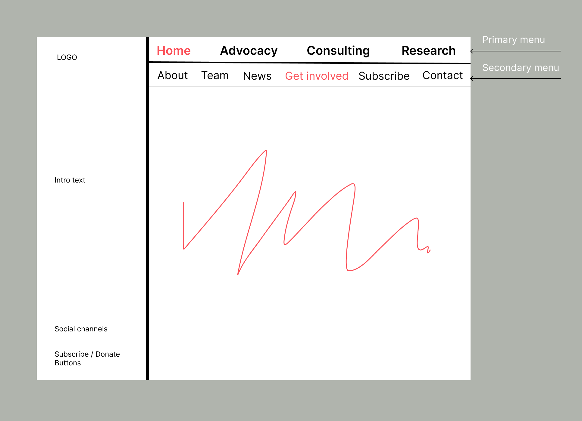
I'm trying to achieve a split screen with menus and content on the right (see an example attached)? How would you go about it while keeping the menu responsive (aligning well with screen size changes)? The space-left and space-top in Customise can be used to position the menu, however it doesn't stay fixed when resizing screen.Thanks a lot!

-
Submitted URL marked ‘noindex’I have the same issue
-
PayPal Donation button with PHONE layoutHi there,
When using the paypal Donation button I can have it either on Desktop layout or Phone layout as HTML. If I have it in both, PHONE doesn't show anything. If I remove it in DESKTOP layout, PHONE shows it.
Can you help on that?
Thx
-
Full Screen Slider slides overflowing on PHONE@Richard said in Full Screen Slider slides overflowing on PHONE:
.is-safari #custom-phone-grid .fp-section {
min-height: 100vh !important;
height:100vh !important;
}.is-iphone #custom-phone-grid .fp-section {
min-height: 100vh !important;
height:100vh !important;
}
.is-safari #custom-phone-grid .fp-auto-scroll {
min-height: 100vh !important;
height:100vh !important;
}Hi @Richard , tried that, unfortunately didn't help. This is not an issue only with Safari, the same on mobile Chrome, or Desktop's Safari "Responsive design mode feature"
-
Full Screen Slider slides overflowing on PHONE@Richard any update on this? Thx!
-
Full Screen Slider slides overflowing on PHONE@Richard thanks, this solved it for Portrait view. When I flip the phone to landscape, the slider is not fullscreen anymore and has lot's of content overflow.
See video below:
-
Mobile Menu - unable to open top pages when menu has sub-itemsHi there,
In my Menu I'm using sub-items. On Desktop I can click on the top-level items and they take my to the page. However on Mobile, clicking the top-level item just uncovers its sub-items. That prevents me from going to the top-level pages.
See screenshot below - in this example Strategies page only uncovers its sub-items but I cannot go to Strategies (it's also a page) anymore.

-
Full Screen Slider slides overflowing on PHONE@Richard the new iOS 15 has put Safari's address bar on the bottom, is that what you meant? This is not my customisation -> this is how all new iPhones Safaris look like now.
If yes, how can we make sure that all people on iOS 15 Safari would be able to view the site without this problem?