Ahh okay. Sorry for my misunderstanding and again, thank you for your patience with me.
I meant in relation to the browser height then.
I tried different positions and values but still couldn't get it to work.
Ahh okay. Sorry for my misunderstanding and again, thank you for your patience with me.
I meant in relation to the browser height then.
I tried different positions and values but still couldn't get it to work.
Thanks for the patience!
As shown on your picture and when I of course move the "top" css tag, the page numbers are placed centered in relation to the picture on the right of the slide.
But I want my pagenumbers to be vertically centered in relation to the fullscreenslider hight, so that when you slide to each fullscreen slide, the pagenumer is always placed centered at the same spot.
Hope there is a possibility for this
Yes, correct. I know. But for different screen sizes and picture sizes, the page numbers change position. Sorry for my unclear communication.
I guess I wanted to ask how to make the pagenumbers stop being positioned in relation to the pcitures, so that they'll always remain vertically centered in each fullscreen slide?
When I try use the earlier mentioned CSS, the numbers are still affected by the postion of the pictures on each fullscreen slide instead of just being vertically centered to the right.
@Richard-K
Nice to know!
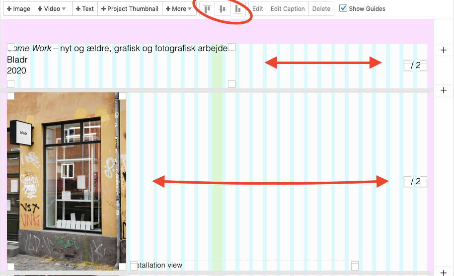
Since I use the fullscreen slider and want to have my pagenumber on each fullscreen slide (see: https://jonasgeorgchristensen.net/some-work) The "vh" or "vw" is repsonding, but it doesnt seem to center the numbers on each slide. can it be something about the positioning of these (see circle on picture below) next to my pagenumbers pictures (see arrows on picture below) that affects the placement of the pagenumbers?

Hi Richard
Thansk for your answer.
I thought I had updated everything when I checked my custom code on and off. But realised the only thing I hadn't upgraded was my Laytheme haha... Sorry for another rookie mistake.
I have one other question now:
I used this code (see below) to position my elements when using the full screen slider and rotating my pagenumbers (sidetal.)
.fp-tableCell {
        vertical-align: top !important;
}

.fp-tableCell .row-inner {
        margin-top: 6%;
}

.sidetal {
        transform: rotate(90deg)!important;
	right: -2.5%;
	top: 50%!important;
}
I want my pagenumbers (sidetal) to be positioned vertically in the middle of the screen.
I tried to do that by using "top: 50%!important;" but the %-mark doesn't work, only when using eg "250px" which I rather not use.
(check the link I posted earlier for seeing the pagenumbers and positions)
Hope you can help me placing the numberc correctly!
Hi again
After upgrading to the newest version of the fullscreen slider addon my pages where the addon is enabled e.g. https://jonasgeorgchristensen.net/foe-pub and https://jonasgeorgchristensen.net/some-work is not working correctly like before.
The up/down arrows is visible and the slider function itself is kind of working, but the addon doesn't divide each site/page into fullscreen site/page
So my question goes:
How do I get the slider to work correctly again with the newest update?
Hope for help again (3^D
@TSJ Oh.... found another begginner fail, that will make it work:
Forgot a period infront of the class-names %(
Now I think I got it...
Sorry for wasting time and thank you for your patience!
@chris-vuko Thanks for the answer!
As i wrote earlier:
"My styling of the feature was working before, when I had the Mailchimp code placed in the custom CSS & HTML section, but now since I placed it on my about page, It doesn't work."
So it should be the same classes as used before. I am thinking that my code is not "overwriting" or "overruling" the one of laytheme and my about page.
Can that be a possibility and if so, is there another way to "overrule"?
I tried moving the !important tag, and place it after each position, but still no result:
mc-field-group {
    font-family: sans-serif;
    font-size: 85%;
    font-weight: 500;
    letter-spacing: 0.01em;
    position: absolute !important;
    right: 8.33% !important;
    top:8.1% !important;
}

input button {
    font-family: sans-serif;
    font-size: 85%;
    font-weight: 500;
    letter-spacing: 0.01em;
    background-color: white;
    position: absolute !important;
    right: 1.5% !important;
    top:8% !important;
}
@TSJ
I wrote this CSS (look below) but it doesn't quite work on https://jonasgeorgchristensen.net/about:
mc-field-group !important {
    font-family: neue-haas-grotesk-display, sans-serif;
    font-size: 85%;
    font-weight: 500;
    letter-spacing: 0.01em;
    position: absolute;
    right: 8.33%;
    top:8.1%;
}

input button !important {
    font-family: neue-haas-grotesk-display, sans-serif;
    font-size: 85%;
    font-weight: 500;
    letter-spacing: 0.01em;
    background-color: white;
    position: absolute;
    right: 1.5%;
    top:8%;
}
@chris-vuko said in Mailchimp newsletter signup:
embedded form
Hi Christian
Thank you for your help!
Of course it worked. I guess I forgot the basics of this theme... (or maybe I'm just too much of a beginner in this field haha)
I have one more problem in that case though:
My styling of the feature was working before, when I had the Mailchimp code placed in the custom CSS & HTML section, but now since I placed it on my about page, It doesn't work.
Do you have any suggestions on how to style the feature, so both the text, button and box is visible?
Hi Laytheme Team and forum
I'm working on a website (https://jonasgeorgchristensen.net/) using Mailchimp's newsletter subscription feature.
The feauture works fine, but I have a simple minor problem of how to place this feature at the right place on the side.
Right now, as seen on https://jonasgeorgchristensen.net/, I have plenty of other problems since I updated to the newest lay-plugins. But my question now is:
How do I make my subscription feature (button, text, and box) only appear at the about (https://jonasgeorgchristensen.net/about) page, and not on the rest of the website?
Hope to be helped c^8)
Thank you for your time!
Thank you for the reply Richard!
Sadly the code you send didn't work for me. My images keeps being centered.
I tried deleting my custom css and others ways.
Do you have other suggestions?
Best
T
Hi
Maybe I'm stating the obvious and something you already tried out.
..But Maybe you haven't set your mobile gridder default to have no margins. Maybe if your put your mobile left/right values to 0 in the default gridders menu, you don' need to change your mobile grid manually each time.
Hope this a help and not an insult haha
Hi Lay support team!
When I place elements on my site and use Fullscreen Slider the elements as a default (of course) always become centered on the Y-axis for each fullscreen slide (as seen in the link below).
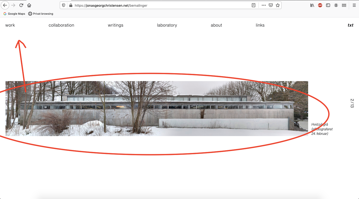
https://jonasgeorgchristensen.net/bemalinger
I do not want my pictures to be centered like that so...
How can I position my elements at the same place for each fullscreen slide with fullscreen slider?
In the case seen in the link, I would like to have my pictures on each slide positioned to the left (as they are now) but placed higher up on each slide, starting around 6 % from the top.
(see my beautiful screenshot to get help understanding my poor explination)

I tried to html-tag the pictures individually, and then place them individually by CSS: "position" and "top: 6%" , but that ofc only place the first picture/element correcty...
Can you pleace help me find a way to position all the pictures with the same distances to the top, when they are displayed in each slide.
Kind regards
T