It works perfectly now – thanks for the quick help!
TYLM
Posts
-
pile menu bug in projects -
pile menu bug in projectsHello there,
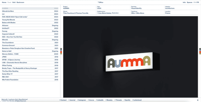
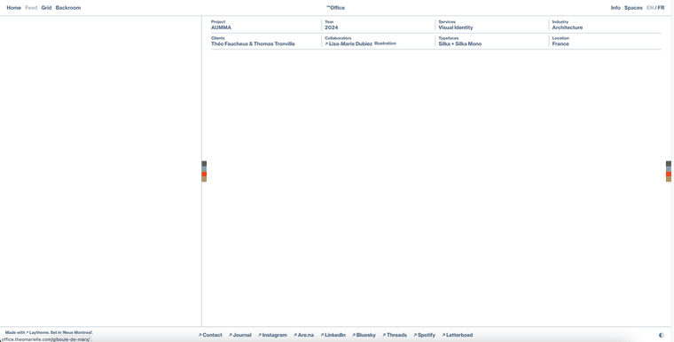
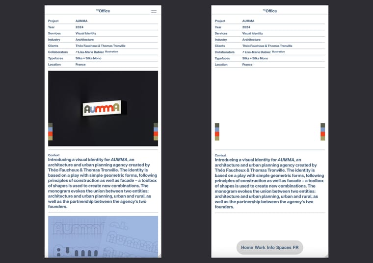
Activating the pile menu on the project pages appears to break several elements: overlays and the project index no longer display, and images fail to load. The issue occurs on both mobile and desktop.
The first image shows how a project displays correctly without the pile menu, and the second shows the result with the pile menu activated on mobile.
https://office.theomarielle.com/aumma/
Thanks in advance for your help!
-
border-radius not working since last updateIt works perfectly now! Thanks a lot for your help @arminunruh :)
-
border-radius not working since last updateI understand the logic – though applying a border-radius on .row-inner doesn't seem to work for some reason


-
border-radius not working since last updateHere's a video https://www.dropbox.com/t/5R662Fbuq9sUPrGt
Btw I'm using Firefox if that's useful
-
border-radius not working since last updateHello there,
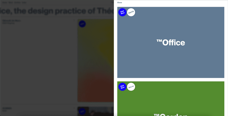
Actually, I noticed a different issue: when hovering over the corners of .row.spaceRow divs, they glitch because the hoverable surface changes size dynamically. This causes the border-radius transition to repeatedly toggle, creating a flickering effect.
Has anyone experienced this before? Any idea how to prevent the hover from being interrupted in the corners?
Thanks in advance for your help!
-
border-radius not working since last updateThanks a lot ! It works again now :)
-
border-radius not working since last updateOk so I just did that but it doesn't change anything
-
border-radius not working since last updateHello there,
I just noticed that the border-radius on some of my rows stopped working after the last update. I have a .spaceRow class applied to certain rows, which are supposed to have a border-radius of 0.5vw by default and 100% on hover. However, the rows now have straight corners, and nothing happens on hover. The problem seems to only exist for the overlay/page “Spaces.”
Could you help me figure out what's causing this issue?
https://office.theomarielle.com/
Thanks!
-
problem with laytheme phpGot it, seems to have solved the problem. Thanks!
-
problem with laytheme phpHi!
I just noticed that there are still some PHP issues somewhere on my website. Here's what I see when I go to the "Add Plugin" page… Not sure what's causing this.
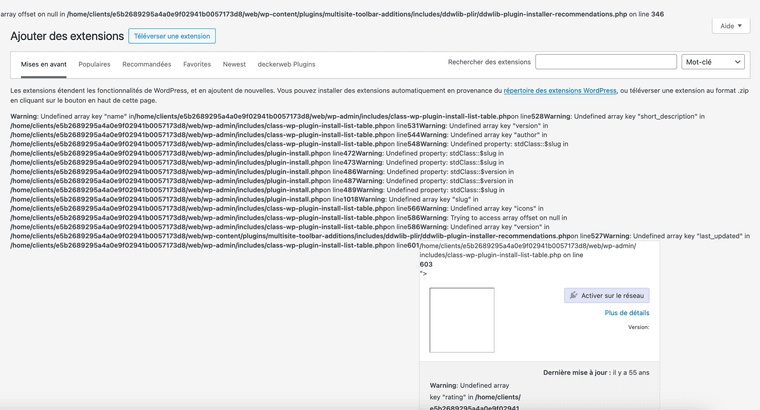
https://office.theomarielle.com/
Thanks in advance for the help!
Cheers,
-
Element Grids not showing in overlaysNo worries, thanks @arminunruh :)
-
Element Grids not showing in overlaysHello there,
I just noticed that element grids are not visible in overlays. They are being displayed, but their opacity is set to 0. It seems they don’t receive the “initialized” class that would make them visible.
I just updated Lay Theme with the last version 8.1.4
My website is https://office.theomarielle.com
Thanks in advance :)
Cheers !
-
graphic design portfolio@arminunruh Thanks! :)
-
problem with laytheme php@arminunruh Alright, thanks! :)
-
problem with laytheme php@arminunruh The plugin was actually already installed, but I was unable to activate SSL from Firefox for some reason… I managed to do it on Safari and now I think it's correctly activated.
Don't know if that fixed the problem of parts not loading though…?
-
problem with laytheme php@arminunruh Thanks for your help!
I just added an image for the “Video Play Icon”, but it doesn't seem to change anything – and it doesn't appear on my videos. It's a png, I also tried with a svg, but had the same result.

I can definitely wait for the next lay update though!
-
graphic design portfolioPerfect! Thanks a lot 🙏
-
Website doesn't load on some browsersWell, it seems that clearing my website's cache in WordPress fixed the issue.
Could someone test it on their browser, please? That would be much appreciated!
Also, if anyone has an idea of why clearing the cache resolved the issue—and what the problem could be exactly—so I don’t have to check my website every day to see if something is wrong… I’d love to hear your insights! :)
Cheers to the community <3
-
graphic design portfolio@fernandol97 could you check if it works now without adding the /home? Thanks :)