perfekt. thought i need custom css.. but lay has it all. great
g.
vernandel
Posts
-
fullscreen homeMar 10, 2024, 6:51 AM -
fullscreen homeMar 7, 2024, 6:42 AM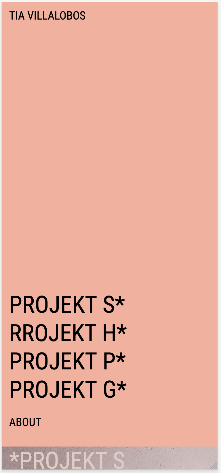
hi there,
on my mobile the fullscreen of "home" does not work.
https://tiavillalobos.dei am not sure what to do.
thank you
g. -
Partial relocation of a websiteDec 13, 2023, 2:45 PMHello everyone,
I'm currently creating a website for a client. Since they don't have a domain yet, I'm building the site on my domain using my Lay Theme, like this: https://.........de/tias-welt/
The clients site mainly consists of photos. So far, I'm managing without a menu, etc., etc.
My question is: Can I migrate only this part of my domain (with its own WordPress and Lay Theme) or do I have to rebuild everything? Are there any tips or tricks for this?only this site will be the cliens website: https://360style.de/tias-welt/
thank you so much
best
g. -
iframe full size & responsiveJun 8, 2023, 4:03 PMhey, did you see my last post/question?
thank you
g. -
iframe full size & responsiveJun 6, 2023, 11:06 AM@arminunruh
hi armin, thank so so far.
i still have the same problem with the mobile version. (https://360style.de/cookiesworld/) part of the logo is cut off, do you know why?also in the mobile version same url:
https://360style.de/cookiesworld/if click on the iframe button it opens a new window. i would like to have it in the same window. i cant find a documentary with iframes.
thank you so much
götz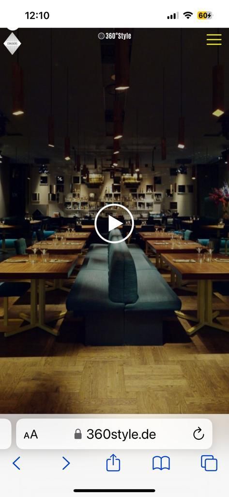
-
iframe full size & responsiveMay 5, 2023, 8:37 AM@arminunruh
THANK YOU! GREAT:
https://360style.de/video-wrapper/jut 1 more thing:
how to get ridd of the scrollbar on the right? there is nothing to scroll...all the best
g -
iframe full size & responsiveApr 29, 2023, 6:43 AMhi there,
i want to create a landingpage with an iframe.
it should be full size & responsive.
it is working at a regular html site:
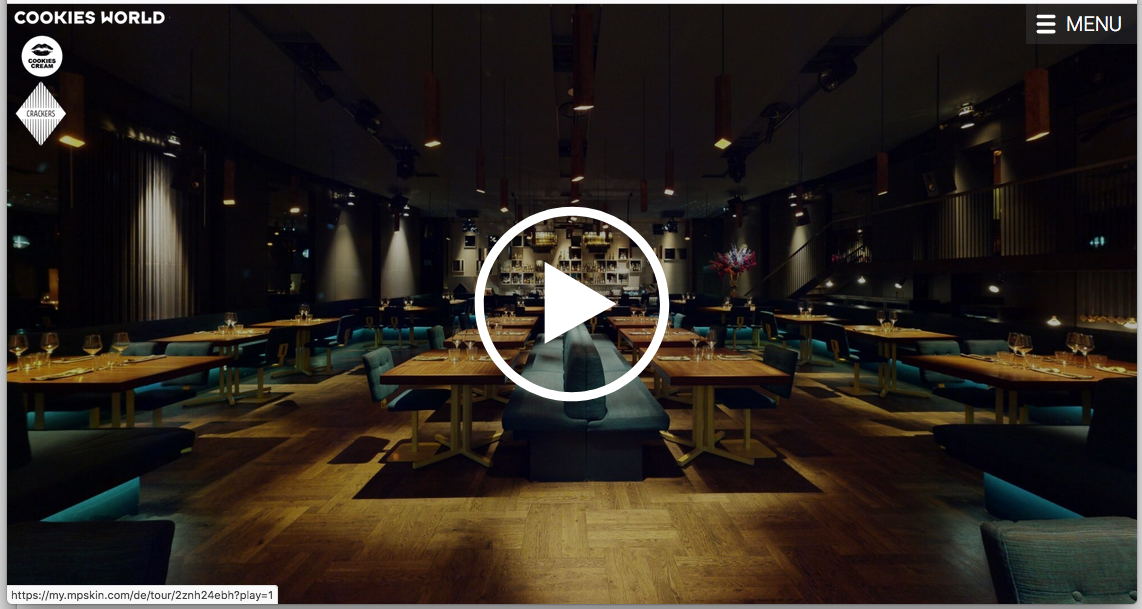
http://klubberlin.de/COOKIESWORLD.htmlwhen i use the same coding in laytheme the i frame is too big. you can see it that the logo (left top "COOKIESWORLD") and after click the play button the menu at bottom is missing:
https://360style.de/test_wrapper-copy/this is the code i used:
.video-wrapper {
position: relative;
padding-bottom: 100%;
padding-top: 0;
overflow: hidden;
}.video-wrapper iframe,
.video-wrapper object,
.video-wrapper embed {
position: absolute;
top: 0;
left: 0;
width: 100%;
height: 100%;}
<div class="video-wrapper">
<iframe width="100%" height="100%" src="https://my.mpskin.com/de/tour/2znh24ebh" frameborder="0" allowfullscreen></iframe>
</div>could you please help me with this
thank you
g.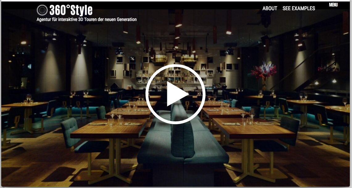
-
gridderSep 27, 2022, 3:47 PM@arminunruh superbe! thank you
-
gridderSep 27, 2022, 7:55 AMthese are all html links. texts and images are displayed. html links are not.
-
gridderSep 26, 2022, 12:57 PMhey there. my gridder looks like this after updating lay theme today. yes i deactivated all plugins.
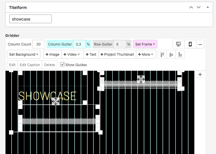
i am not abel to work with this anymore.
anyone who knows a solution?
thanks a lot
v. -
iframe content does not show up in safariApr 13, 2022, 9:17 AM@Richard thank you!
i did another site where it is working fine: https://360style.de/showcase/
i realy dont understand this issue with my regular site:
https://360style.de/#showcasedo you have any idea how to get it work?
thank you so much
g. -
iframe content does not show up in safariApr 11, 2022, 1:20 PMhey there,
the content of my iframes does not show up anymore. it is working on firefox but not with safari.
is this a known problem with laytheme? or Wordpress?
thank you so much
g. -
mobile menu scrolls to topFeb 25, 2022, 11:11 AMhey hey!
it was the plugin "Easy Smooth Scroll Links"
after deactivating all links are working. and after reactivating the same problem appears. thank you richard!do you know a better plugin for the same effect?
all the best
v. -
mobile menu scrolls to topFeb 22, 2022, 7:50 PMhey there,
when i click on the mobile menu its docent scroll to the anchor, it scrolls always to the top. it works fine on desktop.
does somebody know what to do?thank you
v. -
Customizer is not loading ...Feb 9, 2022, 10:12 AMhey, its still not working after changing the language ...
any news here?
thank you
g -
2 different mobile menus on 2 different sitesNov 19, 2021, 6:12 PM@Richard GREAT!
thank you 1000 and 1 times!all ist working now
best
g. -
2 different mobile menus on 2 different sitesNov 12, 2021, 10:20 AM@Richard
dear richard. did you get my message via chat? -
2 different mobile menus on 2 different sitesNov 10, 2021, 8:49 AM@Richard done ;-)
-
2 different mobile menus on 2 different sitesNov 9, 2021, 5:49 PM@Richard
edit
when i delete
.slug-test .laynav.mobile-nav {
display:none;
}the primary menu will show up on mobile
-
2 different mobile menus on 2 different sitesNov 8, 2021, 10:00 PMhey hey,
test page: https://360style.de/test/
the second menu appears as desktop but not on mobile
CSS:
.slug-test .laynav.primary {
display:none;
}.slug-test .laynav.mobile-nav {
display:none;
}any idea what to do next?
thank you
g.
I also code custom websites or custom Lay features.
💿 Email me here: 💿
info@laytheme.com
Before you post:
- When using a WordPress Cache plugin, disable it or clear your cache.
- Update Lay Theme and all Lay Theme Addons
- Disable all Plugins
- Go to Lay Options → Custom CSS & HTML, click "Turn Off All Custom Code", click "Save Changes"
This often solves issues you might run into
When you post:
- Post a link to where the problem is
- Does the problem happen on Chrome, Firefox, Safari or iPhone or Android?
- If the problem is difficult to explain, post screenshots / link to a video to explain it