@arminunruh Thank you! Much better now.
wirefoxterrier
Posts
-
text that flows from one column to the next -
text that flows from one column to the nextHey Armin, sorry – one more question about this. I worked with this code and everything seemed fine with Firefox.
With Safari, the columns break if you open and close several 'collapsed' rows that include the two-column script.
Please see for yourself: https://arminlorenz.net/home/home-copy/
Is there any way to fix this?
Thank you!
Armin -
Customizing html audio playerHello,
I would like to make use of streaming audio content directly from my website. However, I don't like how the default browser players look. I am capable of understanding basic html/css rules, but do not know at all how to integrate js code (at all).
I found a player on this site that I really like, which seems to be a jplayer element:

I would love a similar player (black color instead of violet). The website i took this from is: https://www.lyrikline.org/de/gedichte/bristepunktet-part-1-13852
Is this something that would take a lot of work?
Thank you, also for the previous help I got from this forum.
Best wishes,
Armin -
text that flows from one column to the next@arminunruh Thank you so much! This was really easy.
-
text that flows from one column to the nextHello,
i work a lot with indesign and unfortunately i am not very familiar with text design options in laytheme. I need a way to split text into two columns. I would like the text to flow from one column to the next, depending on the browser dimension. Is there anyone who can help me with this?
Greetings, (another) Armin
-
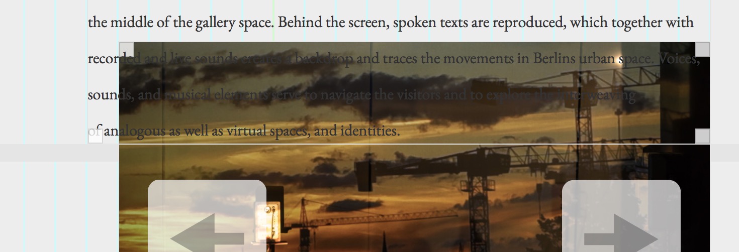
Offset / Image + Text@mariusjopen Thanks. Well, today, I tried again and somehow It did work - I don't know what's the logic. There's no definition of whats above and below?
http://wirefoxterrier.info/ -
Offset / Image + TextDear @mariusjopen , Thanks!
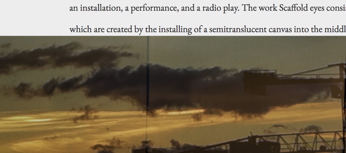
Here offset image in the 'draft mode'

Here how it looks if you post:

I would love the text to lay over the image.
Can you help? Many thanks! -
Offset / Image + TextIf I use the offset between 2 different rows (or even in the same row) the text is automatically under the image. Anyone know how to solve this?
The lay theme seems really very limited.