Hi Marius,
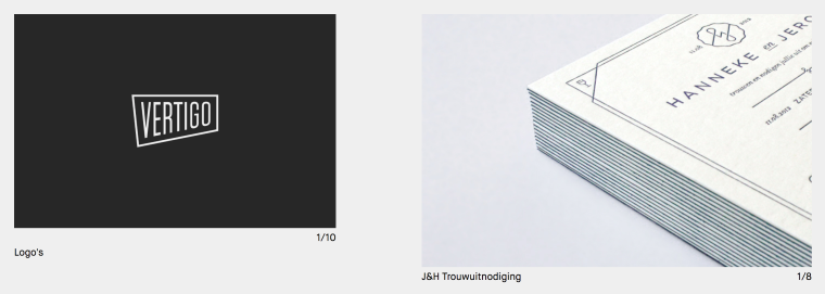
it's not lower anymore because I used Dustin's method of adding the same caption to al the images individually.
When you add a caption tot the carousel alone, it's lower.
You can see the difference in the screenshot. Both captions use the same text format, but the one on the left is an overall caption for the whole carousel, where as the one on the right, the caption is placed on the image itself.
