Skip to content

General Discussion

5.0k Topics 21.7k Posts

A place to talk about anything Lay Theme related

  • This topic is deleted!

    1
    2
    0 Votes
    1 Posts
    7 Views
    No one has replied
  • imagehover image size Vertical vs horizontal

    3
    2
    0 Votes
    3 Posts
    293 Views
    P
    @arminunruh thanks a lot!
  • different carousel style on desktop and mobile

    3
    0 Votes
    3 Posts
    643 Views
    T
    Thanks for your answer @arminunruh I will make a special layout for the mobile version then, no worries. And thanks for the support! ;)
  • Click anywhere close modal for page intro and carousel caption

    2
    0 Votes
    2 Posts
    212 Views
    arminunruhA
    ok read this: https://javascript.info/bubbling-and-capturing any click event bubbles up the dom tree, meaning you can capture any click on any element just by jQuery(window).on('click', function(){ }) or window.addEventListener("click", function(){ }) the event target value shows you what was clicked on specifically: https://developer.mozilla.org/en-US/docs/Web/API/Event/target jQuery(window).on('click', function(e){ console.log(e.target); })
  • Fullscreen slider and image hover bug?

    2
    1 Votes
    2 Posts
    194 Views
    arminunruhA
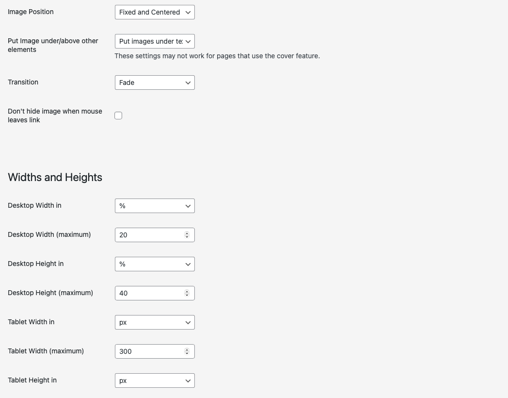
    yea i will have to re-evaluate how i coded the imagehover addon we have the same issue when the cover feature is enabled could take a while for me to fix this :|
  • image size, mobile

    4
    0 Votes
    4 Posts
    830 Views
    arminunruhA
    ah i see the sizes of elements depend on their width. they don't depend on the height of your browser. so in that case the image will be cut off so when you look at the website on your phone in landscape, the image is cut off. if you use fullscreen slider you can use lay options -> fullscreen slider -> scroll down, activate "Give elements a max-width and max-height and center them" this only works if the image is the only image in the row im planning to somehow make it possible to restrict image sizes based on the height of the browser when you create a carousel you can for example check "fixed height" and enter a value like 100vh which will make the element as tall as the browser height
  • Mobile menu on tablet

    3
    0 Votes
    3 Posts
    409 Views
    B
    @arminunruh thank you it willl be so cool. At the moment my problem is that i show tablet menu really big: [image: Screenshot 2023-07-03 alle 10.39.29.png] this is my css: .navbar { border-bottom-width: 3px; } .fixed-element{ position: fixed; top: 200px; left: 30%; z-index: 5; } .rotate { animation: rotation 8s infinite linear; } .primary li { color: white; background: var(--primary-color); font-size: 5px; font-weight: 100; line-height: 1em; border: 3px solid; border-radius: 20em; padding: 0.25em 0.5em 0.4em 0.5em; transition: 200ms ease-in-out; } .primary li:hover { color: #1F54FF; line-height: 1em; border: 3px solid; border-radius: 20em; padding: 0.25em 0.5em 0.4em 0.5em; } li.current-menu-item { color: #1F54FF; line-height: 1em; border: 3px solid; border-radius: 20em; padding: 0.25em 0.5em 0.4em 0.5em; } .lay-thumbnailgrid-filter-anchor { background: var(--primary-color); font-size: var(--step--1); font-weight: 300; line-height: 1em; border: 3px solid; border-radius: 20em; padding: 0.25em 0.5em 0.4em 0.5em; transition: 200ms ease-in-out; } .lay-thumbnailgrid-filter-anchor:hover { background-color: #1F54FF; color: white; line-height: 1em; border: 3px solid; border-radius: 20em; padding: 0.25em 0.5em 0.4em 0.5em; } .lay-thumbnailgrid-filter-anchor.lay-filter-active { background-color: #1F54FF; color: white; line-height: 1em; border: 3px solid; border-radius: 20em; padding: 0.25em 0.5em 0.4em 0.5em; } Can you help me?
  • Elements change stack order randomly in Fullscreen Slider

    7
    0 Votes
    7 Posts
    679 Views
    B
    Hey @arminunruh , thanks a lot! The hack you suggested worked :) Even better, I just did the most recent update and now it also works without the hack. Did you work on that issue for the newest lay theme update or is it a coincidence?
  • 0 Votes
    4 Posts
    475 Views
    arminunruhA
    xD ok! will work on it soon
  • mobile site is suddenly aligned to the right

    3
    0 Votes
    3 Posts
    305 Views
    A
    @arminunruh hey there! At the time of posting, I was up to date. I haven't looked again to see if there's a new update available, but I will tell you that sometime from when I went to bed and woke up today, the issue corrected itself. That landing page is now centered on mobile again. If admins want to delete this since it resolved itself, totally cool. Thanks!
  • Chrome shows wrong text weight on certain text blocks

    2
    0 Votes
    2 Posts
    269 Views
    arminunruhA
    some browsers render fonts differently than others can u show a screenshot of which blocks exactly you mean?
  • Link to next project using fullscreen slider last slide

    4
    0 Votes
    4 Posts
    454 Views
    arminunruhA
    how about you link the last row in your projects to #laynextproject maybe that works! as i said: you can right click the row's background and click "set row link"
  • Tap to show/hide on mobile

    2
    0 Votes
    2 Posts
    234 Views
    arminunruhA
    i think you need to use javascript to toggle a html class on tap, not :active
  • only bottom space of images works as a LINK?

    2
    0 Votes
    2 Posts
    140 Views
    arminunruhA
    Post a link to where the problem is if possible, please <3
  • menu with submenues but no page itself

    2
    0 Votes
    2 Posts
    181 Views
    arminunruhA
    maybe create an empty page that you can use for this or a custom menu link maybe that works? not sure [image: Screenshot 2023-06-30 at 17.15.39.png] then in the customizer use the setting where you have to click on the menupoint to make it expand the submenu rather than the option where you just have to mouseover to expand the submenu
  • Issue aligning site title and menus on the same baseline

    5
    0 Votes
    5 Posts
    618 Views
    arminunruhA
    i think this can happen if you use a different font or different fontsize for the site title and the menu for you that doesnt seem to be the case for me it seems to work properly: [image: Screenshot 2023-06-30 at 18.04.44.png] i use the same font and font size for site title and menus maybe it has to do with the lineheight. maybe you use a textformat for one and dont use a textformat for the other in your link it seems you have created a different design so i cant check
  • 0 Votes
    2 Posts
    197 Views
    arminunruhA
    maybe if you go to textformats[image: Screenshot 2023-06-30 at 18.00.34.png] you see theres "html class" the class here is ._test3{ } so use custom css: ._test3{ font-family: yourfontname, another-fontname, sans-serif; } maybe that works, not sure i think this won't work ^^
  • What does this floating "layers" tab?

    4
    0 Votes
    4 Posts
    481 Views
    arminunruhA
    mh but if you put it in the right bottom corner it doesnt take up much space and it remembers its position [image: Screenshot 2023-06-30 at 17.50.39.jpg]
  • HIding the secondary menu in the projects

    2
    0 Votes
    2 Posts
    216 Views
    arminunruhA
    Post a link to where the problem is if possible, please <3
  • test your external links in the menu

    2
    0 Votes
    2 Posts
    299 Views
    arminunruhA
    make sure your url contains: http:// or https:// if it doesn't the link won't work properly [image: Screenshot 2023-06-30 at 17.15.39.png]
Online Users
Forgot your key, lost your files, need a previous Lay Theme or Addon version? Go to www.laykeymanager.com