Anchor scroll position, relative to filterbutton div height
-
Situation (here is my website draft):
- I have 12+ filter buttons, position fixed on top of the website.
- the buttons have anchor links that scroll to a certain area.
Problem:
- Depending on the screen width, the div, holding the buttons has a different height, breaking into 2, 3, or 4 lines, which makes the div height increase, on smaller screens. This is a problem, because the anchor scroll position should be relative to the div height holding the buttons, it should always scroll to the bottom edge of the div holding the buttons. Now the anchor links scrolls underneath the buttons on small screens. I put a padding-top 200px on the content div, but this only works for wide screens, not when the buttons break in to 3 or 4 lines, on smaller screens.
Any suggestions or tipps on how I can solve this? I'm happy to get some help on this. Many thanks in advance!
-
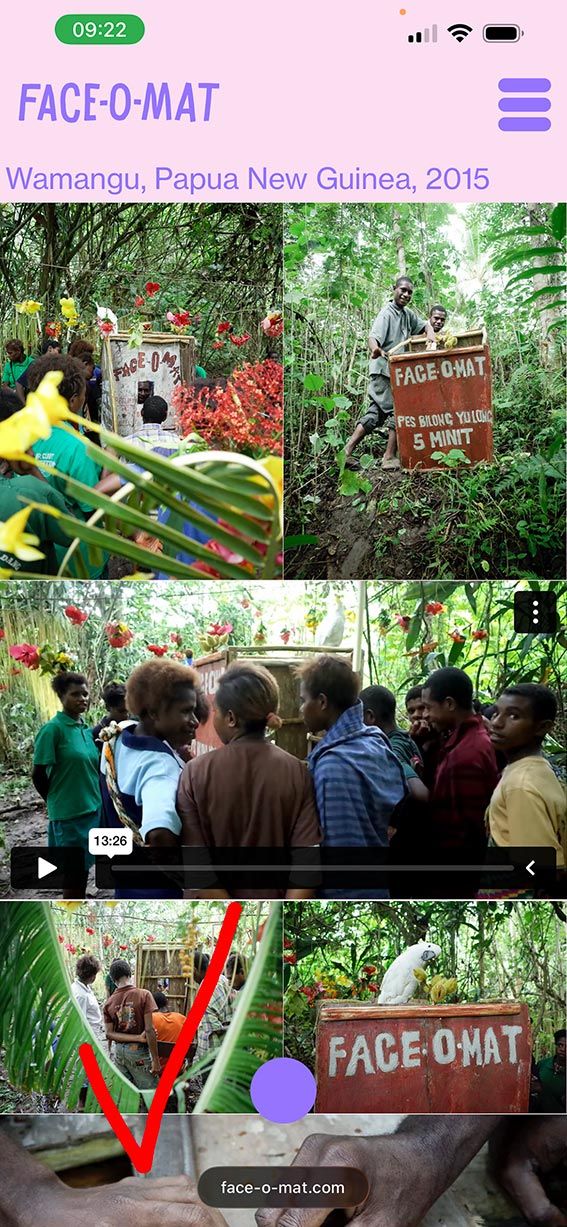
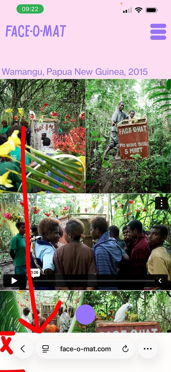
I also have a second issue, with the same filterbutton-menu from above. In mobile I used css and js to collapse the menu. For some reason, on iphone safari, once I click on one of the filter buttons, the bottom area suddenly covers in white. I spent hours with ChatGPT, trying to find the bug, but couldn't find a solution. So, here I am, I need some human help with this? :-) Could anyone look into it? Bellow images showing the correct screenshot on the left and the bug version on the right (once clicked on a filter button.
-
1.:
you could use a textformat for the buttons that uses a % based font size, namely vw:
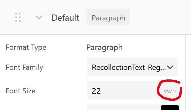
in textformats, click this and vw will appear. this will make the font size scale with the browser width
2.:
second issue is some new thing with the ios safari, nothing that can be done here as far as i know! found nothing online
-
thanks for your replies!
-
I found a different solution, hiding menu when scrolling to anchor point.
-
That is strange. Also sometimes the area is black and sometimes white, sometimes purple. I think it has something to do with my custom js menu, because on all other pages it works great and shows transparent. It is just when I open my filter menu on one of my pages (1 or 2) on mobile, or click an anchor link, the bottom area below url UI of Safari is covered with a color. ChatGPT thinks it's the combination of position: fixed elements and the way my custom JS toggles the filter menu on iOS Safari. But ChatGPT could give me a solution that works.
Perhaps there’s a way to handle this specifically for iOS Safari when the menu is opened or a user clicks a filter button. Any guidance or solution you could suggest would be greatly appreciated.
Thank you very much for your time and expertise!
-
-
yea theres no real info i could find on the second issue, about how ios safari determines the color of that bar
maybe this
https://stackoverflow.com/a/71804262could make you set that color. by setting the body css bg color in "custom css"
and some meta tags in "custom <head> content" in lay options -> custom css & html
For paid 1-on-1 Lay Theme Coaching, contact Audrey (audrey@cyberslayers.work) or me (info@laytheme.com).
We also code custom websites or bespoke Lay features. Drop me a line at info@laytheme.com or check out my work at arminunruh.com.
Want to support my work? paypal.me/arminunruh
Before you post:
- When using a WordPress Cache plugin, disable it or clear your cache.
- Update Lay Theme and all Lay Theme Addons
- Disable all Plugins
- Go to Lay Options → Custom CSS & HTML, click "Turn Off All Custom Code", click "Save Changes"
This often solves issues you might run into
When you post:
- Post a link to where the problem is
- Does the problem happen on Chrome, Firefox, Safari or iPhone or Android?
- If the problem is difficult to explain, post screenshots / link to a video to explain it