"use browser height for min-height of row" for desktop but not for mobile (without magnetic slides addon)
-
Hello Forum,
I would like to "use browser height for min-height of row" for desktop but not for mobile cause the spaces between the images are too big then? Is it possible to have it checked for desktop but not for mobile? And I would like to do it without the magnetic slides addon.
Would be nice to get some help.
Thanks,
Regine -
Hey Regine, you can use that feature without the magnetic slides addon yes. Just right click on an empty spot of a row and check "use browser height for min-height of row".
To deactivate that for mobile use this CSS in "Lay Options" -> "Custom CSS" -> "Custom CSS for Mobile Version"
.row-inner, .row{ min-height: 0!important; } -
@arminunruh said:
.row-inner, .row{
min-height: auto!important;
}Hi Armin, thanks for your response.
If I insert it into custom CSS for mobile there is a ecxlamation mark showing this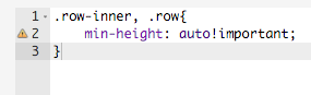

Could you help some more.
Best, Regine
-
-
Hey about the css warning, you can ignore that.
It works on dektop if you resize the browser so the preview area is less than 900px wide. On Iphone it works in landscape but not in portrait.
Ah, ok can you give me your link so I can check that?
-
-
Yeah, or via chat here :D

Hello! It looks like you're interested in this conversation, but you don't have an account yet.
Getting fed up of having to scroll through the same posts each visit? When you register for an account, you'll always come back to exactly where you were before, and choose to be notified of new replies (either via email, or push notification). You'll also be able to save bookmarks and upvote posts to show your appreciation to other community members.
With your input, this post could be even better 💗
Register Login