Image with fixed height and responsive width
-
Hi Marius,
Unfortunately I am still struggling with this. Could you please give spandau20.com/subscribe a look?
The image banner should have a height of 150px and cover the full width (-20% left and right).On the Dates page you can see the image I want to crop to the final size. The table underneath is positioned as if the banner was 150px high, but the banner image isn't cropped at all :(
Best
Julius -
Dear @jw
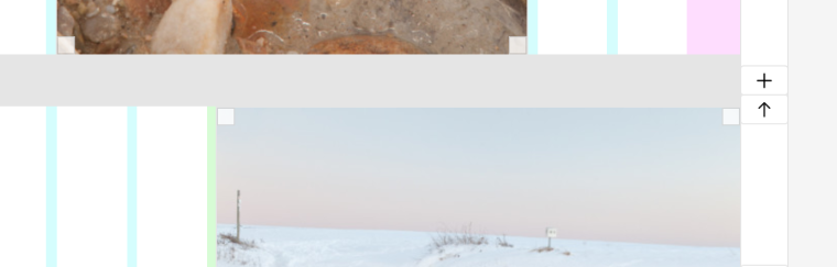
The image is trapped in the container:

But you can drag images out of the gridder, into the pink area.
Best!
Marius
-
-
-
Hi Marius,
I tried dragging the image to the left which worked but didn't yield the effect I was aiming for. (See www.spandau20.com/dates)
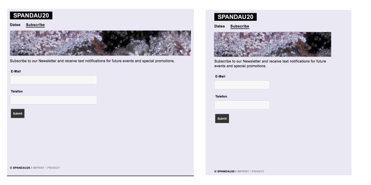
Maybe my aims were a bit unclear: The banner on the subscribe page looks great with only one problem: I want the height to remain at the same px value across all screen sizes. The width is correct.
I made a quick sketch in Ps of how I want this to look across two screen sizes:
Best
Julius -
Dear @jw
ok. I understand. you can use CUSTOM CSS to change the height.Also look into:
- !important
- object-fit
Best!
Marius
-
-
Dear @jw
try this:
.banner img {
    height: 100%;
    object-fit: cover;
}
.banner div {
    height: 100%;
}
Hope that works!
Best!
Marius
-
Hi Marius,
That didn't work either but I managed to work it out using a HTML object:
<img src="wp-content/uploads/2019/02/banner_03.jpg" alt="Banner" class="banner">
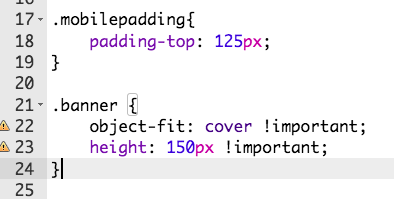
The CSS class:
.banner{
position: relative;
padding-top: 125px;
height: 125px !important;
object-fit: cover !important;
}Thanks for your help!
Julius -

Hello! It looks like you're interested in this conversation, but you don't have an account yet.
Getting fed up of having to scroll through the same posts each visit? When you register for an account, you'll always come back to exactly where you were before, and choose to be notified of new replies (either via email, or push notification). You'll also be able to save bookmarks and upvote posts to show your appreciation to other community members.
With your input, this post could be even better 💗
Register Login